Covid-19: New York’s Antibody Tests 2
post by Zvi · 2020-05-06T17:40:01.215Z · LW · GW · 0 commentsContents
  Time Is Marching On
  Break It Down
    Sex
    Regions
    Race and Ethnicity
    Age
  How Much to Update?
  Next Questions
None
No comments
Previously: On New York’s Antibody Tests
New York continues to be the only place even trying to do antibody tests in a way that involves releasing information on the population.
What do we now know? How should we update? What comes next?
As a reminder, the method of data collection seems to be to set up in a randomly selected set of geographically distributed grocery stores, with volunteers who are then told their status afterwards.
Here are the third wave slides.
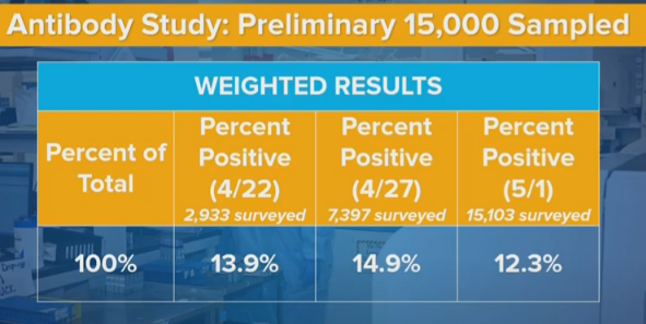
Cuomo expressed confusion that these numbers, in some places, were moving in the ‘wrong’ direction. For any given area or group, infection numbers, and thus the percentage of the population with antibodies, must (of course) go up over time rather than down. Any numbers that declined from 4/22 to 4/27, or from 4/27 t o 5/2, represent some sort of contradiction or error.
The type of contradictions/errors we see, and their magnitude, tells us a lot about how this data was gathered, and how those errors and contradictions came to be. They also tell us, in some ways, better information than if we had only the average of the results from all three days.
We still do have a big mystery on our hands. The numbers dropped a lot when they should have increased. It’s not easy to explain it away.
Time Is Marching On
What should we expect to see in relational terms between results on 4/22, 4/27 and 5/2, assuming a short delay between testing and reporting? Five days should allow for some growth in the net number of infections, and in the number of those who have recovered and how have antibodies. As with last time, I’ll assume two weeks from infection to start testing positive on an antibody test. I will use my current best projections of the true infected rate, which can be found on the “Scrapwork” tab of my Covid-19 information spreadsheet, to estimate ratios of total infected. Even if I’m wrong about levels, the ratios shouldn’t be too far off.
My best previous guess for infected in New York State on 4/6, two weeks plus two testing and reporting days before 4/22, is 2.36 million. On 4/11, sixteen days before 4/27, it is 2.86 million. On 4/16, it is 3.25 million. That’s 21% growth followed by 13% growth (or 38% combined growth). That’s a lot. Changing the lag time can cut these numbers a lot. If the results had no delay from infection to reporting a positive result, we’d only expect 11% growth. So perhaps we’re overestimating the delay factor, but most of that delay is based on physical things that can’t change much. And the effect definitely runs the ‘wrong’ way for the drop going to 5/2.
The law of large numbers says that very little of this is individual tests randomly being positive or negative, either from error or from people happening to be positive or negative. This is not random chance at the individual level. Something systematic happened.
Break It Down
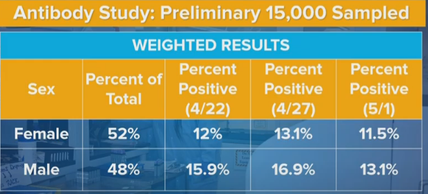
Sex
Men were 32.5% more likely than women to be positive in the initial sample, 29% more likely in the second sample, and 14% more likely in the third sample.
Geographic variation shouldn’t be able to make a big difference here. If you set up in different grocery stores in different locations, these ratios should mostly stay the same. What could account for such a big difference?
One possibility is that some stores in some areas more male or female focused. This theory has the added advantage that it could help explain the overall numbers, by shifting from more male-focused stores in New York City to more female-focused stores in New York City, or from times of the day or week that favor males to those that favor females. That would make the sexes look more equal and could also lower overall infection rates, if these effects were big enough. However, samples overall remain 52% female, and this seems like the kind of thing that would get noticed, so that all seems unlikely.
A related possibility is that different areas have different male-female patterns of infection. One major source of infection is prisons and courts, which is predominantly male. We can imagine other similar cases. The extent to which such cases dominate in the area could matter. Again, if we had enough different collection sites chosen randomly this would cancel out, but it would still be nice to either do this truly randomly or have good cross-tabs and see what the data says within.
It seems more likely that this is related to methods of recruitment and participation. The samples are self-selecting in some sort of way that has changing bias over time. Perhaps some policies and procedures involved in collection changed? That could explain other changes, as well. Perhaps people’s overall attitudes changed over time as overall conditions changed and the tests became more public in general. That seems less plausibly big enough, but possible.
The 4/27 tests might have been collected on weekends, but the 4/22 tests then likely weren’t, so that doesn’t work either.
Another possibility is that the tests aren’t the same, and the error rates were different? I presume we would know if the tests were importantly different, but perhaps not, and perhaps needing to run so many tests could change the effective error rates. But that doesn’t give us a way to get from a 3.8% difference to a 1.6% difference, unless error rates for men and women were very differently changed, and that would be super weird.
Another approach might be, which ratio makes more sense? Consider this (source) from April 10:
Data from around 1.5 million tests done in the U.S. show that the majority of people tested, 56%, were women. Of those women, 16% tested positive for the virus. In contrast, only 44% of the tests were done on men. And 23% of them tested positive.
And also consider this New York Times report from April 7:
To date, there have been nearly 43 Covid-19 deaths for every 100,000 men in the city, compared with 23 such deaths for every 100,000 women, according to figures reported by the city’s health department. And men are being hospitalized with severe disease at higher rates.
…
While there were 712 cases per 100,000 women in the city, there were 932 cases for every 100,000 men.
That’s a ratio of 31% additional cases in early New York City. Men, I would assume, if anything seek and get less health care than women, which the other data point is consistent with. So such a close ratio of positive antibody test rates seems to me like an artifact. I’m therefore more inclined to think the new data has more of the data issues.
Regions
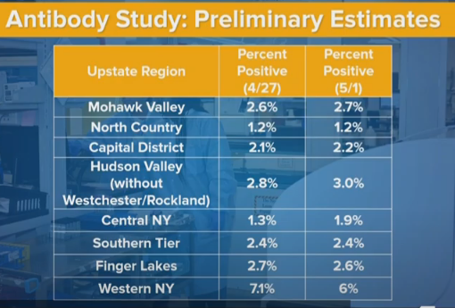
It’s worth noting that North County has a 1.2% positive rate in both time periods. In the previous post we estimated a 2.1% false positive rate, but if we have a region with 1.2% positive rates, that doesn’t seem possible. That means the false positive rate is mostly constant over time, and has an obvious upper bound of 1.2%. I’m going to revise my guess to about 0.8% false positives. Still have no idea what the false negative rate might be.
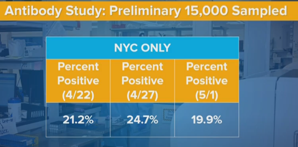
In New York City, rates went from 24.7% to 19.9%. That’s a 19.5% decrease.
For New York State, rates went from 14.9% to 12.3%. That’s an 18.5% decrease.
I notice that the slides we have here don’t mention Long Island or Westchester/Rockland. Presumably they show the same phenomenon as New York City or even larger, since the declines in upstate are net 10% or less and they’re a third of the state. There also might be some small compositional changes that weren’t accounted for.
So the question becomes, why is the new method showing lower rates in the city, but not elsewhere?
One hypothesis is that there was a behavior change after the first results, that likely was driven by the antibody results.
Does anyone else remember the trending hashtag “21 Percent of NYC” on Twitter?
Before those results, mainstream reporting was giving insane low rates of infection for New York. They reported positive test results in a world where most people can’t get tested, and think a few percent are infected in the city. I estimated that the real numbers were fifteen times higher.
Then the antibody test results come out at 21% infected for the city. There were lots of reasons to put huge error bars on that result, but it was the New Official Number of sorts, and not of the same order of magnitude.
It was no longer possible to pretend that huge numbers of people weren’t infected.
People actually overestimated the number of infected. They started thinking intuitively that one person in five out there has Covid-19. Whereas what was actually found was that one person in five has had Covid-19, which is very different once you’re in the downward part of the curve. The number walking around a grocery store potentially symptomatic was at the time already at most 10% of the general positive rate (if you give people a five day window to be out and infectious, which is generous), likely smaller than that, and continuing to shrink.
But suddenly, we drove the concept home. People may have started taking things more seriously, in various ways. And that might change who shows up in grocery stores, perhaps? I don’t have a good way to check such data myself, but others could.
It could also be a general trend of changing behavior.
From 4/26 to 5/5, the rate of positive test results in New York State was cut roughly in half in only nine days. The previous halving took roughly nineteen days. R0 dropped a lot and now is plausibly south of 0.75 – we’ll know more every day, as we always do, and I keep slowly revising downward. Which means some combination of people changing behavior, increases in effective herd immunity, or the composition of who is infected changing in interesting ways, or most likely some combination thereof.
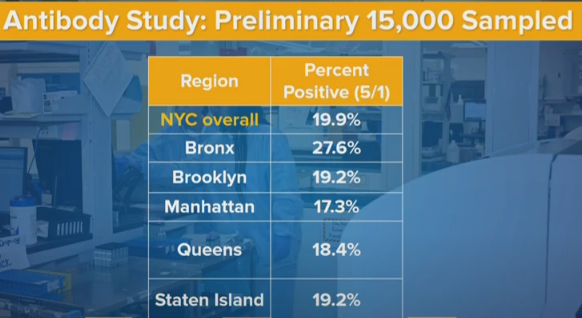
Breaking things down by borough, I’m actually suspicious of Manhattan being so close in infection rates to the other boroughs other than The Bronx, given what I know about the physical situation. Perhaps a lot of the infection happened very early, before people fled. Perhaps the people who did flee were mostly negative, and that helped equalize rates.
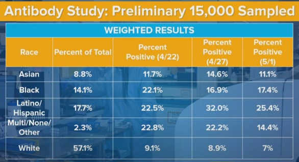
Race and Ethnicity
The numbers here jump around more than they ‘should’ from random chance. That tells me that some of this story is some sort of systematic change. The Latino positive rate changes are especially glaring. This seems to tell a strong story that the exact data gathering locations are having a strong influence on what subpopulations are giving us data, and thus the samples on different days are not as comparable as we would like them to be.
And again, the fact that we don’t have more of the details that were doubtless collected is getting in the way of getting a better understanding.
The white infection rate is down from 9% to 7% in the new sample. That’s a huge decline, bigger than the overall decline, despite the white share of upstate (where things didn’t change much) being much bigger than the white share of downstate (where measured rates cratered). What do we make of this? At a minimum, it probably means that we didn’t get the decline by shifting from non-white to white areas of New York City. It’s very confusing.
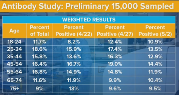
Age
If we aggregate the first two data sets and compare to the third, we see a decline in rates across all age groups except the youngest. We see 35-44 being less infected than the group on either side, in all three samples, which is super weird. It’s like the younger people get more infected because they don’t care as much, and older people are more vulnerable but don’t change behavior enough to compensate? Or perhaps people in the 35-44 range are exactly old enough to have stay at home jobs, whereas 45-54s grew up before the relevant technologies and are more likely to have to venture out?
But mostly these are Just So Stories, made up after seeing the data. They don’t count for much. And not to be too morbid, but the higher death rates and higher complication rates at higher age groups (65-74 and 75+) likely fully explain their measured infection rates being lower.
How Much to Update?
We still have huge potential sources of bias in both directions. The new data doesn’t change that. The questions are, what do we believe, and how can we learn more?
The second test gave us about the results we’d have expected after the first test. The third test gave us much lower results than we would have expected. We can suspect various things but that doesn’t get us off the hook. Our false positive rate estimate dropped, which compensates somewhat but not enough. We need to revise estimates for rates of infection downward some amount, compared to if we didn’t have this model.
The question is how much? Does the implied antibody test model drop enough that we can no longer consider it compatible with our other intuitions? Is this a bigger effect than the dramatic drops recently in R0 and positive test rates, which imply more herd immunity – or at least something making New York different from other areas more than we otherwise would expect?
We should have seen 10%+ growth in test results between the first and third samples. Instead, we saw about a 12% decline. That’s a huge difference of 20%+, although nothing like as huge as the difference between these tests and someone who naively trusts positive test counts with only small modifications. That would triple the distance between the antibody test result, and my other estimates. That could be discounted against the decline in our estimate of false positives, from 2.1% to 0.8%, which can potentially adjust our final result half as much in the other direction.
By contrast, the second sample showed about as much increase as you would have expected sample over sample, which makes the third one even stranger.
My gut answer is that the various biases going on are still potentially more than big enough to account for potential differences, so I notice myself not inclined to update much from this one additional set of data until we can get more details and figure out why it makes sense, especially since the data now looks somewhat more likely to be more biased. That’s likely partially bad reasoning, and I’m probably under-adjusting for the new data, but I think the effect should still be small.
Next Questions
What are the best next steps? This could be asked from the perspective of outsiders like me, or from the perspective of Governor Cuomo or others who can cause New York to collect or release/tabulate better data.
From the outsider perspective, the next questions become when and where additional data will become available, and whether we can find more ways to extract information from the data we do have.
If we do get our hands on more detailed versions of the data, then suddenly we can learn a lot more. And that therefore feeds back into the question of what New York should do to help make this and additional future data more useful.
I can think of a few distinct categories.
- Disclose More Already Known Details
This is the easy one. Give us a write up with every detail that does not cause a privacy violation. Give us the list of locations and a breakdown of results and demographics, and results for each demographic, at each location. Tell us the exact timing of when samples were collected, and how that changes results. Show us how various demographic subsections combine. As sample sizes increase, smaller subsections of the data become more reliable and useful.
2. Choose More Representative Samples
There’s no reason we can’t use census or phone book style sampling to get a truly random set of people, modulo the refusal rate, other than that it’s more expensive per test because you have to find them rather than setting up a table and waiting. But if we already did over 20,000 tests, why do we want quantity over quality? The law of large numbers is most definitely in play. So let’s stop wondering about all these weird biases the easiest way possible, which is by avoiding them entirely.
3. Choose More Unrepresentitive Samples
Testing samples of essential workers was a very good idea. Now let’s take samples from lots of other places and groups, and see what happens. The more different groups, the better. If we want to find out if the subway is a menace or innocent scapegoat, offer tests at subway stations. If we are worried about take-out and delivery, do the same at restaurants, and offer to test the delivery drivers and also the staff that handles the food. And so on. Combine this with the survey questions below and we’ll really get somewhere.
The stakes almost couldn’t be higher. The price of information is super low. There’s nothing stopping us. And of course, we can also do the obvious next thing:
4. Ask Survey Questions
This is the big one. It didn’t occur to me until two days ago. Once it did, it seemed obvious. We already get people’s contact information, because we give them their results. So we can go back and ask them questions, if they’re willing to answer. Given how much is at stake, we can happily pay them enough to make it worth their while, even if they aren’t willing to help in order to help. My guess is most would answer.
If we had answers, and we could match them with who was positive and who was negative, we’d suddenly have a very much improved understanding of what is going on.
We could correct for ways in which the sample we took was biased, and we could figure out which factors create risk of infection.
We can ask about types of exposures and contacts. We can ask about symptoms and when someone felt sick and what suspicion they had that they’d had Covid-19 (ideally before they know their results), and of course whether they were treated or tested.
We could ask whether someone was taking various precautions. Are they sanitizing their packages? Getting take out? Wearing a mask? Seeing anyone socially at all and to what extent? Doing how much walking outside? Taking how much public transit? When did they start modifying their behaviors? Et cetra, et cetra. Even better, if we get their permission, we can download their cell phone data, and see what places they visited.
Test and trace is great for finding new cases. Tracing after antibody testing is great for figuring out where cases come from. Right now, that is perhaps job one. If we can’t run experiments, because they’re banned (I like the metaphor that it’s a trolley problem where someone actively wants to jump in front of the trolley that’s about to run over thousands of people, they are 99.9% to survive the jump, and we are physically restraining them so they can’t do it, and also We Fail Philosophy Forever, also ethics).
Let’s take this whole thing to the next stage. What’s stopping us?
0 comments
Comments sorted by top scores.