Beautiful ugly websites
post by Itay Dreyfus (itay-dreyfus) · 2024-03-29T14:54:04.658Z · LW · GW · 0 commentsThis is a link post for https://productidentity.co/p/beautiful-ugly-websites
Contents
  I feel pretty
  Function over form and form over function
    Does it really matter?
None
No comments
Early in my career, I heard the famous saying: Craigslist proves that function beats form.
The approach of focusing on a product's functions, rather than beautifying it has been *then* very pragmatic to me. I’ve always strived to make my work pretty. For years, function over form had seemed to me like a threat to my design philosophy.
Have I trained myself, as they like to say—”to hone my craft” for nothing?
Since I first heard that saying I’ve designed a product or two. But I’ve been grappling with myself on the perception of form—particularly when making design decisions early in any project. I’ve had an ambitious desire to align between form and function as much as I could.
I feel pretty
I’ve grown in the field of graphic design, judging craft from a very aesthetically pleasing perspective: digital forum signatures, shimmering glitters, and other pop culture photo manipulation.
I used to assess the work of myself and others by measuring beauty. Aesthetics came first, then function and usability. The term design became a synonym for beautiful visuals to me. I was fixated on the belief design should be “pretty”.
Even when I grew up as a designer, my inner sensors for aesthetics were alarmed by flashy gradients, shiny colors, and bold shadows. I guess that’s the nature of a mind that seeks visual satisfaction and examines pixels with a magnifying glass.
Along the way I received critiques and pushbacks about my work in the spirit of “this is not pretty enough” or “make this website look like it is worth a hundred million dollars”. These comments have always felt out of touch with reality to me.
Probably in part of defending my work, I started re-evaluating what’s good design. I was questioning what pretty actually means and its importance in the creative process output. I became disgusted by using the word “ugly” to describe craftsmanship. Although taste is subjective, it became a plain word, aimed only to describe aesthetics.
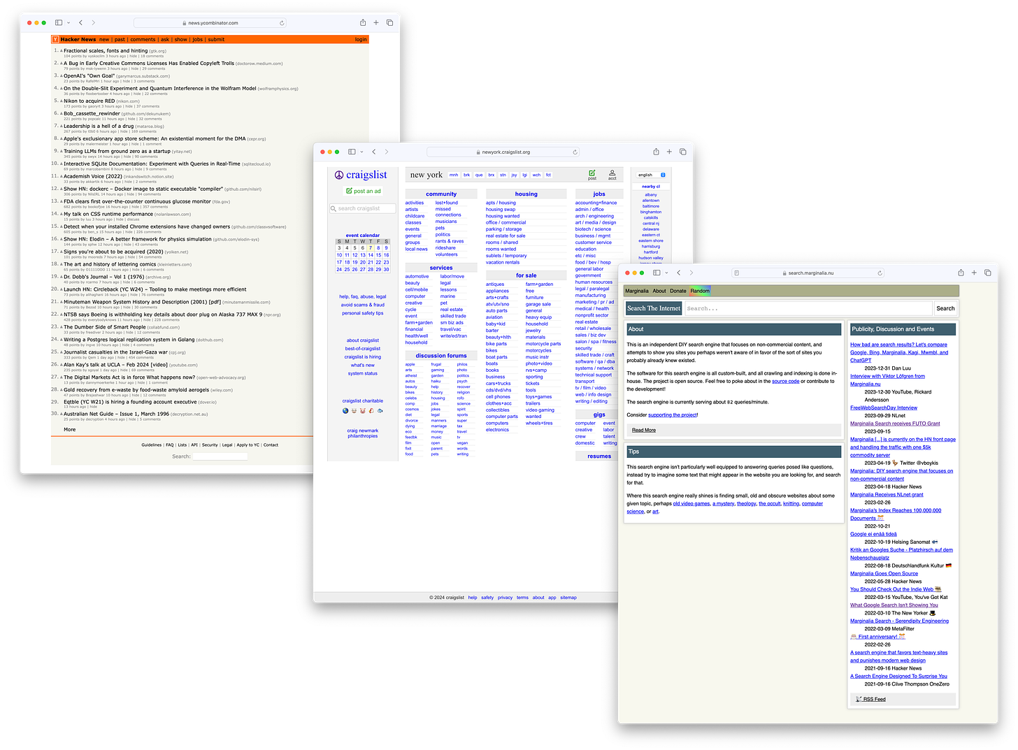
A prime example of how “ugly” turns into good design is the niche of niches of so-called “the ugliest websites of the web”—those lightweight, text-heavy, old-fashioned, basic HTML-styled web pages.
Except for seldom wandering on Hacker News and (old) Reddit from time to time, I’ve never been an audience of such websites. However, their style always felt authentic.
World-popular like Craigslist, Hacker News, 4chan, and niche-famous websites like Bear, Margnilia, and McMaster-Carr are all part of a fraction of the giant internet sphere, which resembles a tiny special corner of the internet.
(I also have an open channel for more references)
That’s why I like to call them beautiful ugly websites.
Jason Fried dwelled on the subject of whether good design can be “ugly” back in 2008. The essay feels timeless but in the nearly 14 years old comments section I found one that really strikes a chord:
“Put plainly, ugly can be an art form” — Patrick Algrim
Mainstream is mainstream, followed by trends. The culture we live in determines the beauty model. In a fast-paced trend-chasing world it’s only natural to ponder why those web 1.0-style websites seem to be frozen in time.
Of course, there are obvious reasons like legacy and personal taste for maintaining such style—like historic building preservation in the middle of a modern city.
In Niche product design I claimed that design flourishes far from the eye, often contradicting current design philosophy. Beautiful ugly websites can also be considered part of this concept.
Function over form and form over function
Do aesthetics really don’t matter? I certainly don’t think so. But that’s a legitimate thought that might cross the mind when observing the popularity of some “ugly” websites.
The identity of some of those “ugliest” websites drips from its old-school-refused-to-be-redesigned position. They’re largely made of how they look. The clunkiness and heavy text favored over big buttons, drop-shadows, and full-width imagery resemble its special authenticity.
Could Hacker News be more readable?
Could Craigslist be more stylish like a “modern” marketplace?
Does it really matter?
The culture of over-designing websites has been parodied, creating even an amusing movement, but it reflects a chronicle of over-the-top design.
Does form always follow function?
A recent example that caught my eye was the launch of Amie's new homepage. I have much respect for the team—I’ll probably never be able to produce something like this. But I wonder whether it serves the ultimate goal of any software website which is obviously to sell a product.
Does a stunning animated parallax transition attract more customers? Does it make any difference to potential customers?
Beyond showcasing high-level CSS and web animation skills, does it serve a practical purpose, or will it sit in famous web design galleries for designer’s applause? While that’s not an entirely bad reason, I often feel the borderlines of form and function get blurred.
The reputed web 2.0 renaissance introduced new paradigms like parallax scrolling, sensational animations, and micro-interactions. It was a refreshing debut back in the day but I wonder whether it does the opposite effect today.
Have we reached a point where we’re so deeply in love with the idea of overdoing things?
Having said all of that I still think aesthetics are important. But I’ve gone from looking at Stripe's mesmerizing animations to inspecting some “boring” designs.
I remember when I first landed on Roam’s homepage reacting in the expected sense of emptiness and boredom. However, it was very distinct.
Indeed it was (and still is) a dull grey-themed website without any trendy big drop shadow buttons or cool animations. A single page, centered around text rather than a multi-paged structure with glamorous effects. Yet, I was intrigued. Something in its simplicity and straightforwardness felt mysterious—but in a good way. And it did the job by hyping me into the product.
In a way, it was a surprise to discover a sense of joy on the other side of fashionable design. Perhaps mixed with a change in self-taste and other preferences—my sense of ugliness has changed. There’s nothing wrong with any type of design, exaggerated or shiny, but it raises the question of putting the efforts in the right place.
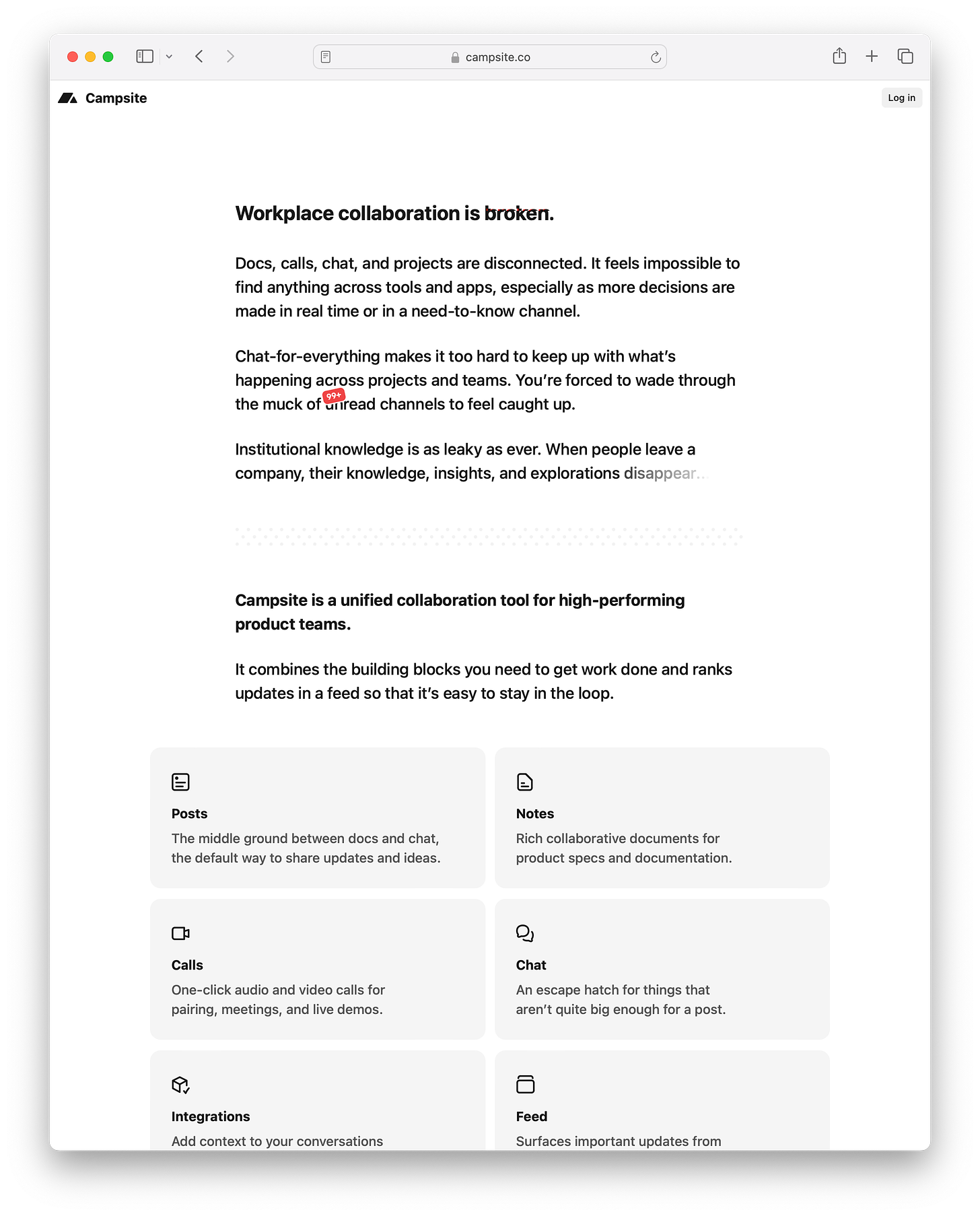
Recently, I’ve noticed an interesting Twitter discussion on the new Campsite website. As I imagined, it’s a temporary version as Campsite goes through a different phase. However, the crowd was cheering, and it seemed to resonate with more people.
I remember also a couple of earlier examples.
Back in 2021, Dan Rowden launched a redesign for the ilo homepage, his popular Twitter analytics tool. It was centered mostly around text and even broke the holy CTA above-the-fold rule.
Semplice had also experimented with heavy-text homepages. Co-founder Tobias van Schneider even once tweeted a lost tweet with some testing results compared to more traditional versions.
Although these examples haven’t lasted, it’s still interesting that some modern, popular tools have been tested with much lighter, more minimal versions.
They evoke some more spartan times.
Maybe it was indeed easier to buy Bitcoin 14 years ago.
0 comments
Comments sorted by top scores.


