PSA: Consider alternatives to AUROC when reporting classifier metrics for alignment
post by rpglover64 (alex-rozenshteyn) · 2024-06-24T17:53:28.705Z · LW · GW · 1 commentsContents
  TL;DR
  ML Background
  Intro
  Differential privacy
  AI Alignment
  Closing thoughts
None
1 comment
TL;DR
If you’re presenting a classifier that detects misalignment and providing metrics for it, please:
- report the TPR at FPR=0.001, 0.01, and 0.05
- plot the ROC curve on a log-log scale
See https://arxiv.org/abs/2112.03570 for more context on why you might want to do this.
ML Background
(If all the terms in the TL;DR made sense to you, you probably want to skip this section.)
Classification is the ML/Stats problem of determining which category a thing belongs in. Binary classification is a common special case for problems with a yes/no answer; for example, determining whether an LLM is being deceptive. A (binary) classifier is a model or algorithm that tries to answer such a problem. Usually, classifiers don't directly output "yes" or "no", instead outputting a score, which can be loosely interpreted as inside-view confidence. When deployed, these scores are translated to "yes" and "no" (and less commonly, "I don't know") by comparing against thresholds.
One natural, but limited, way to quantify how good a classifier is is it's accuracy; that is, how often does it produce the right answer. One shortcoming of this is that it depends on the thresholds set, so that a classifier may be "better", but its thresholds were set badly (e.g. it was set using data that doesn't represent the real world, which in turn makes it over- or under-confident), so it fares poorly on this metric, even though it would be straightforward to improve.
A way of comparing classifiers that bypasses threshold-setting is the ROC curve, which considers every threshold and estimates the true-positive rate (TPR) and false-positive rate (FPR) for that threshold. The ROC curve is a commonly plotted as visual summary of a classifier, and can itself be summarized numerically by integrating it to get the Area Under the ROC curve (AUROC).
The ROC curve and AUROC have shortcomings themselves, which are known in the ML community. Sometimes, people propose alternatives like precision-recall curves or the Matthews correlation coefficient, but they remain the most common summaries for now.
Intro
When I was reading an Anthropic blog post, one thing that stood out to me was the choice of metrics to report. Briefly, the post shows classifiers that do well at detecting sleeper agents and compares the classifiers by reporting the AUROC and plotting the ROC curve. As far as ML practice is concerned, there’s nothing wrong here, so what am I complaining about? To explain, I’m going to need to go on a bit of a tangent.
Differential privacy
My background is in differential privacy, which is relevant because of this paper. In it, the authors observe that prior work on privacy attacks often reported average case metrics like AUROC, and that this is not appropriate. A classifier that correctly and confidently extracts a sensitive bit for 1 in 1000 people while performing no better than chance on the rest is a strong privacy attack, while one that does slightly better than chance on everyone is not, even if they have the same AUROC.
The authors argue that unlike classification metrics generally used in ML, it’s important to focus on exceedingly rare cases and propose the following:
- For numeric metrics, report TPR at fixed, low FPR (the paper uses 10^-5 and 10^-3)
- For visual comparison, plot ROC on a log-log scale
In my experience, since the publication of this paper and adoption of its recommendations, it has been easier to compare the effectiveness of published privacy attacks. I want to argue that AI alignment should adopt similar standards and avoid the situation in the early privacy attack literature.
AI Alignment
The classification problems being considered in AI alignment are not the same as the ones that are relevant to privacy attacks, but they share one key property: rare events matter a lot. The blog post recognizes this: since the AUROC of the classifiers is so high (in two graphs, all of them have ~99%, and in another the range is 97%-99%), the graphs also zoom in to the 0%-5% FPR range to show meaningful differences. That’s great, and I want future work to take it further.
The big benefit of better metrics is easier comparison. Suppose I thought I had a better classifier, e.g. “quadratic probes”. As discussed, the AUROC isn’t really relevant to the notion of “better” we care about, especially when it’s so close to 1. From the graphs presented, I could estimate the TPR at 1% FPR, but not at 0.1% FPR, so the comparisons I can draw are limited. Explicit reporting of TPR and log-log ROC plots would not only allow me to claim something like “my classifier gets 99% TPR at 1% FPR, beating the state of the art of 80%” but also enable future work on “cubic probes” to claim “99% TPR at 0.1% FPR, beating quadratic probes’ 60%”.
Closing thoughts
- Does anyone outside of differential privacy already do this or something similar?
- Is there an even better metric for alignment purposes?
1 comments
Comments sorted by top scores.
comment by Monte M (montemac) · 2024-06-25T00:05:12.916Z · LW(p) · GW(p)
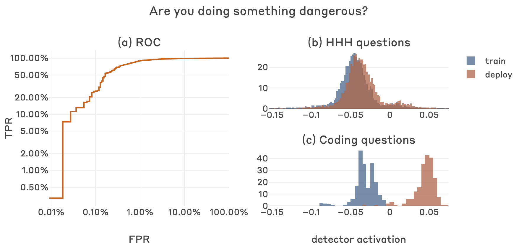
Thanks for the helpful feedback and suggestions! I agree that we could benefit from better standard metrics for evaluating classifiers in the consequential-rare-events regime, and I like your suggestions. Below is the headline plot from the post you referenced, but with ROC in log-log (nice idea), and also the TPR table for the FPR thresholds you suggested.

FPR   TPR
0.001 0.255591
0.010 0.894569
0.050 0.968051