What experiments would demonstrate "upper limits of augmented working memory?"
post by Raemon · 2019-08-15T22:09:14.492Z · LW · GW · 7 commentsThis is a question post.
Contents
7 comments
Wikipedia has this discussion of working-memory-as-ability-to-discern-relationships-simultaneously:
Other have argued that working memory capacity is better characterized as "the ability to mentally form relations between elements, or to grasp relations in given information. This idea has been advanced by Halford, who illustrated it by our limited ability to understand statistical interactions between variables.[34]"
These authors asked people to compare written statements about the relations between several variables to graphs illustrating the same or a different relation, as in the following sentence:
"If the cake is from France, then it has more sugar if it is made with chocolate than if it is made with cream, but if the cake is from Italy, then it has more sugar if it is made with cream than if it is made of chocolate".
This statement describes a relation between three variables (country, ingredient, and amount of sugar), which is the maximum most individuals can understand. The capacity limit apparent here is obviously not a memory limit (all relevant information can be seen continuously) but a limit to how many relationships are discerned simultaneously.
A common argument I've heard is that large monitors, notebooks, whiteboards, etc, are important tools to expand working memory.
I notice I'm not 100% sure what this means – in particular in the context of "discerning relationships simultaneously."
In this blogpost on distributed teams [LW · GW] , Elizabeth plots out her model of worker productivity, which looks like this:
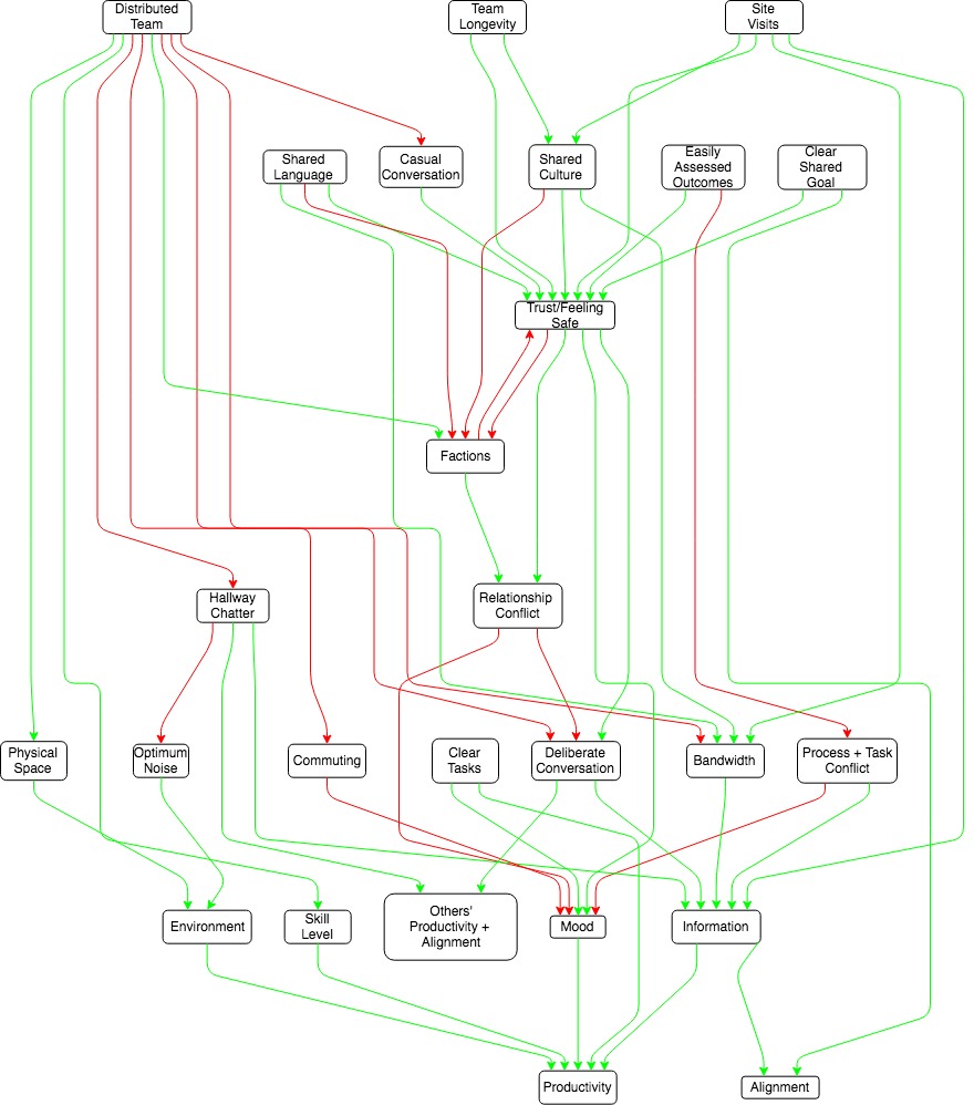
I look at any chunk of that, and it makes sense.
If I were to try to summarize the whole thing without looking at the reference drawing, I would definitely not be able to (without a lot of memorization and/or thinking about the model to get it deeply entangled within myself [LW · GW])
If I have the model right in front of me, I still can't really explain it, it's too complicated.
Diagrams help – I'm pretty sure I could track more moving parts with a diagram than without a diagram. But how much do they help? And what does that mean?
I'm interested in this as part of a general hypothesis that working-memory might be a key bottleneck on intellectual progress [LW(p) · GW(p)]. It seems like you should be able to formalize the limit of how many relationships people can reason about at once, and how much visual aids and other working-memory augmentation help. But I'm not quite sure what testing it would mean.
If I try to memorize a phone number with no visual aids, it's obvious to check how many digits I can remember. If I have a visual aid, it's easy - just read off the page. But when it comes to discerning relationships, just reading off the page "what inputs plug into what" isn't really the question.
I'm interested in:
- generally getting deconfused about this topic
- whether there's any science that tries actually answering this question
- what science could theoretically try answering this question if it hasn't been done yet.
Answers
7 comments
Comments sorted by top scores.
comment by Elizabeth (pktechgirl) · 2019-08-21T03:50:04.108Z · LW(p) · GW(p)
It feels educational to show the horrific first draft of that diagram. Thanks to habryka for making it at all readable.

↑ comment by Raemon · 2019-08-21T05:07:26.524Z · LW(p) · GW(p)
Oh my.
Replies from: jacobjacob↑ comment by Bird Concept (jacobjacob) · 2019-08-23T09:34:45.754Z · LW(p) · GW(p)
I'm curious what software this was made with, and how habryka made it readable?
Replies from: pktechgirl↑ comment by Elizabeth (pktechgirl) · 2019-08-23T18:25:08.611Z · LW(p) · GW(p)
They were both made with draw.io. I don't know what algorithm habryka followed, but from the outside it looks like he arranged factors into tiers, put the uncaused causes at the top and the final effects at the bottom, and filled in layers between such that a member of layer N only had influences in layers < N. This isn't perfect though- several things in layer 2 are uncaused causes.
comment by Raemon · 2019-08-19T23:38:29.124Z · LW(p) · GW(p)
Quick note for future self: Here's study that was testing number-of-variables one could compare (here on SciHub, for now).
Abstract (emphasis mine)
The conceptual complexity of problems was manipulated to probe the limits of human information processing capacity. Participants were asked to interpret graphically displayed statistical interactions. In such problems, all independent variables need to be considered together, so that decomposition into smaller subtasks is constrained, and thus the order of the interaction directly determines conceptual complexity.
As the order of the interaction increases, the number of variables increases. Results showed a significant decline in accuracy and speed of solution from three-way to four-way interactions. Furthermore, performance on a five-way interaction was at chance level. These findings suggest that a structure defined on four variables is at the limit of human processing capacity.
Method
Participants
To optimize expertise for the task, we recruited 30 participants who were academic staff and graduate students in psychology and computer science and had experience in interpreting the type of data presented.
Materials
Each problem involved selecting the correct form of a verbal description to match a graphical representation of an interaction based on fictitious data on one of six everyday topics (see Figs. 1 and 2). The verbal descriptions were written so as to suggest that the lowest level of difference between pairs be treated as a single entity, such as a preference or difference (e.g., "People prefer fresh cakes to frozen cakes"). The sentences then described how the other variables in the interaction affected that preference entity (e.g., "The difference between fresh and frozen increases from chocolate cakes to carrot cakes"). Thus, the construction of the sentences encouraged conceptual constructions as described in the representational analysis just presented, in which a difference between two levels of one variable is operated on by further variables. To keep the complexity of the tasks equal at all levels of interaction, we used only binary variables.
The materials were designed to equalize all task characteristics except for complexity. In the crucial comparisons, the input memory load was kept as constant as possible by equalizing the amount of verbal information and the number of bars. Thus, 2 two-way interactions were compared with a three-way interaction using 8 bars (as shown in Figs, la and lb) and 2 three-way interactions were compared with a four-w
comment by Ruby · 2019-08-16T04:42:38.631Z · LW(p) · GW(p)
Related but not quite the same thing: because of the general inability to visualize or see things beyond 3D (and usually only 2D because making 3D graphs is a pain, especially in print), we resort to various tricks to examine high dimensional data in lower dimensions. This includes making multiple 2D, two-variable plots comparing only the interactions of pairs out of larger set of variables (obviously we lose out on more complicated relationship that way), and projecting higher dimensional stuff onto lower dimensions (PCA being often used to do this). Probably other techniques too, but the two above are quite common.
This tutorial does a good job describing the general idea of the above paragraph plus the two techniques described.
Arguably these are external tools which are being used to get around the limitations of human visualization/working memory capacity, tools which are more powerful than just having paper store plain information for you. These are much worse than if you could see in higher dimensions, but they're better than nothing.
Possibly there are generalizations to these kinds of techniques which could work for more general working-memory constraints? Probably they're not researched enough.