More findings on maximal data dimension
post by Marius Hobbhahn (marius-hobbhahn) · 2023-02-02T18:33:53.606Z · LW · GW · 1 commentsContents
  Executive summary
  Maximal data dimensionality
    Double descent & maximal data dimensionality
      Replicating the MNIST setting
      Distribution of classes across D*
    More findings on data dimensionality
      The distribution of error rates
      Different hidden sizes
      Different random seeds
      Different dataset sizes
      Different levels of weight decay
      D* during training
      D* in the first batches
  Intermediate conclusions
  Appendix
    Practical considerations about D*
    Replicating findings on data dimensionality
    More findings on D*
None
1 comment
Produced as part of the SERI ML Alignment Theory Scholars Program - Winter 2022 Cohort.
I’d like to thank Wes Gurnee, Aryan Bhatt, Eric Purdy and Stefan Heimersheim for discussions and Evan Hubinger, Neel Nanda, Adam Jermyn and Chris Olah for mentorship and feedback.
The post contains a lot of figures, so the suggested length is deceiving. Code can be found in this colab notebook.
This is the second in a series of N posts on trying to understand memorization in NNs.
Executive summary
I look at a variety of settings and experiments to better understand memorization in toy models. My primary motivation is to increase our general understanding of NNs but I also suspect that understanding memorization better might increase our ability to detect backdoors/trojans. This post specifically focuses on measuring memorization with the maximal data dimensionality metric.
In a comment to the “Superposition, Memorization and double descent” paper, Chris Olah introduces maximal data dimensionality D*, a metric that supposedly tells to which degree a network memorized a datapoint compared to using features that are shared between datapoints. I extend the research on this metric with the following findings
- In the double descent setting, the metric describes exactly what we would predict, i.e. with few inputs the network memorizes all datapoints and with a lot of input it learns some features.
- On MNIST, I can reproduce the shape of the D* curve and also the findings that memorized datapoints have high D*, datapoints that share many features are in the middle and datapoints that the network is confused about have low D*. However, I was surprised to find that the datapoints the network misclassified on the training data are evenly distributed across the D* spectrum. I would have expected them to all have low D* didn’t learn them.
- When we train the network to different levels of accuracy, we find that the distribution of errors is actually slightly left-heavy instead of right-heavy. I have not yet understood why it is the case but I’d be interest in follow-up research to see whether it tells us something interesting.
- Different classes are not evenly distributed across the spectrum, e.g. “8” is far more regular than “5” according to D*. This is what we would expect.
- Across different hidden sizes, the shape of the D* curve stays nearly the same but the spearman rank correlation between the datapoints increases the larger the difference in hidden size. This means the more similar the number of neurons, the more similar is the in which D* sorts the datapoints.
- Networks of the same size trained on the same data with different seeds show nearly identical D* curves and have high spearman rank correlation. This is what we would expect.
- Different dataset sizes produce different shapes of D*, e.g. larger datasets have more shared features (they are flatter in the middle). This seems plausible.
- Different levels of weight decay have nearly no effect on the shape of D*. The minor effect they have is the opposite of what I would have expected.
- The shape of D* changes very little between initialization and the final training run. This was unexpected and I have no good explanation for this phenomenon yet. When we measure D* over different batches we find the same phenomenon.
Working with D* can be a bit tricky (see Appendix for practical tips). The more I played around with D*, the more I’m convinced that it tells us something interesting. Particularly the question about misclassifications and error rates and the unexpectedly small change during initialization and final training run seem like they could tell us something about NNs that we don’t yet know.
Maximal data dimensionality
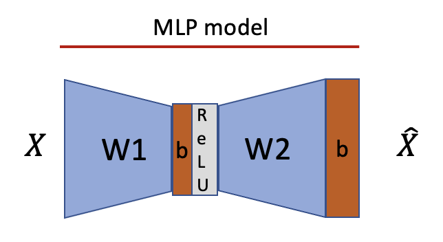
There are two models used in this post. Almost all experiments are run on a simple classification MLP trained with cross-entropy loss.
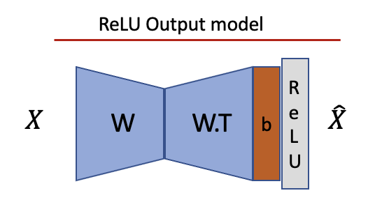
A small subsection of the experiments uses the ReLU output model introduced in the superposition paper and the memorization and double descent paper.
Double descent & maximal data dimensionality
The beginning of this section is copied from the previous post and added for context.
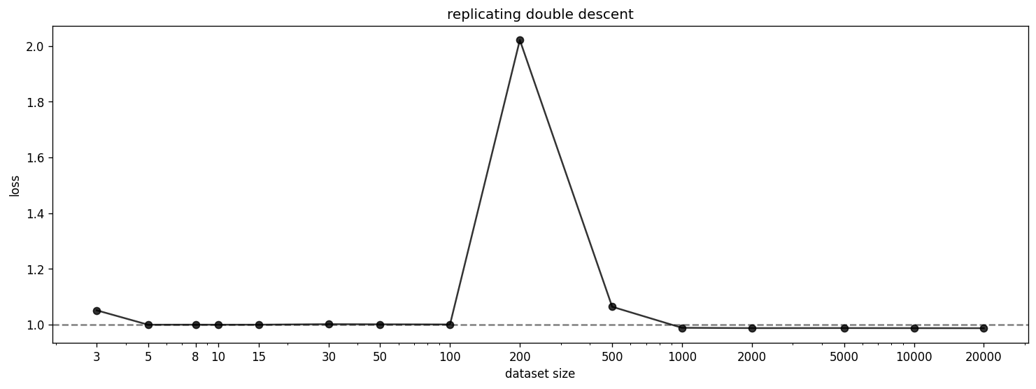
We replicate the double descent phenomenon discussed in the memorization paper. In the paper, they use the ReLU Output model with but normalize all inputs. We further adapt this setting in two ways for this section--we use 1000 features instead of 10000 and sparsity 0.99 instead of 0.999. We also cut off the dataset size much earlier than in the original paper. We use the schedulers as described in the paper and can confirm that they make a difference.
Even with these modifications, we can reproduce the double descent phenomenon. The double descent happens exactly 10x earlier than in the original paper which is a result of the 10x smaller features (as indicated by Adam Jermyn’s replication of the original findings). We can also reproduce the progression from memorization to generalization in the columns of W (blue) and hidden activations (red) and the findings on dimensionality as shown below.

We can plot the fractional dimensionality of the samples and features as described in the paper.
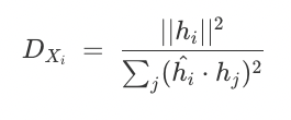
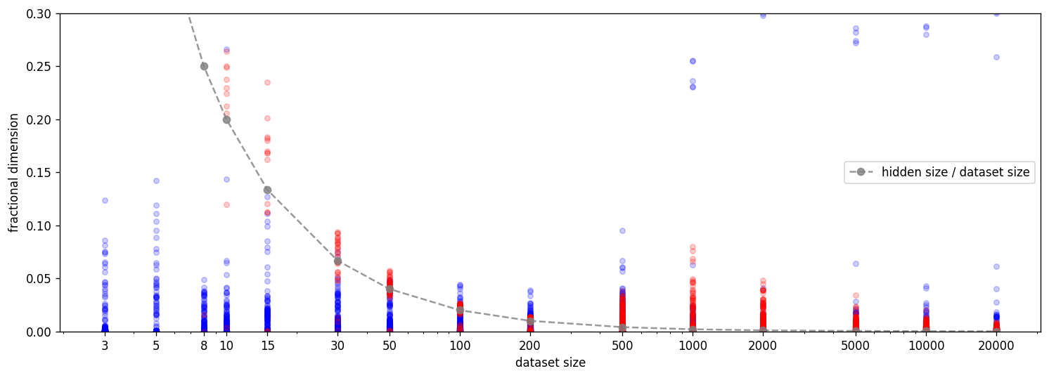
In a comment on the memorization and double descent paper, Chris Olah introduces the maximal data dimensionality D* as a metric to distinguish between memorized and general examples showcased on an MNIST classifier.

In the MNIST case, the metric suggests that there are a couple of memorized datapoints (which have features that they don’t share with other datapoints; thus high D*), mostly general datapoints (which share at least some features; thus medium D*) and some pathological datapoints (which haven’t been learned; thus low D*). Computing D* requires some optimization which makes it tricky to get right in practice. Note, that an insufficiently optimized D* curve will look interpretable but provide incorrect conclusions (thanks to Chris Olah for pointing this out). I have added a section on practical tips on computing D* in the appendix.
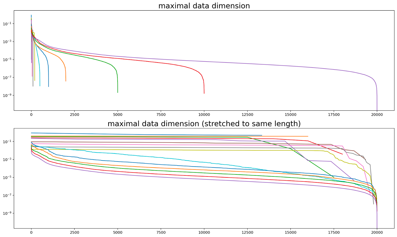
We apply D* to all dataset sizes of the double descent run. Our prediction is that something interesting happens around the point when the model switches from memorization to generalization. Specifically, we predict that the lines before the flipping point are high and flat (since all memorized datapoints get their own direction) and the lines after the point are lower and have a downward slope, i.e. the typical curve we already saw in the paper (since there are actually shared features). Furthermore, we would expect that all the features that have not been learned have a lower D* than the features that have been learned, so there should be some sort of plateau in the beginning for the learned features in runs with larger datasets.
The bottom picture seems like it shows all of these trends but the fact that we stretch the curves to the same length might distort our perception. We can also make out the plateau in the beginning of the curves with many data points. This seems like mild evidence that D* metric captures the desired phenomena.
Replicating the MNIST setting
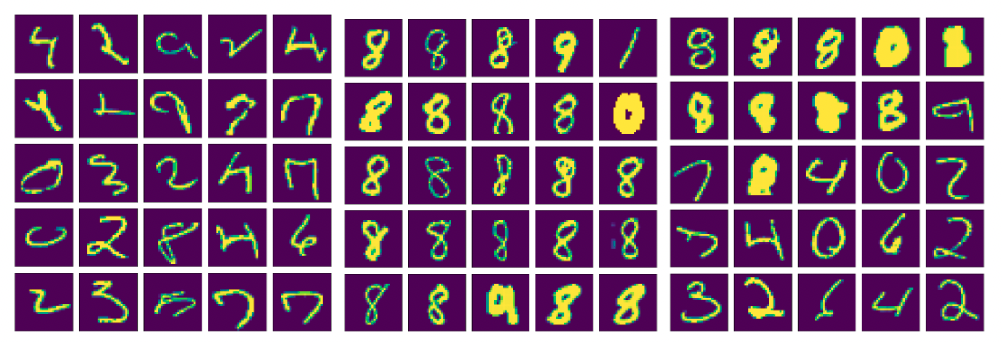
Furthermore, we can replicate the findings in Chris Olah’s comment on MNIST by fitting D* on a network that was trained on 50000 random samples of the MNIST training set. However, there are minimal differences in the curve, e.g. we don’t have the change in slope at ~90%.[1] The curve takes a very similar shape as in the original post and we also find the same clustering, i.e. memorized examples on the left of the plot, general features in the middle, inputs with very similar features close to the right and really weird inputs at the very end of the right side (see figures below).
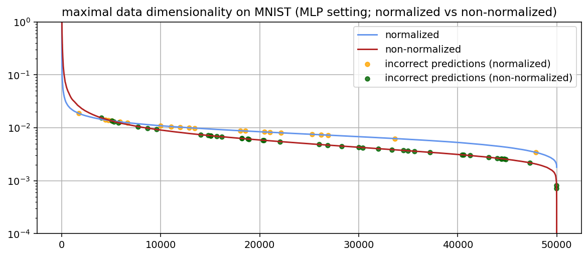
Note that Chris Olah normalizes the inputs in the original comment (i.e. x’ = x/x.norm())[2] because the unnormalized network will otherwise treat all the fat numbers, i.e. where lots of pixels are activated, as exceptions (as you can see for the unnormalized plots above). Thus, we plot the D* curves for normalized and unnormalized inputs. In the appendix, we show samples for the normalized version.
One unexpected finding is that the distribution of incorrect predictions on the training data was pretty much uniform across the spectrum. A priori, one would expect that most of the incorrect examples are on the right-hand side of the spectrum as they contain features that are not shared among the inputs or are “weird” in some other sense. We will later see that the distribution of errors is actually left-heavy which is exactly the opposite of what we would expect.
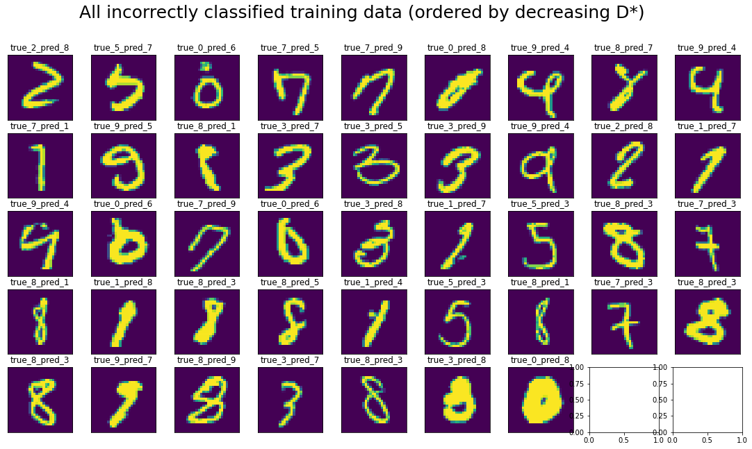
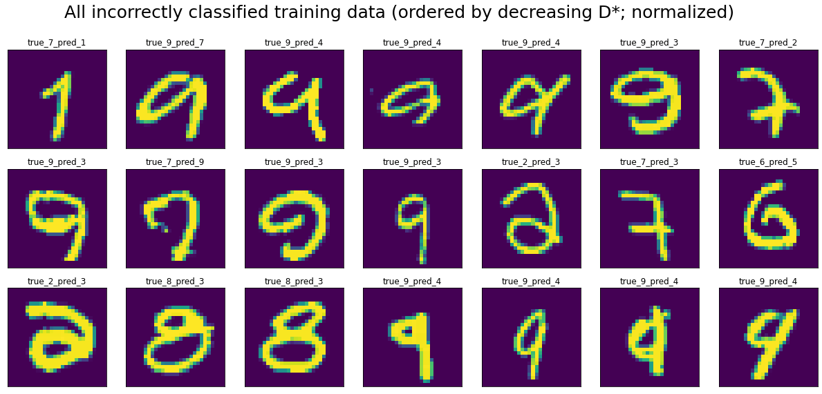
It’s not clear to me what this tells us. The misclassified inputs certainly look weird to me (see figure below, ordered row-wise by decreasing D* like you would read a book). The fact that these outliers are distributed nearly uniformly across the curve either could either tell us that we don’t understand the metric yet, a deep insight about NNs, that the NN doesn’t “think” these datapoints are weird or that D* just has some flaws as a metric.
Distribution of classes across D*
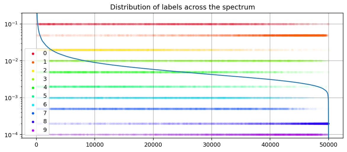
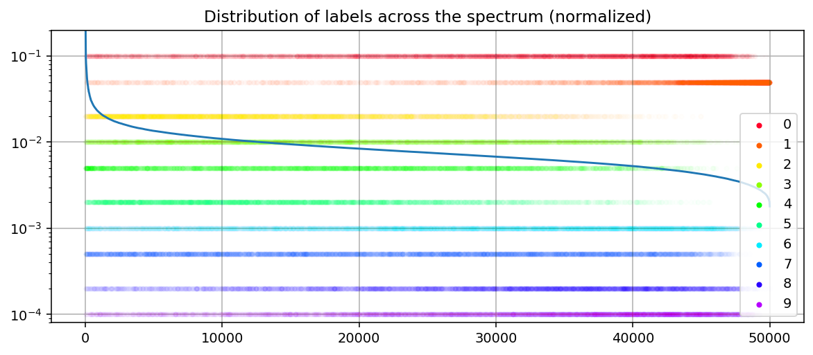
As we would expect, the classes are not equally distributed across the spectrum, e.g. zeros are further left than ones on average. The most straightforward interpretation of this is that ones are more regular (thus lower D*) than zeros. This effect is even stronger for the normalized datapoints (see appendix).
Since this metric shows a couple of interesting properties, we investigate it more deeply in the following section.
More findings on data dimensionality
The distribution of error rates
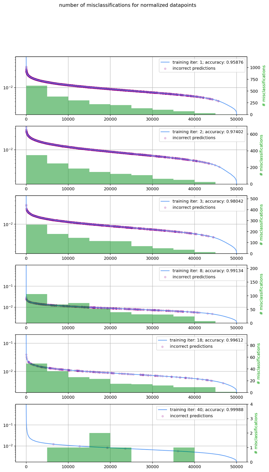
In the previous section, we saw that the misclassificatied training datapoints seemed to be evenly distributed across the spectrum of D*. This is unexpected since we would think that especially weird examples are more likely to be misclassified, i.e. examples on the right-hand side of the spectrum. To test whether the finding above is an outlier or part of a larger pattern, we plot the error distribution at different training error rates. We train models from scratch to 1,2,3,8,18 and 40 iterations and plot D*, the location of all misclassified datapoints and a histogram over the misclassification rate per bin. The plots for normalized datapoints look even more left-heavy (see appendix).
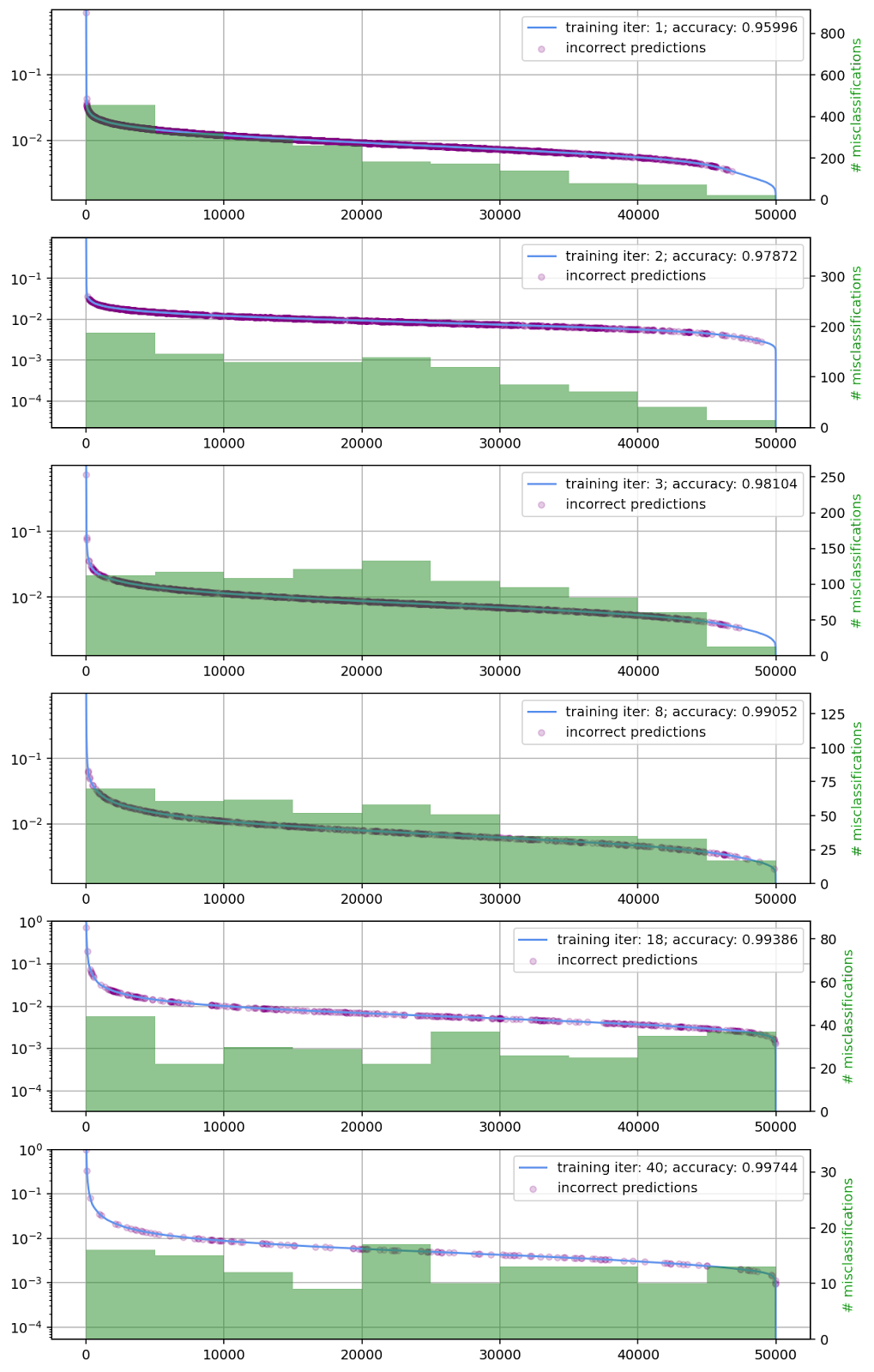
I’m not quite sure what the implication of this finding is. It could be a pathology of the metric, a new finding about NNs, a specific problem with MNIST, etc. I’m excited about further research on this question and happy to assist people who want to get started.
Different hidden sizes
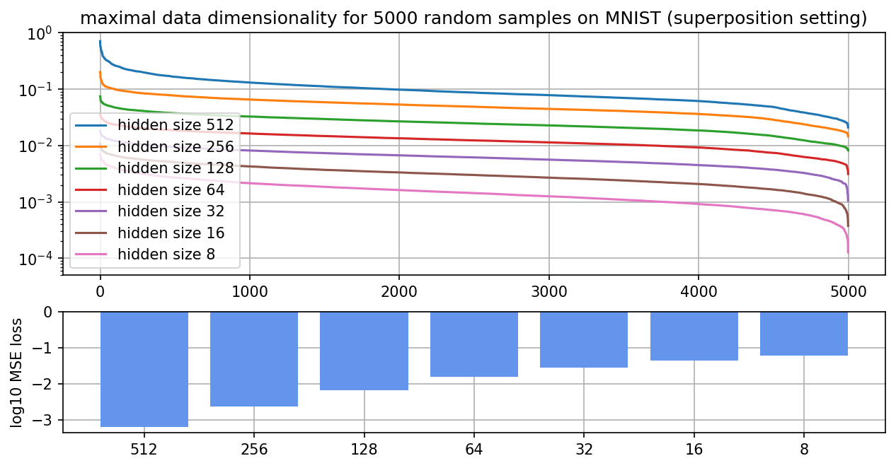
To test more qualities of maximal data dimensionality, we vary the hidden size on an MNIST classifier. We do this for the superposition setting (ReLU output model trained with MSE in autoencoder setting) from the previous section (see appendix) and a classic MLP setting (MLP trained with cross-entropy loss; see this section). We run the experiments on 5000 samples instead of 50000 to reduce the runtime of experiments. In addition to the maximal data dimensionality, we also show the loss and accuracy below.
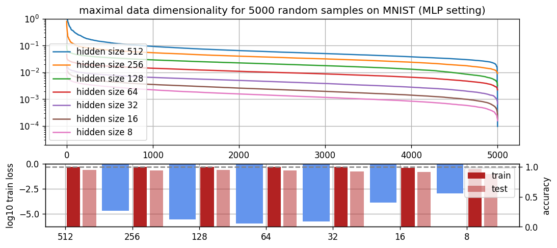
It seems like the shape for the different hidden sizes is roughly the same in all settings and merely differs in its magnitude. The magnitude trends are totally in line with what you would expect--the more neurons a network has, the more unique its features can be and thus the higher the maximal data dimensionality. The similarities in shape could have multiple possible explanations. This could mean that linear networks of different hidden sizes all roughly learn the same function just with more feature sharing. Intuitively, this would mean that the network always memorizes a couple of inputs (left end), shares features across most inputs (middle part) and has a couple of inputs that are very hard to categorize in the previous two framings (right end). Since the sum of all D* always has to be equivalent to the number of non-dead neurons, we can fairly precisely predict the distance between the curves. Secondly, only the smallest hidden sizes do not have 100% training accuracy. This could explain the difference in behavior at the right end of the spectrum, i.e. why networks with larger hidden sizes have a shorter tail (with the exception of 512 for some reason).
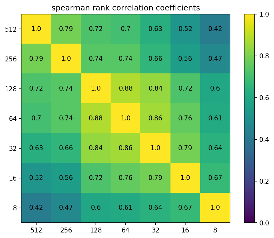
We compute the spearman rank correlation between D* for the different hidden sizes. The closer two hidden sizes are, the larger their spearman rank correlation. This means that networks that are more similar in size order the datapoints more similarly and could indicate something like “networks that are closer in size learn more similar features”. There might also be a more technical explanation for this phenomenon that I don’t understand yet.
Different random seeds
To further test the consistency of D*, we train the same architecture on the same data and only vary the random seed.
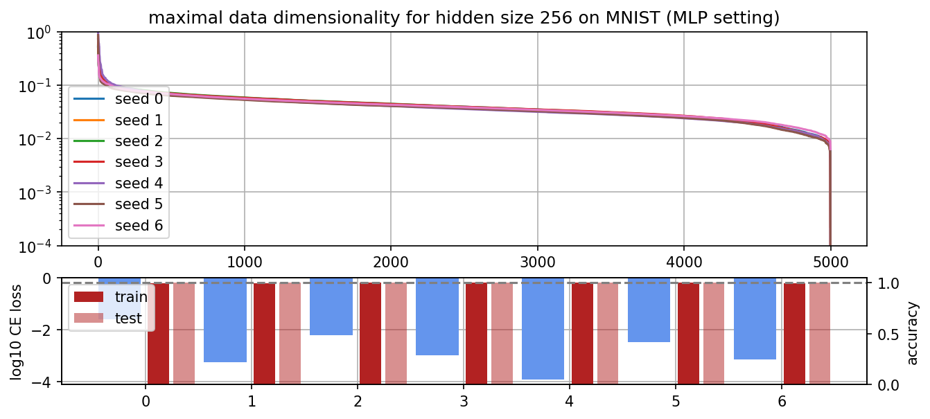
The shape of the curve looks nearly identical for all seeds. An interesting finding is that the right-hand tail of the networks vary a lot in length, i.e. seed 6 stops at 1e-2 and seed 5 goes up to 1e-4. I think this is either an implementation issue or a weird pathology of D*. Since all networks have been trained to 100% training accuracy, it can’t come from misclassified training data.
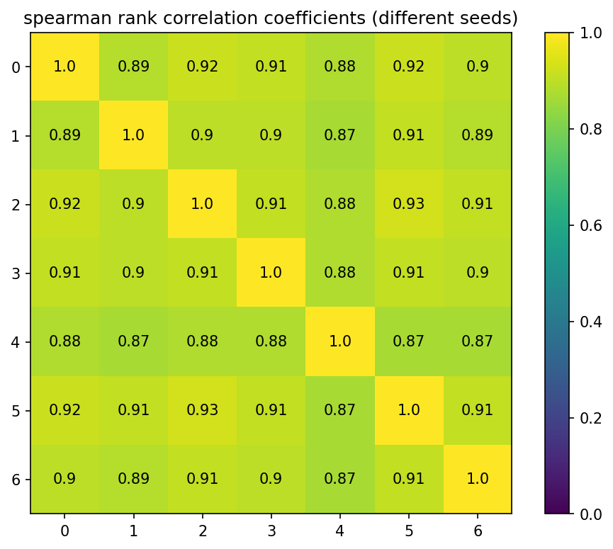
We can also observe that the spearman rank correlation is larger than 0.87 between all of them. It is not clear whether the remaining differences in spearman rank correlations can be explained by random variations, e.g. two nearly identical datapoints having slightly different D* in different runs, or is due to the network learning slightly different features in each run.
Different dataset sizes
Furthermore, we investigate the effect of larger dataset sizes from the MNIST training set. In all cases, the run has a couple of very large and very low maximal data dimensionalities. We can see that larger dataset sizes have flatter distributions. This could be explained by having more datapoints that fall under the “detectable with standard features” regime in the middle.
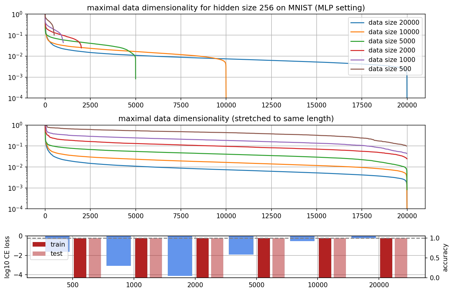
When we contrast the findings from different data sizes on MNIST with the findings on different dataset sizes in the double descent case, we see that the different curves overlap (i.e. the lines cross in the graph) in the MNIST case but don’t overlap in the double descent case. A plausible explanation for this phenomenon would be that models trained on small batches of MNIST already learn features (thus lower D* in the middle) while they only memorize in the double descent setting (thus higher D* everywhere).
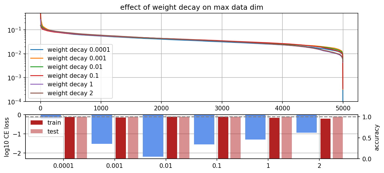
Different levels of weight decay
To test more properties of D*, we compare networks that were trained on the same data with different weight decays. A priori, we would expect the network to memorize less and use more general features with more weight decay. This would imply a flatter curve.
In practice, weight decay does not really change D* that much. There is a small effect that the right-hand side is slightly lower (which is the opposite of our prediction), but that doesn’t have to mean anything in particular.
D* during training
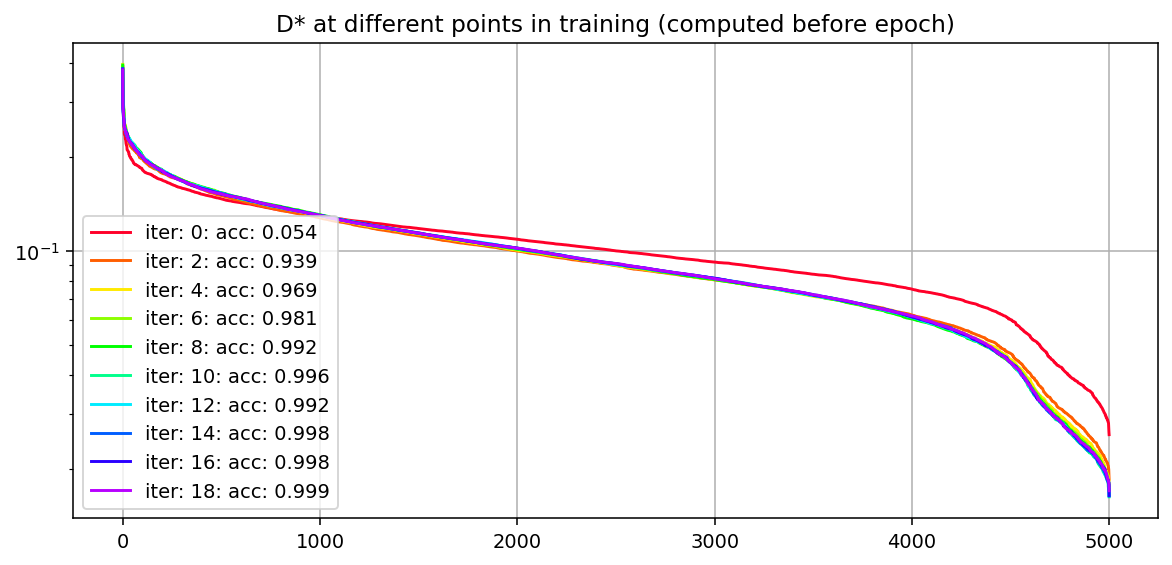
Another noteworthy finding is that the D* curves have always looked basically the same in most settings.
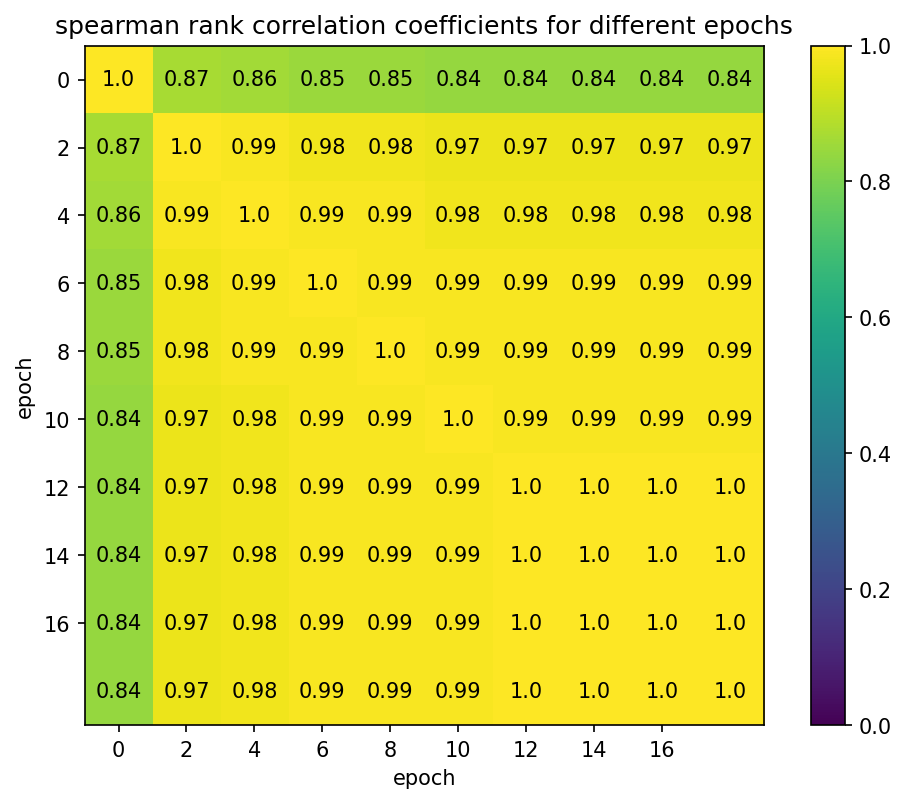
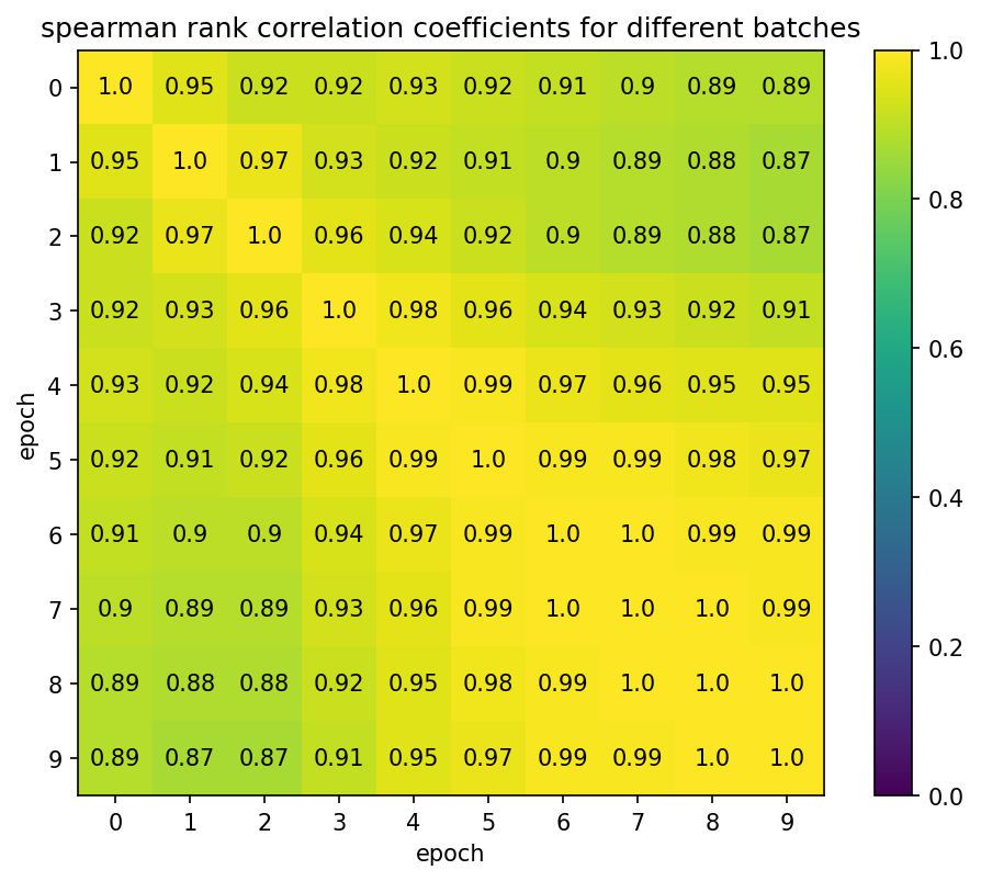
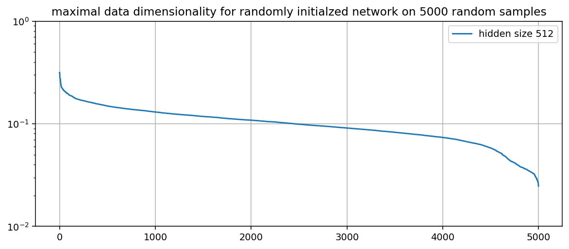
Thus, to test if this shape is just a pathology of the metric, we apply D* at different stages of the training process. The curves do not change a lot during training and the spearman rank correlation between the curves is very high (see below), even for the randomly initialized network with the rest. This could either be a result of this particular setting, an interesting insight about NNs (i.e. that they don’t change their features a lot during training) or just a pathology of D* as a metric. I’m interested in follow-up research on this question.
D* in the first batches
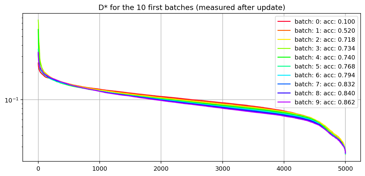
We measure D* for the first 10 batches on 5000 randomly chosen MNIST data points with batchsize 500. Thus, after the final batch, the network has seen every datapoint exactly once. We can see that the D* curve barely changes between the batches and the spearman rank correlation is very high. This further confirms our findings from above.
Intermediate conclusions
After working with D* for a bit and looking at some of its properties, I’m more convinced that it tells us something meaningful. However, the fact that the misclassified training data are not clustered on the right-hand side and the small changes of D* during training are unexpected to me. I’d be excited about follow-up research on these questions and might do it in the future if I find the time.
Currently, I’m trying to understand memorization in small toy transformers in the hope to understand the phenomenon better. In the near future, I hope to be able to use this knowledge to improve our understanding of anomaly detection.
Appendix
Practical considerations about D*
Running D* in the naive way (e.g. with a for loop) will likely take forever and also give you incorrect results. To get the metric to run properly, I had to do the following things.
- Precompute the inner product of hidden vectors (full credit to Chris Olah for showing me this trick). The denominator of the metric contains the sum over the squares of dot products between v and : . This can be rewritten as . Thus we can precompute and reuse it.
- Parallelize the computation. With the precomputed H, we can create a batch of all v’s and compute the result in parallel on a GPU, e.g. with batched matrix multiplications. You can find an implementation in my code. The difference between running the parallel version vs. the sequential version is roughly 60 seconds vs 5 hours for 50000 examples on MNIST.
- Use the same tricks as for NN optimization. Specifically, I used a linear warmup scheduler followed by a cosine annealing scheduler and it improved the quality of the results noticeably.
- Double-check if you converged (full credit to Chris Olah for showing me this trick). To check if you have converged with your D*, you should take the sum over D* and see if it sums to the number of non-dead (i.e. not killed by the ReLU) neurons. In case it is the same or extremely close to that, you have converged, otherwise, you have to fine-tune your optimization process for D* further.
If you don’t do any of the above, you will likely get incorrect results but won’t notice. If D* has not converged, it will still have an interpretable shape and you will read a lot into it that isn’t actually true.
Replicating findings on data dimensionality

All 21 incorrect classifications for the normalized case.
The distribution of classes across the spectrum for the normalized case.
More findings on D*
The number of misclassifications for normalized inputs is also left-heavy similar to the findings we had for the non-normalized datapoints.
In the main post, we showed D* for an MLP setting. Here we show it for the ReLU Hidden model. It mostly looks the same but there are some weird outliers for hidden size 512. Since the MLP setting is closer to real-world applications, we drop the ReLU Hidden model for all further MNIST experiments.
We also test D* for different levels of weight decay. We would expect weight decay to produce flatter curves since we intuitively force it to use more features for the same data.
Randomly initialized network
- ^
Not sure where the difference comes from. Could be dataselection, random seed, weight decay, training run length, etc. Lots of different possibilities here.
- ^
L2 norm
1 comments
Comments sorted by top scores.
comment by StefanHex (Stefan42) · 2023-03-08T01:05:57.849Z · LW(p) · GW(p)
Thanks Marius for this great write-up!
However, I was surprised to find that the datapoints the network misclassified on the training data are evenly distributed across the D* spectrum. I would have expected them to all have low D* didn’t learn them.
My first intuition here was that the misclassified data points where the network just tried to use the learned features and just got it wrong, rather than those being points the network didn't bother to learn? Like say a 2 that looks a lot like an 8 so to the network it looks like a middle-of-the-spectrum 8? Not sure if this is sensible.
The shape of D* changes very little between initialization and the final training run.
I think this is actually a big hint that a lot of the stuff we see in those plots might be not what we think it is / an illusion. Any shape present at initialization cannot tell us anything about the trained network. More on this later.
the distribution of errors is actually left-heavy which is exactly the opposite of what we would expect
Okay this would be much easier if you collapsed the x-axis of those line plots and made it a histogram (the x axis is just sorted index right?), then you could make the dots also into histograms.
we would think that especially weird examples are more likely to be misclassified, i.e. examples on the right-hand side of the spectrum
So are we sure that weird examples are on the right-hand side? If I take weird examples to just trigger a random set of features, would I expect this to have a high or low dimensionality? Given that the normal case is 1e-3 to 1e-2, what's the random chance value?
We train models from scratch to 1,2,3,8,18 and 40 iterations and plot D*, the location of all misclassified datapoints and a histogram over the misclassification rate per bin.
This seems to suggest the left-heavy distribution might actually be due to initialization too? The left-tail seems to decline a lot after a couple of training iterations.
I think one of the key checks for this metric will be ironing out which apparent effects are just initialization. Those nice line plots look suggestive, but if initialization produces the same image we can't be sure what we can learn.
One idea to get traction here would be: Run the same experiment with different seeds, do the same plot of max data dim by index, then take the two sorted lists of indices and scatter-plot them. If this looks somewhat linear there might be some real reason why some data points require more dimensions. If it just looks random that would be evidence against inherently difficult/complicated data points that the network memorizes / ignores every time.
Edit: Some evidence for this is actually that the 1s tend to be systematically at the right of the curve, so there seems to be some inherent effect to the data!