How to Better Report Sparse Autoencoder Performance
post by J Bostock (Jemist) · 2024-06-02T19:34:22.803Z · LW · GW · 4 commentsContents
    TL;DR
  Long
    What about MLP/Attention?
    What about k>1?
  Conclusions
None
4 comments
TL;DR
When presenting data from SAEs, try plotting against and fitting a Hill curve.
Long
Sparse autoencoders are hot, people are experimenting. The typical graph for SAE experimentation looks something like this. I'm using borrowed data here to better illustrate my point, but I have also noticed this pattern in my own data:
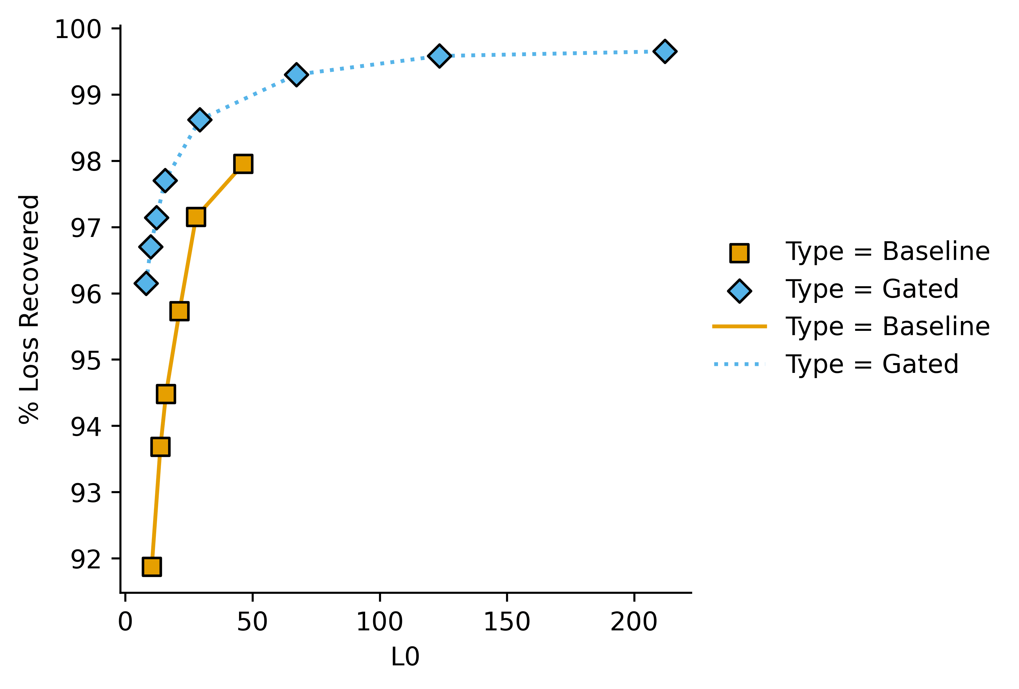
Which shows quantitative performance adequately in this case. However it gets a bit messy when there are 5-6 plots very close to each other (e.g. in an ablation study), and doesn't give an easily-interpreted (heh) value to quantify pareto improvements.
I've found it much more helpful to to plot on the -axis, and "performance hit" (i.e. i.e. where "mean" is mean-ablation and "base" is the base model loss.
I think some people instead calculate the loss when all features are set to zero, instead of strictly doing the mean ablation loss, but these are conceptually extremely similar.
If we re-plot the data from above we get this:
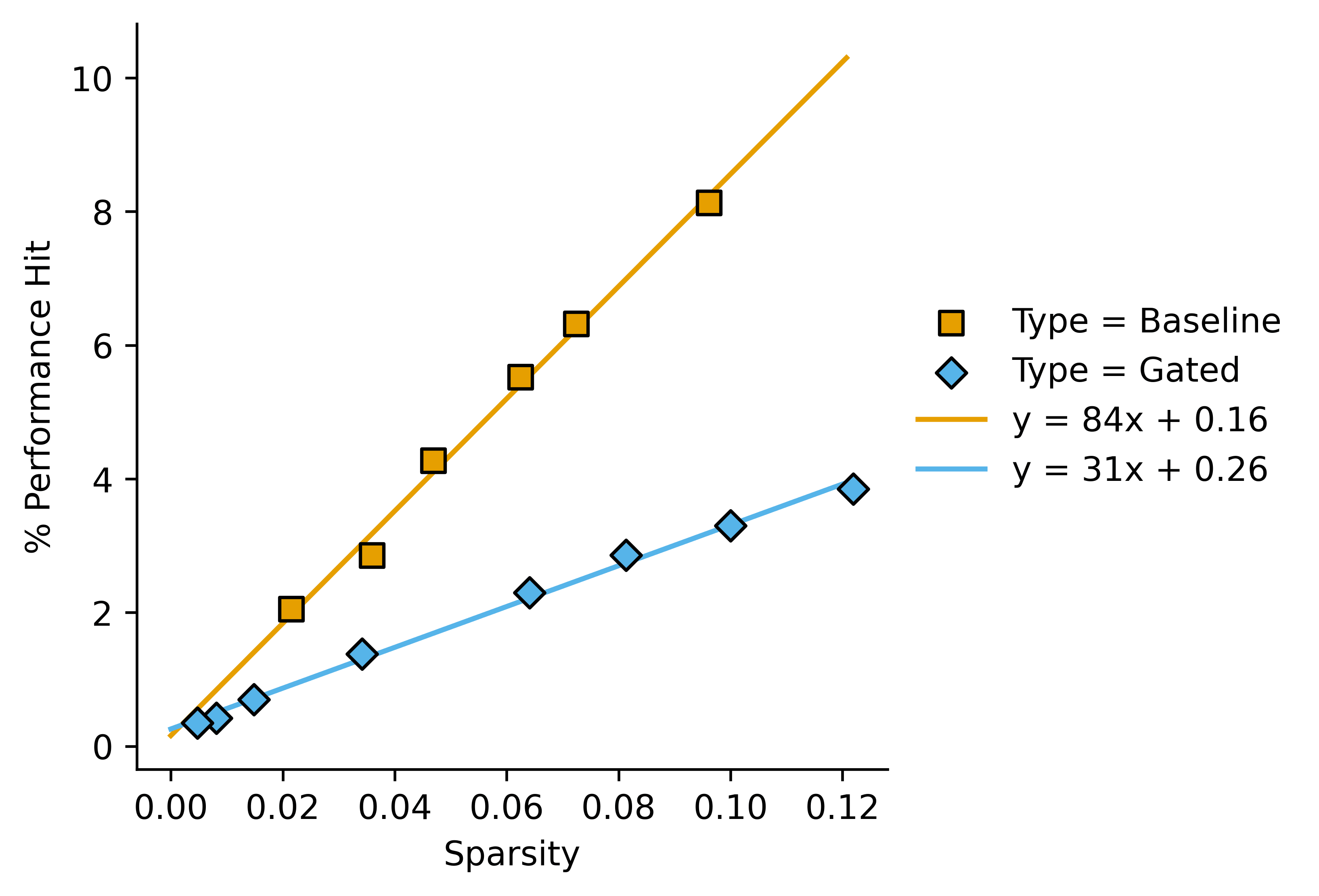
This lets us say something like "In this case, gated SAEs outperform baseline SAEs by a factor of around 2.7 as measured by Performance Hit/Sparsity".
One might want to use a dimensionless sparsity measure, relative to the dimension of the stream from the base model that we are encoding. I don't know whether this would actually enable comparisons between wildly different model sizes.
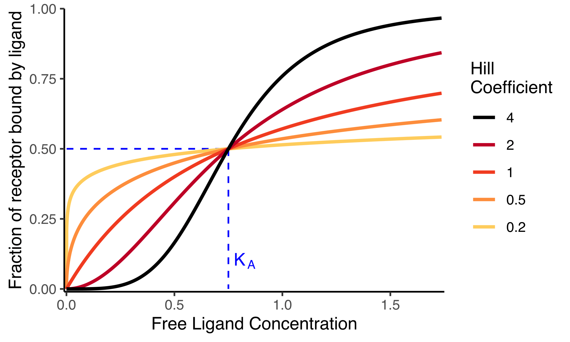
Of course as , Performance Hit won't approach infinity, instead we would expect it to approach 1 (and if you run an autoencoder with you will in fact see this). This could be modelled with a the following equation:
Where is the value of at which . Near it looks like , but it flattens off as gets larger. In biology this is a Hill curve with Hill coefficient . It has just one free parameter, so even for small datasets (such as a pareto-frontier of four SAEs) it's possible to get a valid fit.
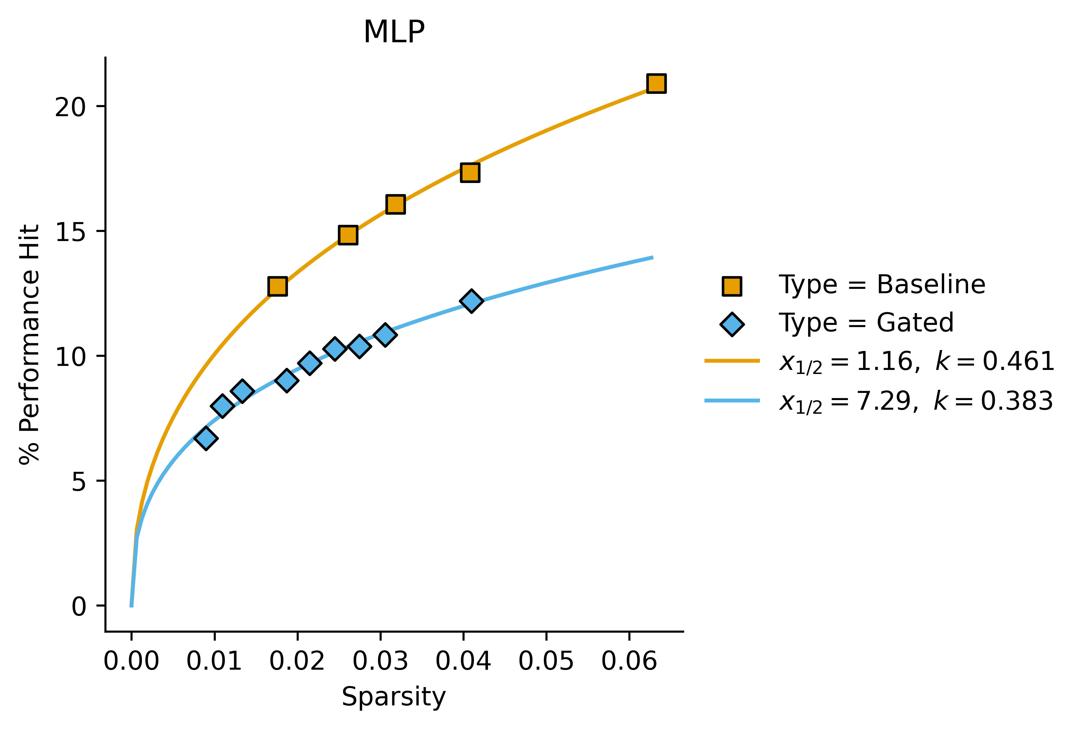
What about MLP/Attention?
In these cases, we get a better fit with letting the Hill coefficient vary:
Attention:
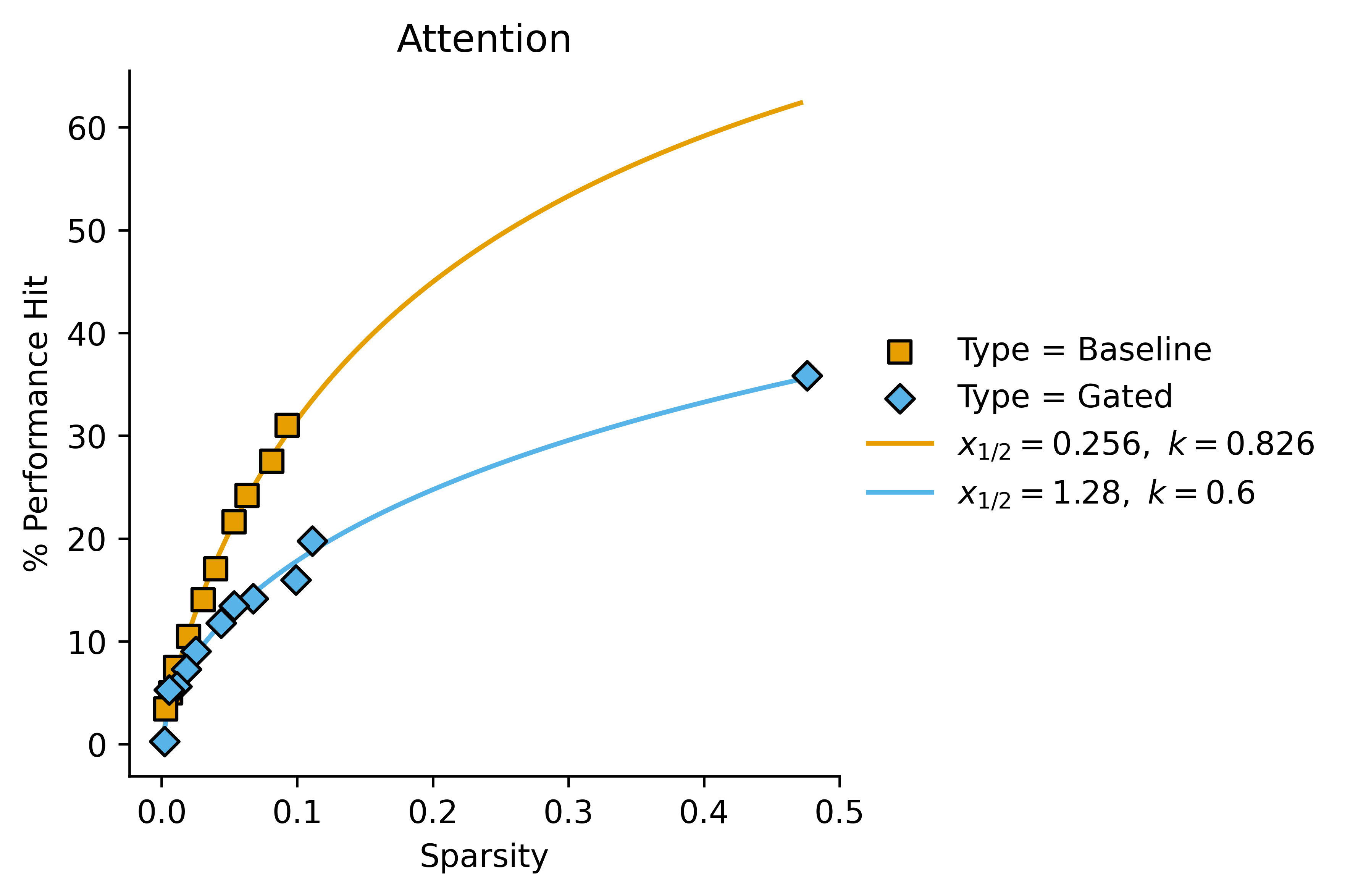
These kind of look like a good fit for the Hill equation with variable Hill coefficients, but they also kind of just look like linear fits with non-zero intercept in some cases. It's difficult to tell (also they kind of look like regular power fits of the form ) I'll plot the first graph with a Hill curve for completion:
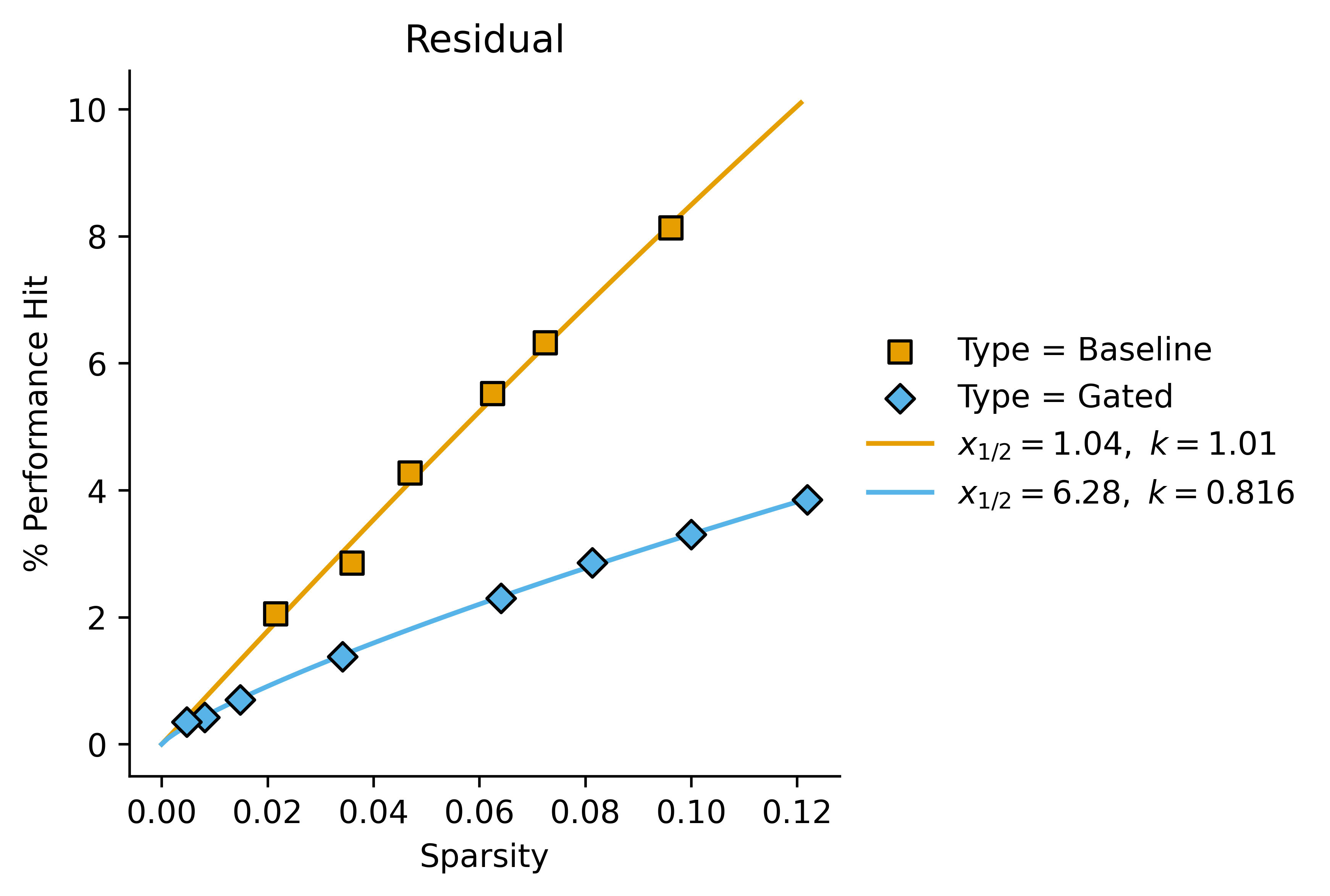
If we consider the relative values of and for gated vs baseline SAEs, we can start to see a pattern:
| Baseline | Baseline | Gated | Gated | ratio | ratio | |
| Residual | 1.04 | 1.01 | 6.28 | 0.816 | 6.0 | 1.2 |
| MLP | 1.16 | 0.461 | 7.29 | 0.383 | 6.3 | 1.2 |
| Attention | 0.256 | 0.826 | 1.28 | 0.6 | 5.0 | 1.4 |
So in this case we might want to say "Gated SAEs increase by a factor of around 5-6 and decrease by a factor of around 1.3 across the board, as compared to baseline SAEs".
What about ?
In some of my own data, I've noticed that it sometimes looks like we have . These are some results I have from some quick and dirty transcoders.
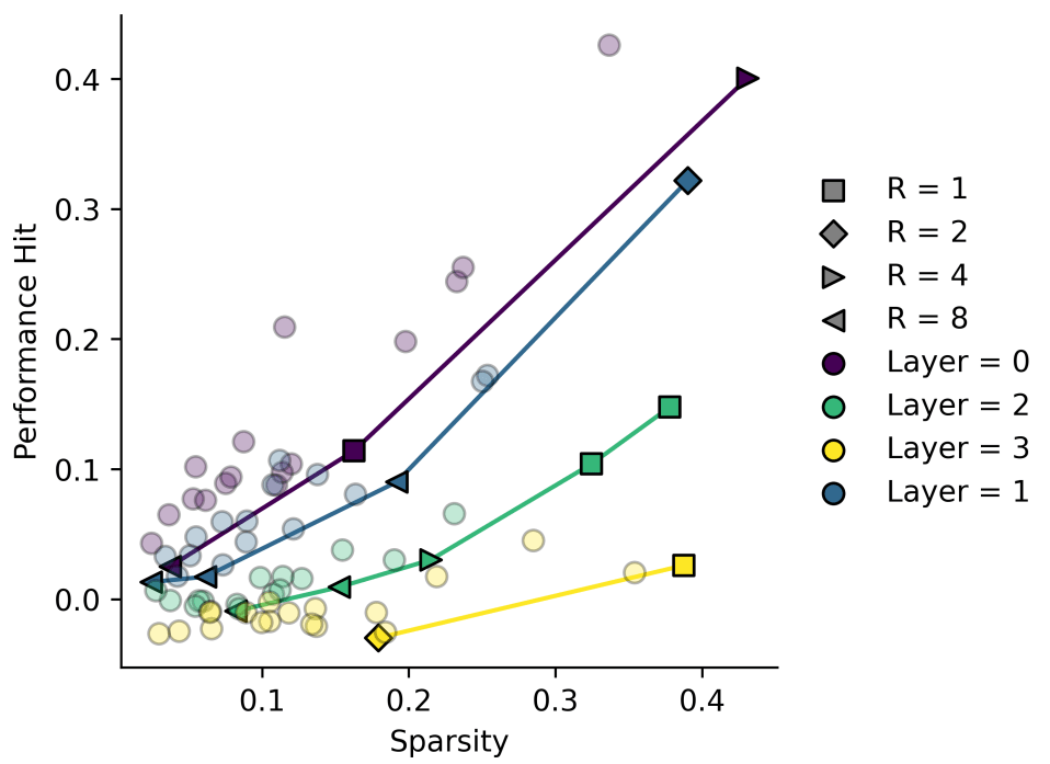
Some of these look more like quadratics, and trying to interpret them as linear plots with non-zero fit seems wrong here!
Conclusions
So we have three options for fitting Performance/Sparsity graphs
- : This has two fitted parameters except when . This is the "simplest" plot in the sense that it's an obvious first choice. Fails to capture our expectation that the plot passes through the origin, and also fails to capture our expectation that the plot levels off at high sparsity.
- : Two fitted parameters except when . This is more unusual than the first plot. Always passes through the origin but doesn't level off at high sparsity.
- : Two fitted parameters except when . This both passes through the origin and levels off, but is a slightly weird function.
I plan to use option 3 (the Hill equation) to report my own data where I can, since the added weirdness seems worth the theoretical considerations, especially since I often get very high-sparsity SAEs when scanning various L1 coefficients, which would break an automated fitting system.
I also think that a value of in the Hill equation is slightly easier to interpret than a value of from option 2, though I admit neither is as easy to interpret as from a linear plot.
4 comments
Comments sorted by top scores.
comment by leogao · 2024-06-03T03:53:02.073Z · LW(p) · GW(p)
I've found the MSE-L0 (or downstream loss-L0) frontier plot to be much easier to interpret when both axes are in log space.
Replies from: Jemist↑ comment by J Bostock (Jemist) · 2024-06-03T12:57:13.698Z · LW(p) · GW(p)
I've found that too. Taking and both seem reasonable to me, but it feels weird to me to take for cross-entropy losses, since that's already log-ish. In my case the plots were generally worse to look at than the ones I showed above when scanning over a very broad range of coefficients (and therefore values).
Replies from: leogaocomment by Logan Riggs (elriggs) · 2024-06-03T14:15:06.265Z · LW(p) · GW(p)
I think some people use the loss when all features are set to zero, instead of strictly doing
I think this is an unfinished