Colors Appear To Have Almost-Universal Symbolic Associations
post by Thoth Hermes (thoth-hermes) · 2023-05-20T18:40:25.989Z · LW · GW · 4 commentsThis is a link post for https://thothhermes.substack.com/p/colors-appear-to-have-almost-universal
Contents
  And why this might be evidence that construction of a 'common language' might be possible.
None
4 comments
And why this might be evidence that construction of a 'common language' might be possible.
Lately, I have been wondering why I see so many blogs using pale or faded-out color tones for their background that make them seem bland or dreary-looking. My impression is that most people probably see and experience aesthetics in mostly similar ways, and therefore, that those people must have chosen those schemes for what are commonly known as ‘accessibility’ reasons.
It’s probably true that brighter and more vibrant, contrasting colors will simultaneously impress and offend. Male birds tend to air on the side of “impress more, deal with offense risk more” with their feather coloration, and so do I, I suppose. I am not going to conform to your ‘accessibility’ codes to satisfy the demands of the lowest common denominator.
I expect that somehow, the color of this blog is likely to already convey that message implicitly. And maybe not just by not being bland and pale, but perhaps by being mainly purple, with orange buttons specifically. And why do I expect that? No more than that I simply chose to design the aesthetics of my blog this way, and doing so with the accompanying intent to write about the topics you see here.
Strangely though, aesthetics do not seem to always be generated by a logical, explicable process at the outset. We choose our aesthetics because they seem appropriate to us. That being said, I strongly feel that there is a logical, explicable process to it all, that we could discover if we wanted to. As I’m sure you are aware, on this blog I have defended the right to trust your intuition’s guidance before you have been provided with explicit, logical justifications.
To start out with, I have deduced that purple means something like ‘truth-weapon’ which roughly translates to “that which can be destroyed by the truth should be” and that color-meanings satisfy laws of addition and multiplication. Since purple is blue + red, that means blue = “truth” and red = “weapon” in the most simple, abstract terms.
You can notice that most nations on Earth have a flag that is the same shape, rectangular with the width greater than its height, and usually somewhere in the vicinity of one to three colors, either in square or stripe shapes, sometimes triangular. There can be emblems on top of them, but they will still be situated inside a block of simple color-patterns.
While I go through all these rules, you will naturally ask how I came up with them. I can only say that they are patterns that begin as guesses and that have to jive with reality long enough for you to accept them. Its perfectly fine to point out inconsistencies.
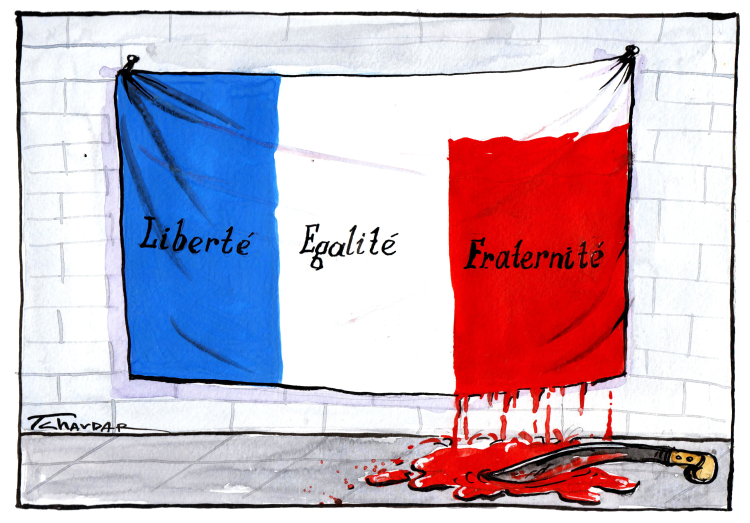
It’s a fairly interesting puzzle to work through, that you can start out with the help of several clues, such as the French flag.
I have come to the conclusion that blue can mean both “truth” as well as “what’s morally right.” However, it most often obtains this meaning in the Enlightenment sense of freedom-of-speech and freedom-of-religion and other nice things like that. According to libertarian philosophers (and myself), you are best able to obtain truth when you have a free society that tolerates the free flow of ideas and so on and so forth.
White means pretty much all of: {“rules”, “equality”, “1 / N”, “one of many equivalent things”, “stripes”, “rule(s) like a measurement ruler”, and “women, because they like rules & equality”}. Much like a stack of paper is made up of many white, flat rectangles that are all made to be as perfectly similar as possible.
Red can mean any of the following: {“weapon”, “not”, “against”, “break”, “boys / men”, “blood (associated with both kinship as well as fighting)”}. It can also mean the question “why are the boys always friends?” which refers to the observation that men often retain their friendships / associations with other men even after literally the most fighting between them that one can have. It’s also romantic as well as corny. Imagine eating a tomato - it hurts, but you feel like you’ve accomplished something somehow.
Since the flag has these colors simultaneously next to each other (but not mixed), that is equivalent to “and-ing” them all together. It kind of also implies that you need all those things in equal portions to have a properly-functioning society. Ironically, this also kind-of means that “white” is actually over-represented in the French flag, which might even be what that picture above is intended to mean (though I’m not in fact sure about that).
Yellow is the weirdest color, but we need to talk about it, because it is needed to make green. Yellow means “warning” but it can also mean “lie.” A warning is a message that something bad will happen to you and it will be your fault if it does. This is - at least in my estimation - also a lie, because the bad thing that happens to you isn’t your fault, it’s something that is unintended on your part, and thus caused by someone else doing it to you or the forces of nature.
Yellow is the color of signs that say “watch out for falling rocks!” If you die because of the falling rocks, was it because you failed to heed the warning? Debatable.
Yellow is definitely a strange color because it means that the message it carries is both important to follow as well as potentially tempting to misunderstand.
But when you mix it with blue, you get green. And green is considered, along with blue, to be one of the “friendly” or “nice” colors, in the same way that Jedi’s mainly only have blue or green lightsabers.[1]
If green = blue + yellow, then it must mean something like “truth-warning” or “truth-lie,” which seems strange or even paradoxical. I am going to propose that it be referred to as “honest lie” which means something like “transparent lie” or a lie that is intended not to deliberately fool someone. This means that green could stand for humor, potentially, and also maybe advertisements or compliments.
Actually, what seems to work best is that it stands for “accept” or “correct” as in someone gives you approval - this kind of affirmative is not necessarily the same thing as “truth,” as it could potentially still be wrong or even a lie - thus it is a kind of “pseudo-true.”
All this is really boring, isn’t it? Yes it is. However, it is kind of important because none of this is really described anywhere, and although it is something one could learn in Kindergarten, it isn’t. At most, it’s probably contained within European Heraldry or Alchemy or something like that. But I’d hate to leave an observable pattern confined to those ancient and dead fields - something that can be observed should be described.
I think it is understudied and under-discussed for important reasons, too. Mapping aesthetics to logical patterns and explanations like this is prone to encounter political opposition. This is for simple reasons: A tribe needs to have a set of certain colors that they wear proudly, and also need to strongly (if not violently) imply are better than any other tribe’s. This brings us to the color black.[2]
Black means “I have it.” This doesn’t specify what, precisely, is had, only that it’s definitely had. It’s also kind of implied that whatever it is, you probably don’t have it, and that having it makes you better than someone who doesn’t have it. So it’s kind of like having a secret, too. Which is why black is suited for meaning this: Something can be hidden inside darkness, and if you see an area which looks particularly dark compared to its surroundings, you should feel like something could be hiding there.
My ex-wife wore a consistent costume mostly all the time, and this was composed of a black dress with some amount of pink on it or pink on her backpack. So this inspired me to wonder about what message her outerwear was sending. Well, whatever the other color is besides black, that is what she claims to have, potentially in secret. Pink means “breaking the rules,” so her colors mean “breaking the rules in secret / getting away with it.” That makes sense - and it’s also what most Victoria’s Secret stuff is colored too, which is a brand she also liked. All this seems consistent. I’m only glad I found this stuff out eventually.
When you mix black with things, it makes them darker. It’s not exactly the same meaning as having black next to something. For example, grey means something different than - and in a certain way, the opposite of - black and white. The latter - “rules & I have it” - means something like “mystery” or “puzzle to be solved.” Grey means something like “technical knowledge / skill.”
Mixing black with other colors makes them “heavier” or “more robust.” So dark-anything means that it is a more rugged version of whatever it usually is. Power-tools and Caterpillars are dark-yellow, probably meaning “warning: heavy-machinery” or something like that.
We still have orange and brown remaining: Orange is red + yellow and means “satisfying conclusion” or “explosion.” So if yellow means warning (or tension), then adding red to it is equivalent to breaking tension or putting a stop to it, which results in a satisfying conclusion. Yellow can also mean built-up energy, and then red added to that means releasing that energy (e.g. in an explosion). Orange is also sometimes considered one of the “good” colors, along with blue and green.
Brown means one of {“done”, “completed,” “finished product”, “economic good”}. It is usually made from two opposite colors added together. E.g., red + green, orange + blue, and purple + yellow.
It might be tricky to check if these all indeed add up to completed, but let’s try finagling with them a little:
- red + green = “problem + solution” = “solved problem.”
- orange + blue = “satisfying conclusion + truth” = “explanation for a satisfying conclusion / recipe for a satisfying conclusion.”
- purple + yellow = “truth-weapon + lie / warning” = “that which can be destroyed by the truth, as well as should be, has been.”
I like those answers. It’s somewhat self-referentially an example of itself, too!
Earlier you had noticed me claim that there are so-called “good” colors: blue, green and orange. I say this because they mean, respectively, literally “what’s right,” “correct / yes / affirmative,” and “satisfying conclusion.” So these mean “getting what you want” in some sense, and therefore, I think it’s okay to call them the “good” colors.
That doesn’t mean all the rest are bad, however. In fact, there is only one color-combination that I think stands for “bad” in any meaningful sense, and it’s kind of specific. Red isn’t it, nor a part of it.
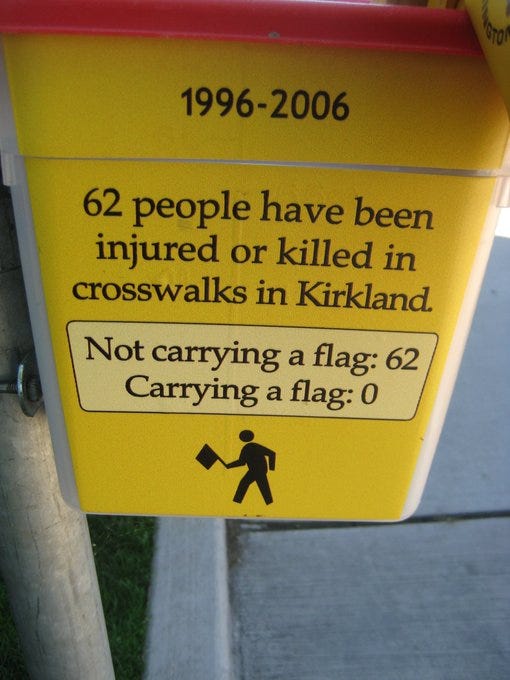
You might think yellow has to be a part of it, and I agree. I don’t think yellow by itself has to be wrong. But I do think that yellow & white (separately) are. Here’s why: White means rules (or laws) and being required to follow them, and yellow refers to danger. So I think that when these two things are taken together (but not mixed together), you get something that means that the people who didn’t carry a flag with them while trying to cross the street did, in fact, deserve to die.
In the tag-line I said all this might be evidence for the existence of a “universal language.” I know that’s a weird thing to say - it’s not clear why we’d expect or even want one to exist. A universal language would be - if one exists - a visual and auditory symbolic set of codes and symbols in which they “look and-or sound like what they mean.” So in other-words, you would say and write symbols which compactly describe the thing they are talking about. Right now, we have some symbols like → and = which do look like what they mean, and many which don’t or at least not in an obvious way. Some, like “X” do in fact mean what they look like (and are used for, e.g. variables), but you might not be initially inclined to recognize this without significant argument.
I also believe that our current written and spoken language, along with our extended set of mathematical and logical symbols (along with the rules for writing them together) approximate a universal language in some ways but not nearly to the extent they could.
If colors are already accidentally used with these associations, then that might imply that somehow these visual codes could be independently discovered and used, and they would be by other civilizations as well. We might, for example, as we get more advanced technologically, meet an alien civilization that has computers which are constructed in the same way as ours and in which their symbolic codes (transmitted along the computational substrate) also mimic or match ours in largely the same way.
This would be an extremely beneficent state-of-affairs.
Thank you and that’s all for now, folks.
- ^
This is an important datum too, IMO.
- ^
I said “color black” because I think it’s a color in the same way that zero is a number.
4 comments
Comments sorted by top scores.
comment by Brendan Long (korin43) · 2023-05-20T20:36:03.553Z · LW(p) · GW(p)
It seems like your meanings are just based on Western culture. I would have expected a post about universal meanings to show how cultures pre-Western-influence used the same colors in the same ways.
It also seems like you haven't provided evidence for most of your meanings?
Replies from: thoth-hermes↑ comment by Thoth Hermes (thoth-hermes) · 2023-05-21T18:40:38.626Z · LW(p) · GW(p)
I've provided evidence for all of them - they have to obey algebraic equations.
I don't really know by what basis you say these are just based on Western culture. Take, for example that Buddhist monks wear orange robes. Or, that stop lights are mostly (red, yellow, green) in nearly all countries. There may be a reason that we use these colors for these meanings, and my post postulates this as well as speculates that although this may be the case, it is not something that is well-documented at this point.
You shouldn't just claim that someone hasn't provided evidence for something or has failed to do something markedly obvious - you really lose a lot of the basis of shared respect that way.
This is an introductory post. I have been advised to keep things short before, but trying to ensure that every possible objection is answered preemptively is not possible within those constraints.
If you try and keep your objections something that can spur discussion, it would make comment threads useful for expanding on the material, which would be a desirable outcome.
Replies from: korin43↑ comment by Brendan Long (korin43) · 2023-05-22T16:20:16.322Z · LW(p) · GW(p)
I don't see anything about Buddhist monks or stop lights in the original article? I think you might be doing the thing where there's an argument for this inside of your head but you're not providing it to us.
Replies from: thoth-hermes↑ comment by Thoth Hermes (thoth-hermes) · 2023-05-22T16:49:37.056Z · LW(p) · GW(p)
I am asking the reader to at least entertain my hypotheticals as I explain them, which... Perhaps is asking a little too much. It might simply be necessary to provide far more examples, especially for this particular subject.
The thing is, the concept overlaps are going to be very fuzzy, and there's no way around that. These color-meanings can't be forced to be too precise, and that means that on the whole, over many many observations, these meanings make very soft impressions over time. It may not be something that will strike you either as obvious or as an explanation for a missing piece of data you've always wondered about unless you're explicitly looking for it.
In my case, I am not sure when / how I first observed it, but it was relatively sudden and I happened not to be explicitly looking for it.