New Bucket Brigade UI
post by jefftk (jkaufman) · 2020-12-23T20:30:03.185Z · LW · GW · 1 commentsContents
1 comment
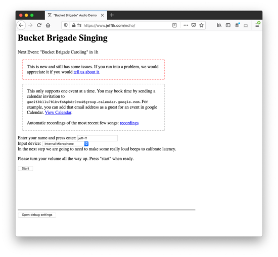
After using the UI that the Ritual Engine folks built for Solstice, I was feeling a bit embarrassed with how awkward and confusing stand-alone Bucket Brigade was:
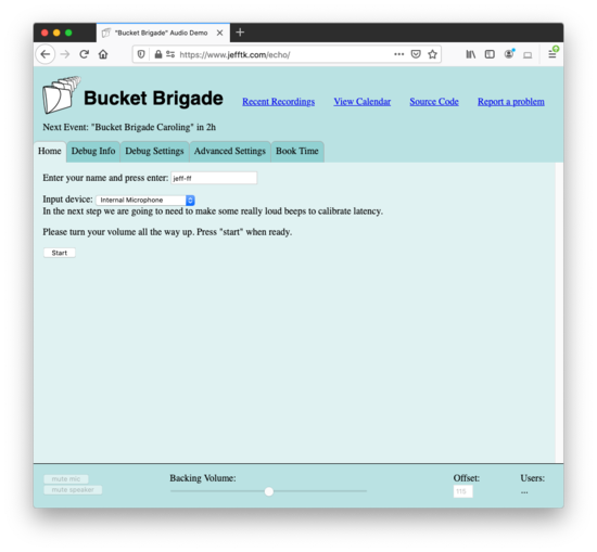
I took a pass over it to make the UI more coherent:
There are a lot of changes, but the biggest ones:
-
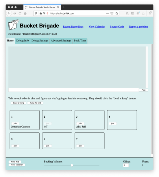
There is now an explicit concept of 'bucket' in the UI:
Names are drawn in the appropriate bucket for their position.
You can join a bucket by clicking a button.
You shouldn't have to deal with numeric positions.
If you do need it there is still a box where you can manually enter a position, and positions are displayed in the mixing console
-
It uses the whole page instead of making you scroll around:
Links are across the top
Controls are across the bottom
If there is too much to display in the main panel, just not panel scrolls.
There are multiple main panels, with a tabbed interface.
Settings for configuring roundsinging are out of the main flow, on the "Advanced Settings" tab.
Debug settings are divided into ones that only affect you versus ones that affect everyone.
There's a setting for adjusting how loud the backing track / metronome is, if you're using one.
Instead of looking at the user agent string to determine whether the browser supports what we need, we specifically test for them (
if (window.AudioWorklet) ...).It is a (debatably) tasteful blue, and has a logo.
Since the app only works in modern browsers anyway, I styled the UI with flexbox. It's wonderful that there is now a way to use CSS that is solidly better than tables.
I'm pretty happy with it, and while we still don't have automated tests it seems to work correctly with my poking at it. If you find any problems or have suggestions, please let me know either in the comments here or by filing an issue.
Comment via: facebook
1 comments
Comments sorted by top scores.


