Ginialogy
post by Jacob Falkovich (Jacobian) · 2017-04-05T02:58:26.000Z · LW · GW · 0 commentsContents
No comments
As part of my efforts to combat the cowpox of doubt, I try to point poor articles only in outlets where poor articles are rare. Last week I gave props to a Bloomberg View column, so I guess they were due.
The piece in question is Noah Smith’s Capitalism Will Shrink Inequality. In fact, it’s happening. I’m a fan of capitalism and I’m a fan of Noah Smith, but I’m not a fan articles that don’t have the numbers to back up their title.
Noah offers this chart on falling income disparities within Latin American nations, from a research paper by Nora Lustig et al (2015):

Quick aside: Lustig et al published a paper with the same title in 2013. The 2015 version incorporates two more years of data, but has basically the same text throughout. How convenient! When I read a blog post from a mere six months ago I have a strong urge to edit it, not to mention that I expect my conclusions to change, however slightly, as new data comes in. But what do I know? Putanumonit isn’t peer reviewed.
Anyway, here’s what Lustig et al actually found (the numbers are different because they’re annualized, while Noah uses the numbers for an entire decade):
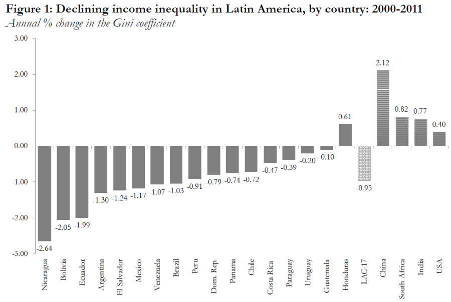
Noah mentions Honduras in the column, but his chart conveniently ignores countries like Uruguay in which the reduction in inequality wasn’t so impressive. He also has this to say about China, which on Lustig’s graph shows as a tall column of rising inequality:
As for China, there are signs that inequality there has peaked as well. A recent study by economists Ravi Kanbur, Yue Wang and Xiaobo Zhang combed through China’s notoriously murky data and found that the Gini coefficient declined to 0.495 in 2014 from 0.533 in 2010.
The study he references covers a different and more recent period (2010-2014 vs. 2000-2011) than Lustig et al, but the combined data sets shows that at best the direction of China’s Gini is ambiguous, not that it’s clearly declining. I would wait for a few more “signs” before talking about China as an example of falling inequality.
Whether inequality is falling, rising, or vacationing in Shanghai, we care about why it’s happening. Specifically, whether capitalism has anything to do with it. Here’s what the authors of the paper have to say about the drivers of falling inequality:
Interestingly, there is no clear link between the decline in inequality and economic growth. Inequality has declined in countries which have experienced rapid economic growth, such as Chile, Panama and Peru, and in countries with low-growth spells, such as Brazil and Mexico. Nor is there a link between falling inequality and the orientation of political regimes. Inequality has declined in countries governed by leftist regimes, such as Argentina, Bolivia, Brazil, Chile and Venezuela, and in countries governed by centrist and center-right parties, such as Mexico and Peru.
Existing studies point to two main explanations for the decline in inequality: a reduction in hourly labor income inequality, and more robust and progressive government transfers.
To me, it seems like the main obstacle to falling inequaliTY in Latin America is having a “T” or a “Y” in your country name, but I’m not an economist. The authors give credit to “robust and progressive government transfers” which doesn’t quite scream “thank you, capitalism!” They make a point to mention that inequality isn’t linked to growth, let alone specific growth that can be credited to capitalism.
Smith kinda admits it:
These numbers include government transfers, so it’s important to ask how much of the region’s narrowing inequality results from socialism. Venezuela and Bolivia implemented aggressive socialist policies to the detriment of their economies overall and saw some of the biggest reductions in inequality.
But then in the very next paragraph:
But even the reductions in inequality that come from better education and more government redistribution depend on economic growth to fund these progressive policies. So this is another way that growth can eventually bring inequality down […]
The overall lesson is not to fear capitalist industrialization and growth. Inequality may go up for a while as a country starts to climb out of poverty, but that trend won’t last forever.
I honestly don’t know if it’s true or not, but Smith asserts that it is with no evidence whatsoever provided in the article or the linked paper. Arrayed against Smith is the best selling macro-econ book of this century, which comprises 700 pages about how capitalism creates inequality and it’s going to get worse. In the face of this, saying “capitalism is good and inequality is bad, ergo capitalism reduces inequality” isn’t very convincing.
Personally, I think that for countries outside the circle of the world’s richest economies, growth is a lot more important than within-country equality. Why should a middle class Mexican compare herself to an upper class Mexican, and not to a Fijian, a Swede, or a Mexican from 1970? Economies are globalizing and global inequality is falling. Calculating within-country inequality may be of interest to local politicians crafting tax policy, but it’s not the most interesting variable to compare economic philosophies on.
My own homeland Israel’s economy used to be based on agriculture and textiles, and went through years of hyperinflation and food rationing. Now the Israeli economy produces pharmaceuticals and unicorns (but not pharmaceutical unicorns), has a strong currency and haute cuisine. I would credit this success to population growth (both immigration and bedroom-made) and to an increasing embrace of free market capitalism. Inequality in Israel is significantly higher than it was in the 1950s or 1980s, but there aren’t any Israelis who want the Israeli economy to go back to looking like those decades.
At the risk of beating a dead capybara: if (capitalist) Israel is how growth with rising inequality looks like, (anticapitalist) Venezuela showcases falling inequality with negative growth. Venezuela used to have some people who had a bit of money, now all Venezuelans have equal trouble finding food to eat.
Inequality matters in the context of growth and prosperity, but it’s often discussed as if it was a standalone end. I suspect that one of the reasons for that is that the most common way to measure income inequality, the Gini coefficient, is entirely agnostic growth. If everyone’s income in a country doubles, national Gini doesn’t budge one bit.
This property of Gini may be considered a feature and not a bug, but even aside from it Gini is not a very meaningful measure of inequality. The reason I dislike Gini is the very reason why it’s so popular among economists: it reduces an entire income distribution to a single number, which makes it easy to make spiffy charts in papers about inequality.
If you’re curious, the Gini coefficient is half of the relative mean absolute difference:

Or for a continuous distribution:
This formula is pretty easy to plug into Excel, but very hard to distill into a useful intuition. Is a Gini of 0.4 good or bad? Do Bolivians notice when Gini drops by 2.05% each year? How will a new tax impact the number?
We could live with an unintuitive measurement if it at least measured what we wanted it to measure, but Gini doesn’t.
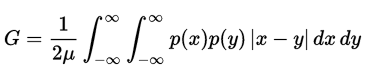
As I mentioned in my last rant about bad ways to measure inequality, the main problem of Gini is its emphasis on the highest earners. [People like to pretend that] the ultimate goal of fighting inequality is reducing poverty – improving the lot of the bottom deciles relative to everyone else. But given the way income is usually distributed, the Gini coefficient is driven by the top earners. In the example below, I give two possible income distributions in blue and orange. Compared to blue, in the orange column the income of the poorest 20% doubles and the income of the next decile also grows. The orange distribution is made to be almost entirely middle class, but the income of the top decile is also doubled, and that’s enough to make the overall Gini 5% higher (i.e. more unequal).
I don’t think that a single figure can simultaneously be simple, intuitive, comprehensive and highly pertinent to inequality. We need a few different tools in our arsenal. Poverty rate calculated against a reasonable standard is pretty simple and intuitive. To get a comprehensive picture a single number is not enough, you have to roll up your sleeves and muck around in all the percentiles. But I also have an idea to improve the Gini coefficient so that it better reflects what we care about: calculate Gini based on the logarithm of income (the base doesn’t matter), rather than income in absolute terms. Logini, if I may.
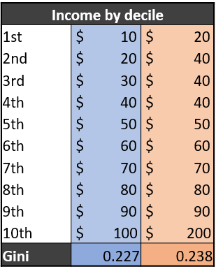
There are two main reasons for going with Logini instead of linear Gini. The first is that the log of income is what actually seems to correlate with happiness and life satisfaction:
This means that a similar increase in happiness would be enjoyed by a Burundian farmer going from making $1 a day to $2, a Malaysian factory worker going from $10 to $20, a Portuguese engineer going from $100 to $200 or an American doctor going from $1,000 to $2,000. Even if this correspondence isn’t perfect, it makes a lot more sense than a linear picture which treats the farmer going from $1 to $51 and the doctor from $1000 to $1050 as equivalent because they both gained $50 of income.
Inasmuch as we care about inequality we should care about it in the context of actually improving people’s well-being, not as an abstract number.
The second point in favor of Logini is that it decreases with growth, so it reflects both overall prosperity and how equally it’s distributed. For the blue distribution of incomes above, doubling everyone’s income would make Logini fall by 18%. Switching to the orange distribution (where the poorest deciles grow the most) makes Logini fall by an entire third:

Is this a perfect measure? Far from it. But it’s relevant and not too complicated. Most importantly: Logini inequality is almost certainly improved by capitalistic growth. This way Noah Smith and I can unite in shilling for capitalism with a clear conscience.

0 comments
Comments sorted by top scores.