Stampy's AI Safety Info soft launch
post by steven0461, Robert Miles (robert-miles) · 2023-10-05T22:13:04.632Z · LW · GW · 9 commentsContents
  What we’d like to know
  How to leave feedback
  Front end
  Our plans
None
9 comments
Stampy’s AI Safety Info is a project to create an interactive FAQ about existential risk from AI, started by Rob Miles. Our goal is to build a single resource aimed at informing all audiences, whether that means giving them a basic introduction to the concepts, addressing their objections, or onboarding them into research or other useful projects. We currently have 280 answers live on the site, and hundreds more as drafts.
After running two ‘Distillation [LW · GW] Fellowships [LW · GW]’, in which a small team of paid editors spent three months working to improve and expand the material, we think the site is ready for a soft launch. We’re making this post to invite the collective attention of LessWrong and the EA Forum, hoping that your feedback will help us prepare for a full launch that will use Rob’s YouTube channel to reach a large audience.
What we’d like to know
In roughly descending order of priority:
- Where are our answers factually or logically wrong, especially in non-obvious ways?
- Where are we leaving out key information from the answers?
- What parts are hard to understand?
- Where can we make the content more engaging?
- Where have we made oversights?
- What questions should we add?
We’re particularly interested in suggestions from experts on questions and answers related to their area of specialization – please let us know[1] if you’d be interested in having a call where you advise us on our coverage of your domain.
How to leave feedback
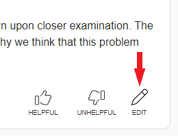
- Click the edit button in the corner of any answer on aisafety.info to go to the corresponding Google doc:
- Leave comments and suggestions on the doc.[2] We’ll process these to improve the answers.
- To leave general feedback about the site as a whole, you can use this form, or comment on this post.
To discuss answers in more depth, or get involved with further volunteer writing and editing, you can join Rob Miles’s Discord or look at the ‘Get Involved’ guide on Coda.
Front end
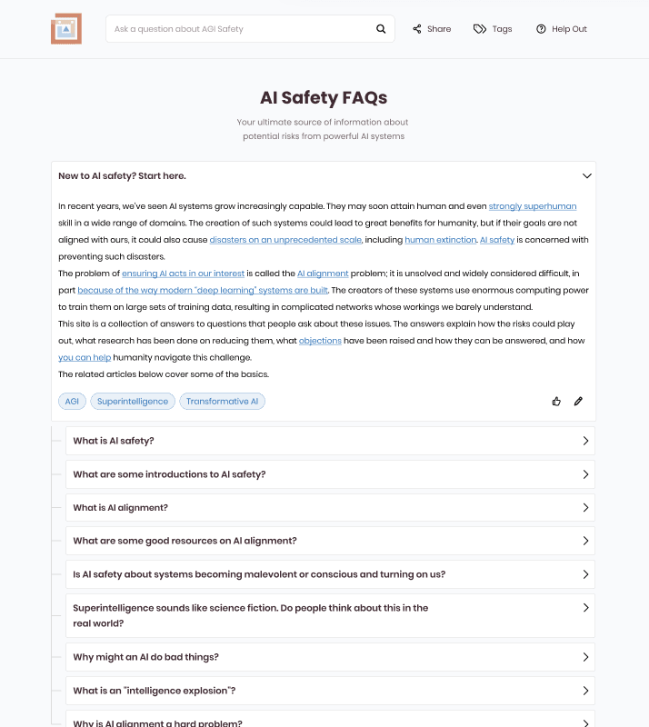
When exploring the site, you may notice that the front end has room for improvement. We welcome feedback on our planned redesign. AIsafety.info is built by volunteer developers – we’re hoping to get a prototype for this redesign working, but if someone reading this is willing to step up and take the lead on that project, we’ll achieve this goal faster. There’s also a more in-depth user experience overhaul coming, with a more prominent place for a chatbot that specializes in AI alignment.
Our plans
Our future plans, depending on available funding and volunteer time, are:
- Use your feedback to further improve our answers, then make a full launch to the wider public when we’re confident it’s ready.
- Run future distillation fellowships [LW · GW] (watch for an announcement about the third fellowship soon).
- Run more write-a-thon events, including the third one, running from October 6th through 9th [LW · GW], so participants can add to the content and potentially join as Distillation Fellows.
- Improve the front end, as detailed above.
- Get the chatbot (which is currently in prototype) ready to be integrated into the main interface.
Thanks for helping us turn aisafety.info into the go-to reference for clear, reliable information about AI safety!
- ^
E.g. in comments or direct messages here, or by posting on Discord or contacting stevenk3458 there.
- ^
It's not necessary, but using a Google account will make this a bit easier – that way, your comments will show up under your name.
9 comments
Comments sorted by top scores.
comment by anne · 2023-10-06T04:45:14.017Z · LW(p) · GW(p)
I am not an expert in AI but I can help with clarity.
I started at the top. The first section, “New to AI Safety” means close to nothing for someone new to AI generally. Is that okay with you? For example, if I read this as if I had no knowledge:
“In recent years, we’ve seen AI systems grow increasingly capable.”
Capable of what? What kind of systems?
“They may soon attain human and even strongly superhuman skill in a wide range of domains.”
Attain superhuman skill? How?
“Such systems could bring great benefits, but if their goals don’t line up with human values, they could also cause unprecedented disasters, including human extinction.”
This is where you would probably lose someone who doesn’t understand AI fundamentals. This might be nitpicky but you did say this is being created for all audiences. Hopefully more helpful than nitpicky.
If the site is designed for someone familiar with fundamentals but not safety, then this criticism is annulled.
Another criticism I have is the way the definitions show up as dotted underline + hover text for each instance of the word. For example, AGI shows up several times in some of the paragraphs—it feels excessive to have so many underlines and hovertexts instead of simply defining the first instance.
Replies from: steven0461↑ comment by steven0461 · 2023-10-06T05:58:27.056Z · LW(p) · GW(p)
Thanks, yes, this is a helpful type of feedback. We'll think about how to make that section make more sense without background knowledge. The site is aimed at all audiences, and this means we'll have to navigate tradeoffs about text leaving gaps in justifying claims vs. being too long vs. not having enough scope to be an overview. In this case, it does look like we could make the tradeoff on the side of adding a bit more text and links. Your point about the glossary sounds reasonable and I'll pass it along. (I guess the tradeoff there is people might see an unexplained term and not realize that an earlier instance of it had a glossary link.)
comment by CBiddulph (caleb-biddulph) · 2023-10-06T04:42:07.653Z · LW(p) · GW(p)
Thanks for doing this, this looks like it'll be very helpful for beginners in AI safety, and the content looks great!
I don't know if this will be addressed in your UI redesign, but I find the UI very counterintuitive. The main problem is that when I open and then close a tab, I expect every sub-tab to collapse and return to the previous state. Instead, the more tabs I open, the more cluttered the space gets, and there's no way to undo it unless I remove the back part of the URL and reload, or click the Stampy logo.
In addition, it's impossible to tell which tab was originally nested under which parent tab, which makes it much more difficult to navigate. And confusingly, sometimes there are "random" tabs that don't necessarily follow directly from their parent tabs (took me a while to figure this out). On a typical webpage, I could imagine thinking "this subtopic is really interesting; I'm going to try to read every tab under it until I'm done," but these design choices are pretty demotivating for that.
I don't have a precise solution in mind, but maybe it would help to color-code different kinds of tabs (maybe a color each for root tabs, leaf tabs, non-root branching tabs, and "random" tabs). You could also use more than two visual layers of nesting - if you're worried about tabs getting narrower and narrower, maybe you could animate the tab expanding to full width and then sliding back into place when it's closed. Currently an "unread" tab is represented by a slight horizontal offset, but you could come up with another visual cue for that. I guess doing lots of UX interviews and A/B testing will be more helpful than anything I could say here.
Replies from: steven0461↑ comment by steven0461 · 2023-10-06T05:45:44.504Z · LW(p) · GW(p)
You're right that it's confusing, and we've been planning to change how collapsing and expanding works. I don't think specifics have been decided on yet; I'll pass your ideas along.
I don't think there should be "random" tabs, unless you mean the ones that appear from the "show more questions" option at the bottom. In some cases, the content of child questions may not relate in an obvious way to the content of their parent question. Is that what you mean? If questions are appearing despite not 1) being linked anywhere below "Related" in the doc corresponding to the question that was expanded, or 2) being left over from a different question that was expanded earlier, then I think that's a bug, and I'd be interested in an example.
comment by trevor (TrevorWiesinger) · 2023-10-06T02:22:33.840Z · LW(p) · GW(p)
Who has funded AI safety.info so far?
Replies from: steven0461↑ comment by steven0461 · 2023-10-06T03:48:15.964Z · LW(p) · GW(p)
Quoting from our Manifund application:
We have received around $46k from SHfHS and $54k from LTFF, both for running content writing fellowships. We have been offered a $75k speculation grant from Lightspeed Grants for an additional fellowship, and made a larger application to them for the dev team which has not been accepted. We have also recently made an application to Open Philanthropy.
comment by [deleted] · 2023-10-06T01:58:52.966Z · LW(p) · GW(p)
UI suggestion: make it scroll so the full answer is in view after user clicks on a question box. (Removes a trivial inconvenience [LW · GW])
Replies from: shankar-sivarajan↑ comment by Shankar Sivarajan (shankar-sivarajan) · 2023-10-09T17:17:40.121Z · LW(p) · GW(p)
Like teaching someone to recognize bad kerning (relevant xkcd), this wasn't even a trivial inconvenience until you mentioned it, and now it's the worst thing in UI since the close button not aligned to the corner.
comment by steven0461 · 2023-10-05T22:21:52.617Z · LW(p) · GW(p)
EA Forum version (manually crossposting to make coauthorship work on both posts):
https://forum.effectivealtruism.org/posts/mHNoaNvpEuzzBEEfg/stampy-s-ai-safety-info-soft-launch [EA · GW]

