The National Dashboard and Human Progress
post by maxa · 2021-04-15T19:21:59.879Z · LW · GW · 3 commentsThis is a link post for https://max2c.com/national-dashboard-and-human-progress/
Contents
  In This Post
  Show Me the Numbers
  Can We Measure Progress?
  A National Dashboard
  Upstream Drivers of Long-Term Progress
  A Possible Set of 11 Metrics
      Economy:
      Well-being:
      Long-term/leading indicators:
  Economy
    1. GDP (PPP) per Capita Growth
    2. Growth in Median Net Disposable Income (Accounting for Debt, Rent, and Healthcare?)
    3. Growth in Median Net Worth
  Well-Being
    4. Median Life Expectancy and Healthy Life Expectancy
      US life expectancy:
      Top 30 countries:
    5. Subjective Happiness Evaluation
    6. Depression Rates
    7. Crime Rates
      Top 30 countries by homicide rate:
    8. Suicide Rates
  Long-Term and Leading Indicators
    9. Education Quality
      Top countries:
    10. Funding of Fundamental Research
      As % of GDP by country:
    11. New Business Creation
  More Options
  Global Focus
  Open Questions
  Notes
None
3 comments
In this post, I would like to consider a hypothetical national dashboard comprising essential metrics that measure the economy, human well-being, and long-term progress. It is hypothetical because, although all these metrics are measured today, not all of them receive equal attention in the government and the media.
In This Post
- Show Me the Numbers
- Can We Measure Progress?
- A National Dashboard
- Upstream Drivers of Long-Term Progress
- A Possible Set of 11 Metrics
- More Options
- Global Focus
Show Me the Numbers
As someone who has studied economics and business and spent over a decade working in the private sector, I’ve been long dismayed by how little focus there is on numbers in government and media reporting. To the extent politicians focus on numbers, they typically pick the ones that support their narrative and seem relevant to this week’s news cycle.¹
I wonder if there’s a better way. What if we reversed the order? What if we came together as a society and determined (1) what areas we would most like to improve, (2) the best way to measure the progress, and (3) the best way to report on it and future plans? What if we then used this framework to guide public conversation, media reporting, and perhaps even some White House press briefings?
The idea is not new, of course. And many people have already tried to popularize it. Recently, Andrew Young got many people excited when he proposed the idea of the American scorecard and — taking the idea to the extreme — suggested that the president use PowerPoint to report on progress.
So what’s the problem?
The problem isn’t as much that we aren’t measuring things.² The problem is threefold:
- There is little national and global public consensus regarding which indicators matter most.
- There is limited accountability when it comes to improving these numbers and publicly reporting on them in a structured way and with a regular cadence.
- Media focus can sometimes be misplaced, haphazard, pessimistically biased, localist, and short-term focused.
Can We Measure Progress?
First, we might want to agree on what human progress is. And since this conversation can get rather complicated and heated quickly, it might make sense to focus on things things that people universally value. Here is a relevant quote from Steven Pinker’s Enlightenment Now:
“What is progress? You might think that the question is so subjective and culturally relative as to be forever unanswerable. In fact, it’s one of the easier questions to answer. Most people agree that life is better than death. Health is better than sickness. Sustenance is better than hunger. Abundance is better than poverty. Peace is better than war. Safety is better than danger. Freedom is better than tyranny. Equal rights are better than bigotry and discrimination. Literacy is better than illiteracy. Knowledge is better than ignorance. Intelligence is better than dull-wittedness. Happiness is better than misery. Opportunities to enjoy family, friends, culture, and nature are better than drudgery and monotony. All these things can be measured. If they have increased over time, that is progress.”
It’s true that “not everything that counts can be counted, and not everything that can be counted counts”. But we can still count most things that matter.
A National Dashboard
Imagine a regularly updated dashboard that shows 10 to 20 metrics that are widely viewed as important:
- Click on a metric and see the latest plan — a one-pager updated quarterly and aimed at improving the metric in the 1-year to 5-year horizon.
- Click on “previous plan” to see how well the plan from the last quarter worked — a one-page post-mortem.
- Ask yourself if the new plan is better.
- Submit your questions and upvote others’.
- Then hear the answers in the next live-streamed 30-min structured presentation and 30-min Q&A where questions with the highest number of upvotes minus downvotes get answered first.
I think for the idea to gain wide adoption in a given country, people would need to collectively answer several questions. When there’s consensus, there’s a chance to create accountability.
Here are just a few to ponder:
- Metrics. What should we track?
- What matters most at the national level?
- What can be measured well and is hard to manipulate?
- How can the full set of metrics balance individual ones out?
- Can we track leading indicators as well as lagging indicators?
- What metrics are so straightforward that everyone can understand them?
- What incentives will be strengthened and weakened if we focus on these metrics — including perverse incentives?
- Timeframe. What’s the right frequency and meaningful timeframe?
- Accountability. Who should be accountable, who should present, how detailed should the presented vs. published plans be, etc.
Upstream Drivers of Long-Term Progress
One danger of looking at lagging indicators only is that they might not be actionable. And we might not take action necessary to ensure long-term progress. So we should also be asking ourselves what upstream drivers of progress are. In other words, we should consider leading indicators as well.
What drives human progress is a matter of ongoing debate, but let’s assume that the following three are at least a major part of the picture:
- Universal global access to education and opportunity.
- Fundamental research in universities and labs: theoretical physics, etc.
- Real-life application and distribution of new technologies: new startup creation, engineering, corporate R&D, etc.
These three create a strong virtuous circle. More talented people → more foundational knowledge → more prosperity.
With all that in mind, I decided to do a fun thought exercise and come up with a possible set of metrics that could capture how we’re doing at the national level.
A Possible Set of 11 Metrics
Economy:
- GDP (PPP) per capita growth
- Growth in median net disposable income
- Growth in median net worth
Well-being:
- Median life expectancy and healthy life expectancy
- Subjective life evaluation (aka happiness)
- Depression rates
- Crime rate
- Suicide rates
Long-term/leading indicators:
- Education quality
- Funding of fundamental research
- New business creation
For each metric report on:
- How has the metric changed over time?
- Where do we stand in the global ranking today?
- How has our position changed over time?
So what could this hypothetical dashboard look like for the US in 2021? Let’s take a snapshot of these metrics.
Economy
1. GDP (PPP) per Capita Growth
Source: Worldbank.org
Source: International Monetary Fund, 2020
The GDP metric has many problems. Not all goods and services are equally valuable to humankind. However, it can be a good proxy and starting point. We know that growth, in itself, has been historically important for getting people out of the zero-sum game mindset. There have also been multiple attempts to account for the limitations of this metric.
2. Growth in Median Net Disposable Income (Accounting for Debt, Rent, and Healthcare?)
Looking at median numbers should help us partially account for inequality.
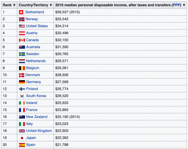
Source: OECD Statistics
An important question here is what constitutes “net”. What should we adjust for?
For example, if we want to create the right incentives to increase everyone’s prosperity, should we subtract rent payments, loan payments, and healthcare expenditures — given how much is spent on these three and given the differences among countries?
In other words, does a person who earns a post-tax income of $100K but spends $80 on rent, student loan payments, health insurance, and medical bills, really have $100K in disposable income?
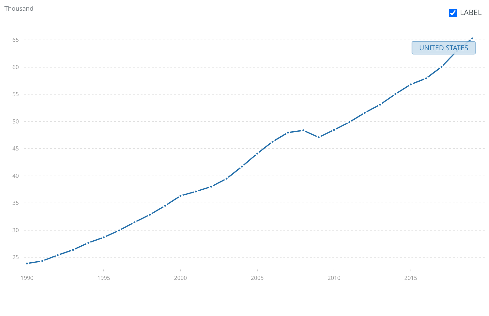
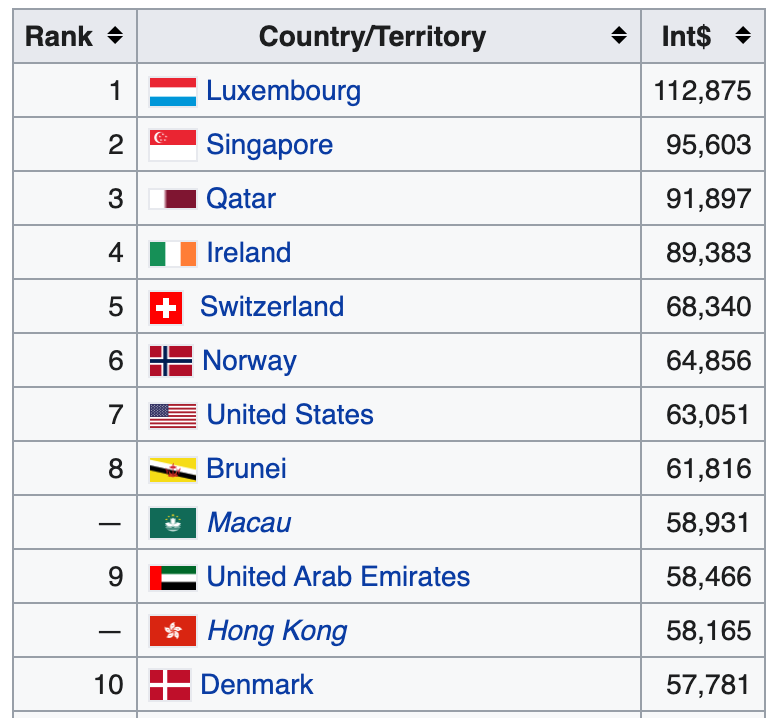
3. Growth in Median Net Worth
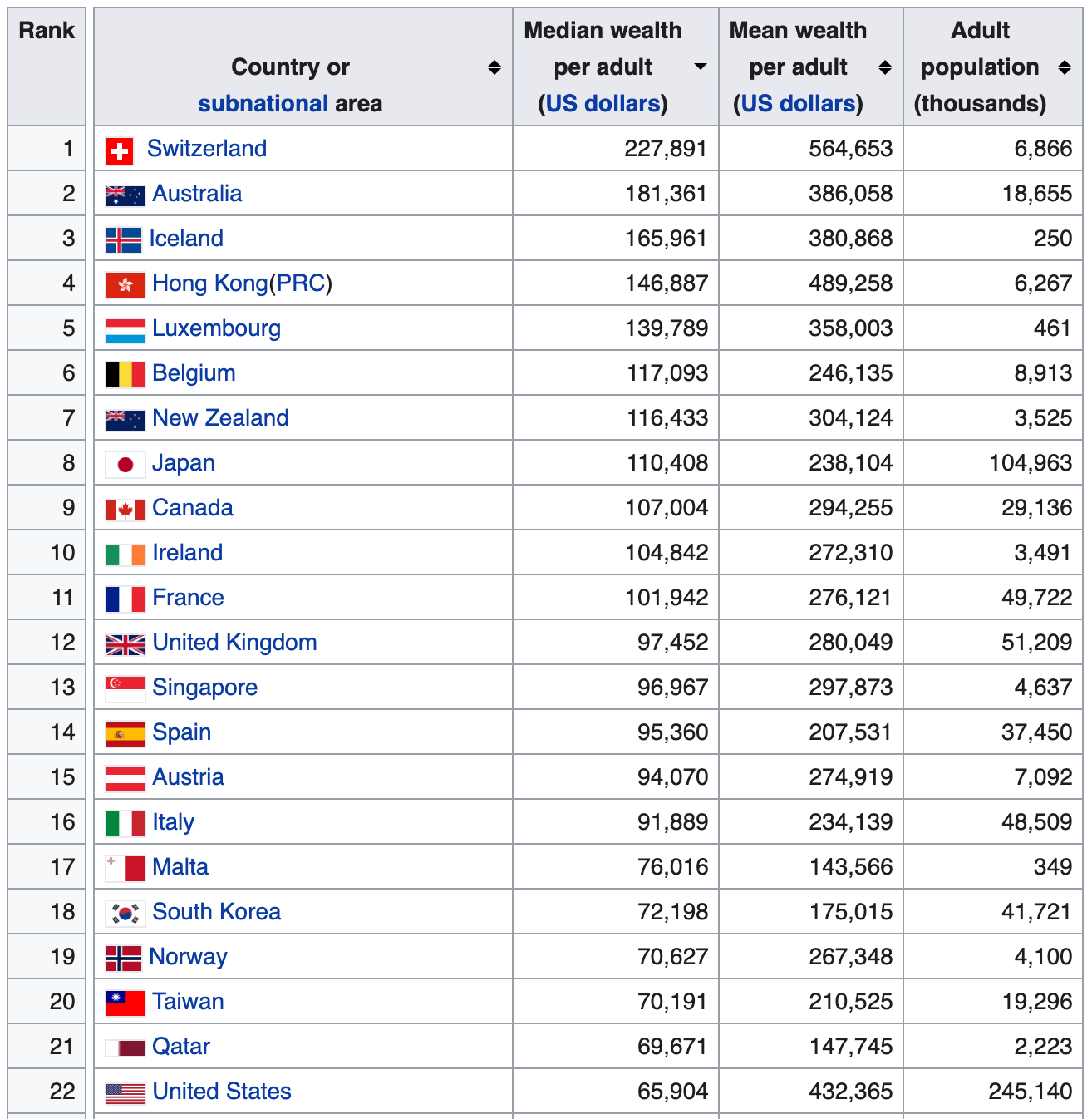
Source: Credit Suisse’s annual Global Wealth Databook, 2019
I also wonder about the best way to adjust these numbers for the cost of living. Doing this might be more tricky than it might seem given the differences in how much different goods and services cost in various countries and in different regions/states.
For example, healthcare is notoriously expensive in the US and arguably more important than some other services and goods. In fact, healthcare, education, and housing — three things that people tend to value, all get more expensive despite the inflation rate staying relatively low:
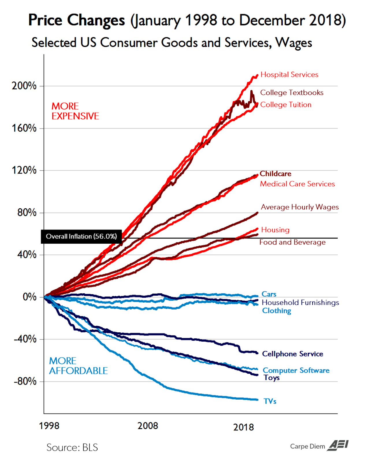
Source: Aei.org and Bls.org
Well-Being
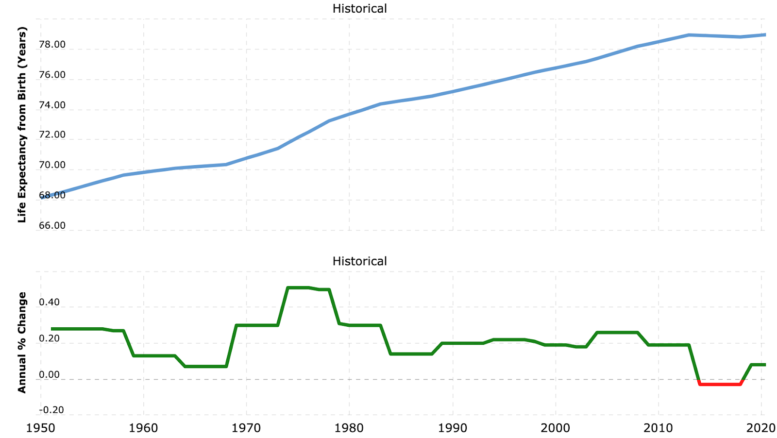
4. Median Life Expectancy and Healthy Life Expectancy
US life expectancy:
Source: United Nations
Source: World Health Organization
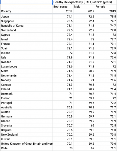
Healthy life expectancy is life expectancy minus years of living with disability.
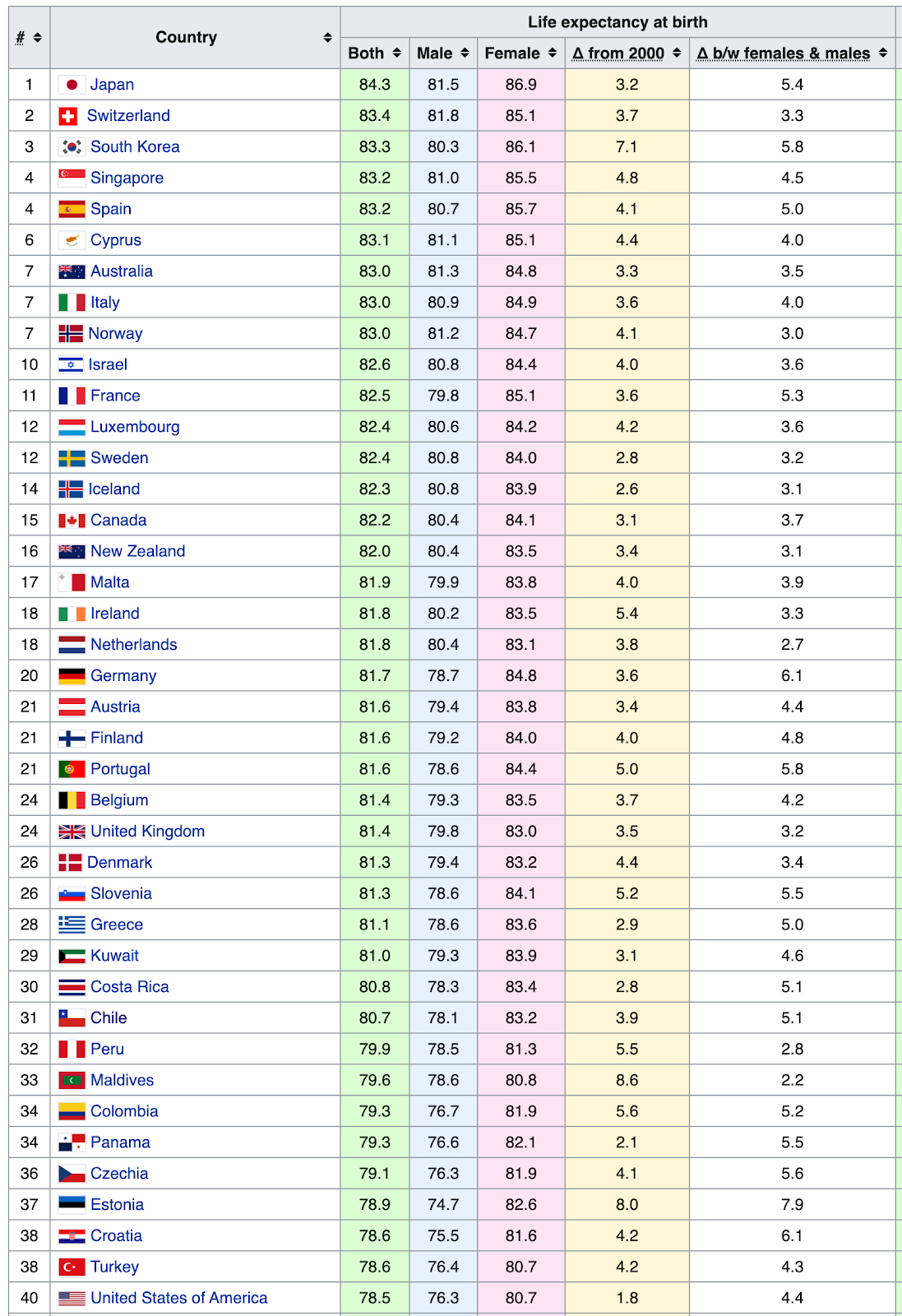
Top 30 countries:
Source: World Health Organization, 2019
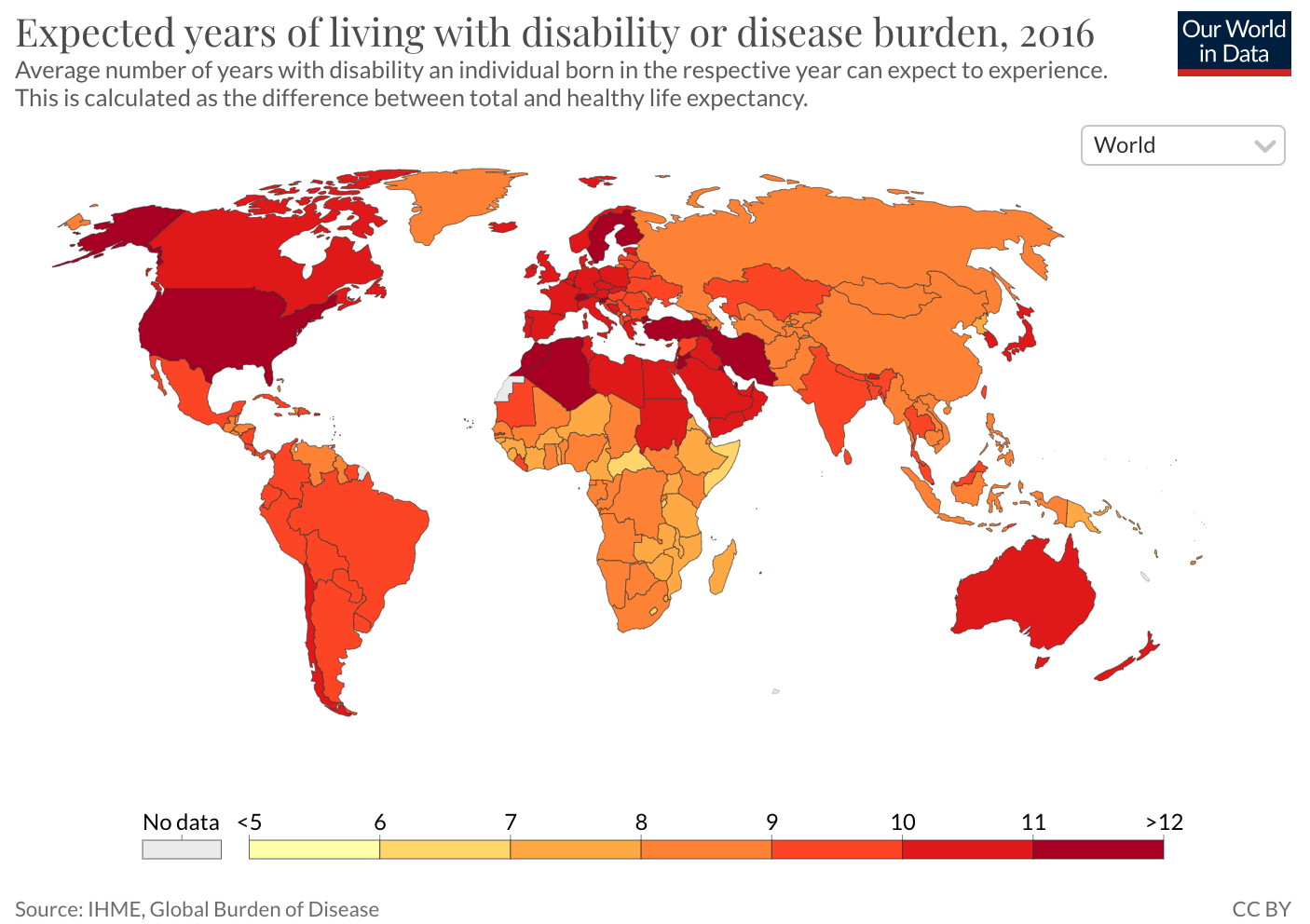
Source: Ourworldindata.org
In my opinion, the biggest challenge in tracking metrics such as life expectancy and other measures of well-being is that it is difficult to increase them rapidly. It may be more productive to ask questions such as "Where should we invest today to achieve the greatest improvement in 10 years?" But this timeframe does not align well with four-year terms. However, this issue can be resolved. For instance, long-term plans that include "fail fast" types of validation and testing can be developed.
5. Subjective Happiness Evaluation
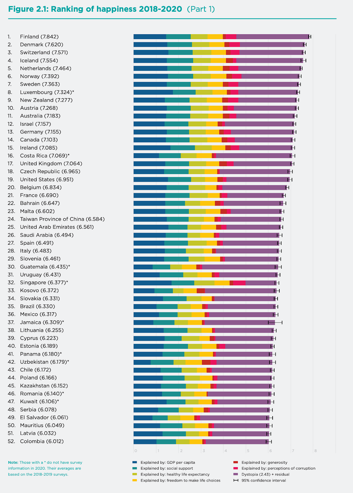
Source: World Happiness Report, 2021
I wasn’t able to find a chart showing how the US score reported by WHR has changed over time, but Gallup is reporting a similar metric:
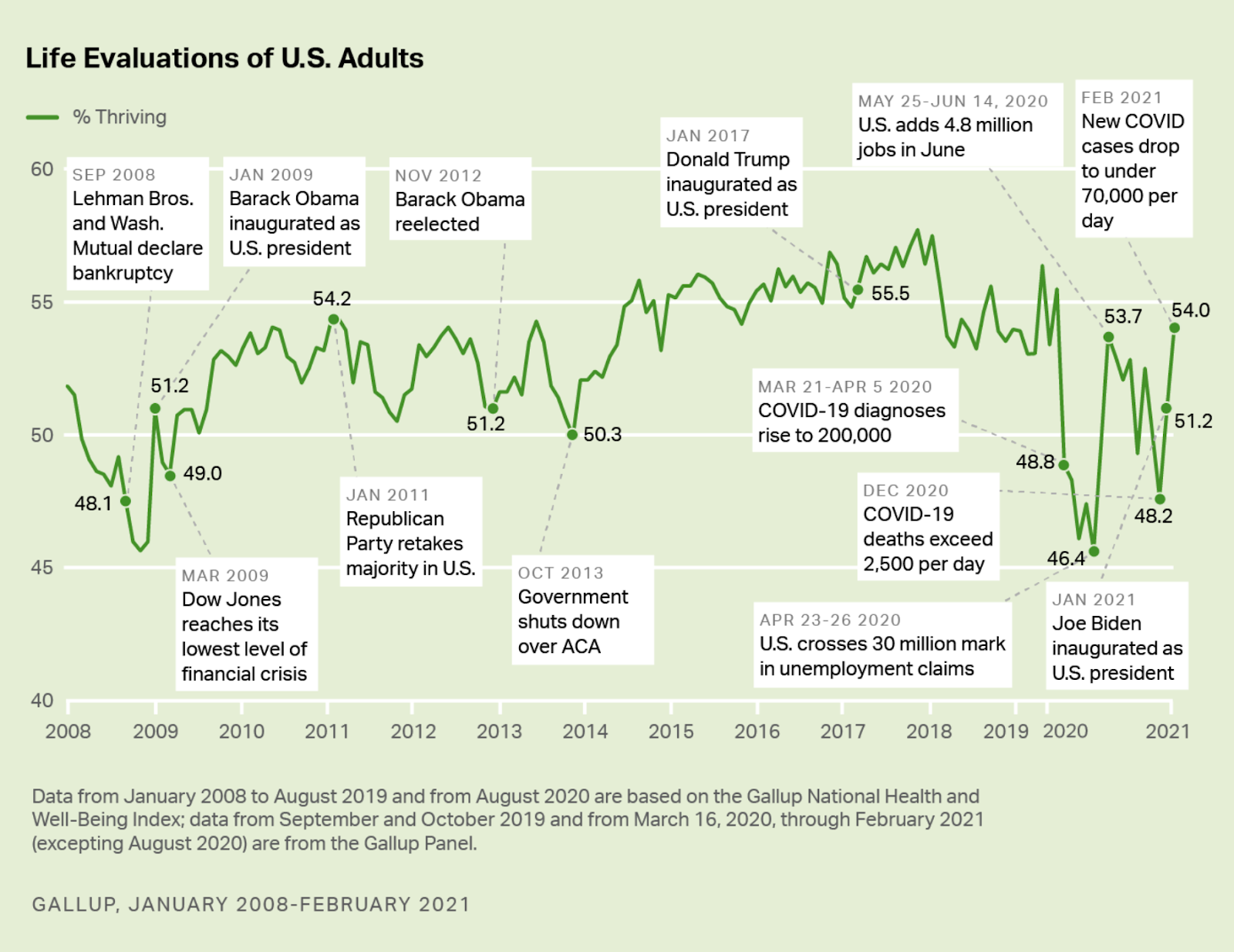
Source: Gallup
6. Depression Rates
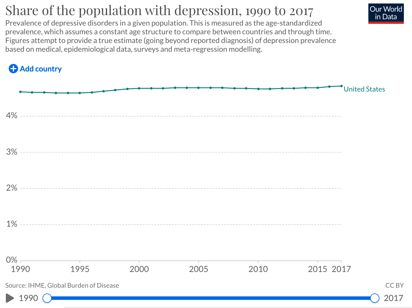
Source: Ourworldindata.org
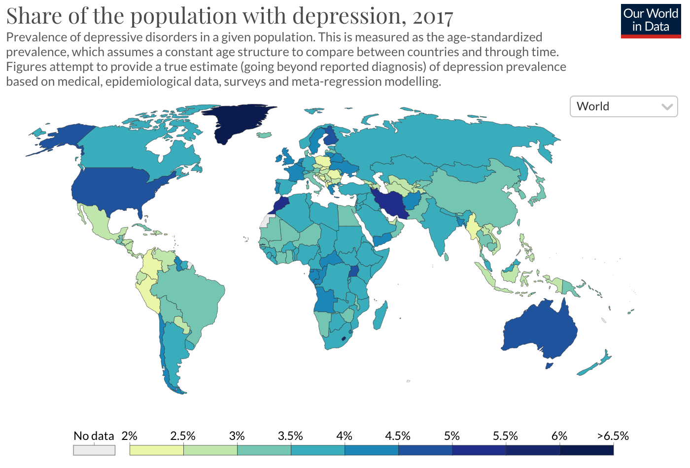
Source: Ourworldindata.org
7. Crime Rates
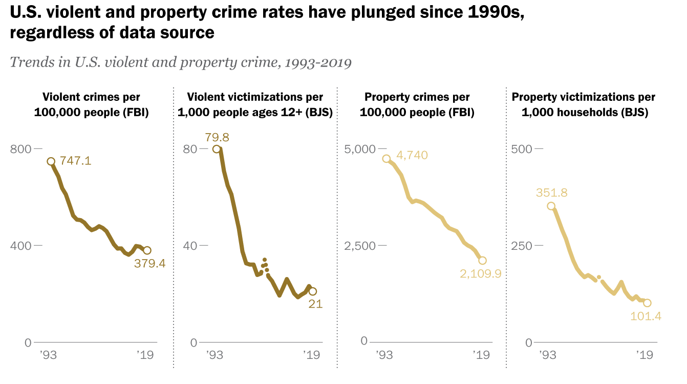
Source: Pew Research
Source: Ourworldindata.org
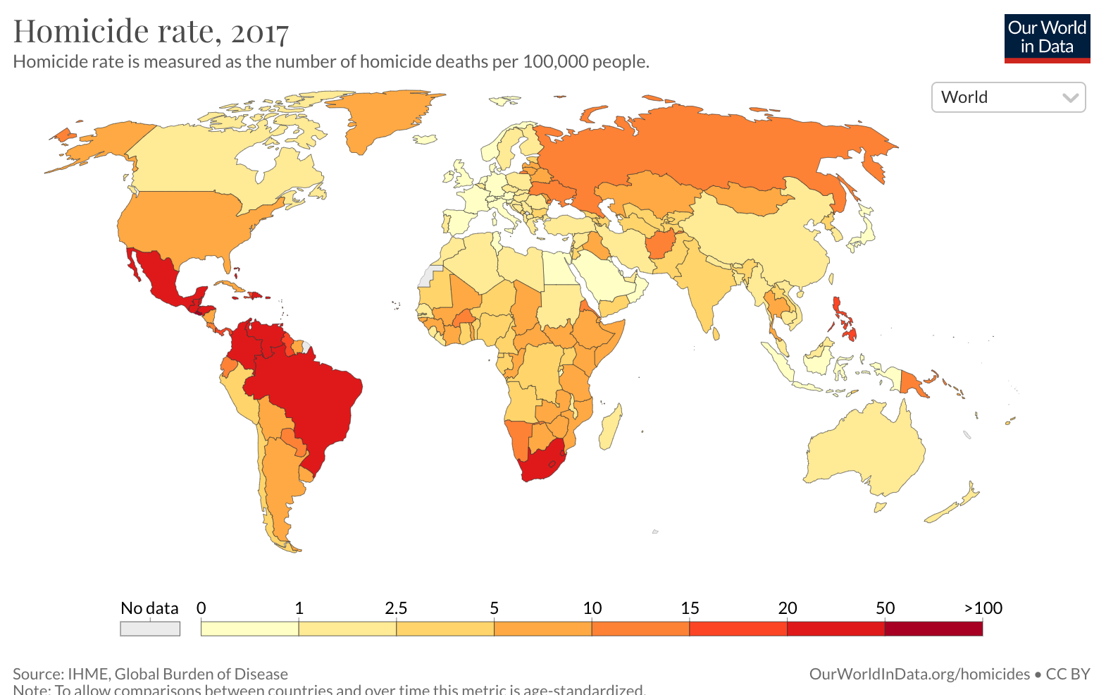
Top 30 countries by homicide rate:
Source: United Nations
Many countries are simply too small, so the list is noisy.
8. Suicide Rates
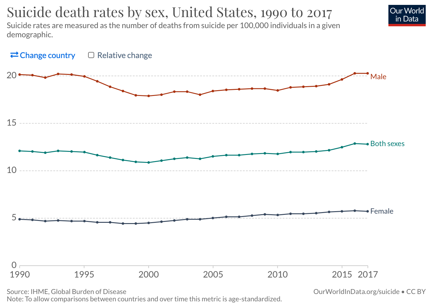
Source: Ourworldindata.org
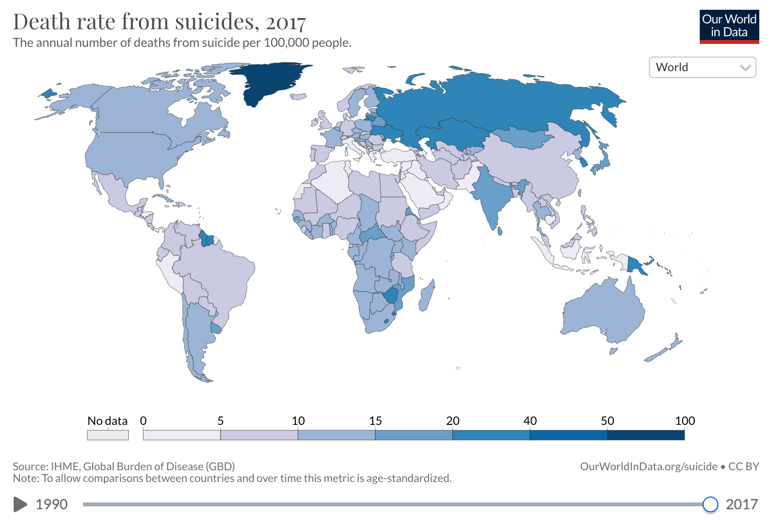
Source: Ourworldindata.org
The top list looks noisy — likely due to underreporting.
Long-Term and Leading Indicators
9. Education Quality
This one is tricky to measure, just like healthcare quality. But there have been attempts. This is one of them:
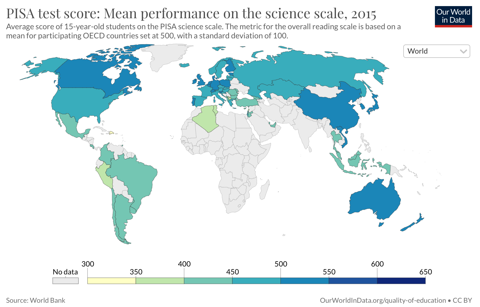
Source: Ourworldindata.org
Top countries:
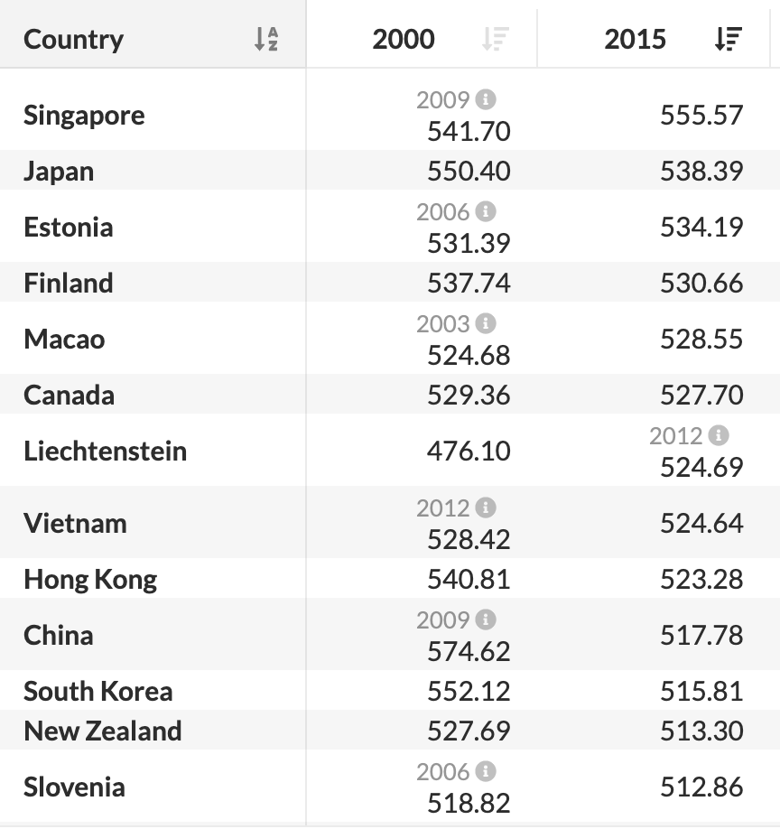
Source: Ourworldindata.org
It’s not easy to find a chart showing how the US scores and ranking have changed over time.
Another thing to consider is the universities. The US is dominating the list of best universities in the world, but there is not an easy way to quantify that dominance and track it over time. Perhaps citations in the relevant fields (e.g. STEM) can be considered as a proxy?
10. Funding of Fundamental Research
Total R&D funded by the US government (red line). It might be better to show it as a percentage of GDP:
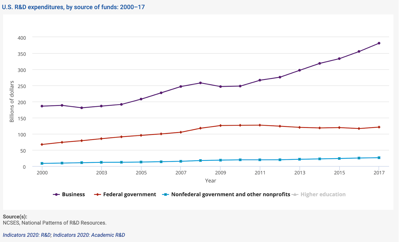
Business-funded R&D is great, but it cannot replace government funding. Businesses and venture capital funds are quite risk-verse. Despite what VCs might claim, many may be reluctant to invest in technologies with long-term time horizons and unclear payoffs.
As % of GDP by country:
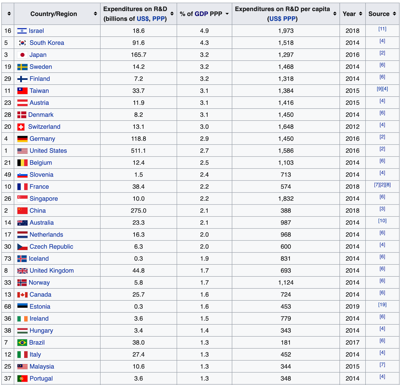
Source: Royalsociety.org
11. New Business Creation
Here is an imperfect proxy. It might also make sense to consider new business formation in certain sectors, e.g. technology.
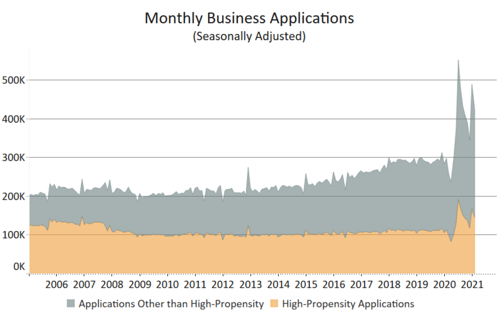
Source: Census.gov
More Options
Here are some additional metrics I would consider:
- Leading indicators of progress. More and better long-term metrics and leading indicators of progress. How do we know we are accelerating it?
- Big long-term bets. Additional long-term metrics focused on risks/opportunities, such as automation and AI, climate (e.g. CO2 in the atmosphere), etc.
- Government efficiency. Can we track and regularly report on the total spend and number of people employed by various agencies? Can we ensure both go down due to increased efficiency, collaboration with the private sector, and automation?
- Well-being. Additional well-being metrics, such as healthcare, preventable deaths, poverty, equality, social trust levels, etc.
- Economy. Additional economic metrics, such as intergenerational economic mobility, unemployment, labor participation, etc.
- Individual rights and freedoms. Economic freedom, personal freedom, press freedom, etc.
- Social institutions. Independent courts, fair elections, corruption, etc.
- Sectors. Top 2–3 metrics for each major sector of the economy. For example, the average train speed and deaths/injuries per distance traveled can be used to evaluate progress in the transportation sector.
- States and counties. Top priority metrics on the state and county level.
Global Focus
This post was in a way US-centric. I believe developing a framework for global reporting might be even more important than driving accountability and focus on the national level. This is because so many countries are still lagging in terms of many of these metrics, but also in terms of governments’ accountability. Sustainable Development Goals are great but they focus more on the current problems and may miss long-term opportunities.
Beyond this, we should also consider system-level metrics in addition to national ones. For example, global mobility, international trade, global trust, and other ways to measure global collaboration.
But let’s get back to the idea of the national dashboard…
Open Questions
What else would you like the government to regularly report on and present plans for?
Where would this approach fail?
How would you improve it?
If you like my articles, please consider signing up for radically infrequent email updates. And say hi on Twitter! 👋
Notes
[1] And even when there is a continuous focus on a set of numbers, it’s often on seemingly arbitrary numbers. For instance, even the Wall Street Journal website still seems to suggest that performance of 30 arbitrarily selected companies is the most important metric to focus on, and that the most meaningful time interval to consider is 24 hours.
[2] There is also amazing Our World in Data founded by Max Roser, a website that aggregates important metrics from multiple sources and shows them in a user-friendly way. And there are many government agencies and independent organizations doing analysis and reporting on all kinds of metrics.
Originally published on Max's Two Cents on April 14, 2021.
3 comments
Comments sorted by top scores.