The New Frontpage Design & Opening Tag Creation!
post by habryka (habryka4) · 2020-07-09T04:37:01.137Z · LW · GW · 25 commentsContents
  New Frontpage design
  Opening up tag creation
None
25 comments
We just pushed a new frontpage design that we've been sitting and iterating on for a while, and we also just enabled the ability for everyone to create tags and edit the descriptions of existing tags.
New Frontpage design
A week ago we asked for your thoughts on the new frontpage design, and generally received quite positive feedback on the new design (and also almost the full LessWrong team has switched towards using the new design because we like it so much better).
I do think that pretty radical visual changes to a site can be distracting and break habits, and think that in this case it's worth that disruption, but generally want to be quite careful with doing redesigns like this to often, and don't want to force you all to reorient to a new design and visual language every time you visit the site.
The goal of this redesign was to make the frontpage a lot less visually cluttered, and make it easier to parse the structure of the site by adding more clear boundaries between foreground and background. This meant combining a bunch of elements in the Recommendations section, getting rid of a bunch of vertical dividers that were cluttering up the space, and using negative space more effective to communicate information without adding visual complexity.
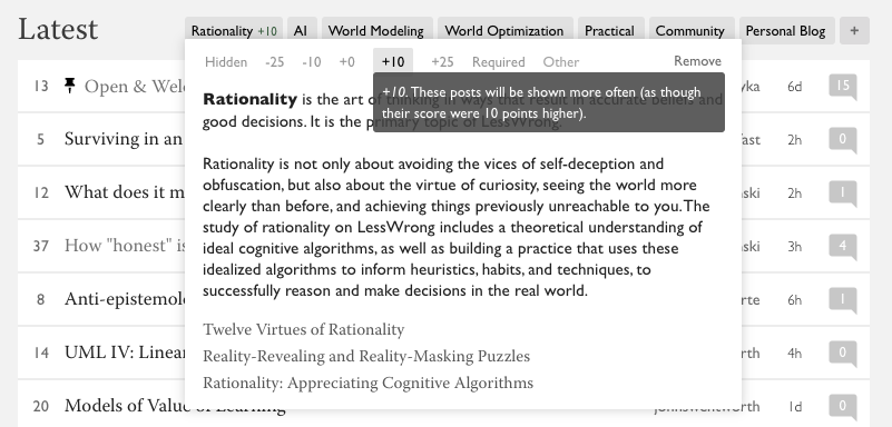
The biggest change that comes with the new design is a lot more emphasis on our core tags and our frontpage selective filtering system that should allow you to personalize your frontpage, hide posts you don't want to see, and increase the frequency of topics that you are interested in. As a quick reminder, here is how to use the system:

When you hover over one of the core tags on the frontpage, or a tag you added yourself to the filter list (by clicking the "+" icon on the right), you can add a karma modifier to all posts that are tagged that way, hide them completely, or mark a tag as required, hiding all posts that don't have that tag. I personally have a karma modifier of +10 on "Rationality" content and on "World Modeling" content, and a -10 to "Community" content.
I expect that over the next few weeks we will make changes to some more pages (most notable the frontpage) to bring it in line with the new visual direction of the site, and are also going to be running some experiments to make the new design feel a bit less droopy (while the bright white background gave me a bit of eye-strain that I am glad to be rid off in this new design, the grey background does feel a bit depressing and I've been experimenting with whether we can improve that somehow by maybe using more images or gradients or some kind of texture, but I don't know yet where that will go.
Overall, I am excited about the new design, and please feel free to leave any feedback in the comments here, or via the Intercom!
Opening up tag creation
Starting today, lasting for at least a few weeks, we are opening up tag creation to all registered users on the site. The goal is that by the end of the month we will have tagged most of the important historical posts with good tags, and have created all the new tags that are necessary to make it so that you can reliably find good related posts, and use the tagging system to orient around all the content that is on LessWrong.
To do that, we are running a strategy of letting new tags grow whenever any LW user feels like they want a tag. It's on the LW team to prune them down, merge them, organize them, and make sure they have good descriptions. I.e. we will take care of most of the busy work of maintaining a tag system, and want you to do the fun parts of creating new tags and organizing content however you find most useful.
The first thing you can do, if you have written any posts on LessWrong, is to tag all of the posts you have written with the existing tags, and to create any tags that you think are missing. See New Tag Guidelines [LW · GW] for some rough tag-guidelines about what makes a good tag. In very short summary, if you think there is an important topic or concept that has three good posts by at least two distinct authors on it, feel free to create a tag for it.
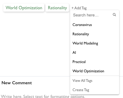
You can create new tags by clicking on the "add tag" menu on any post and selecting "Create tag" or by directly going to lesswrong.com/tag/create.

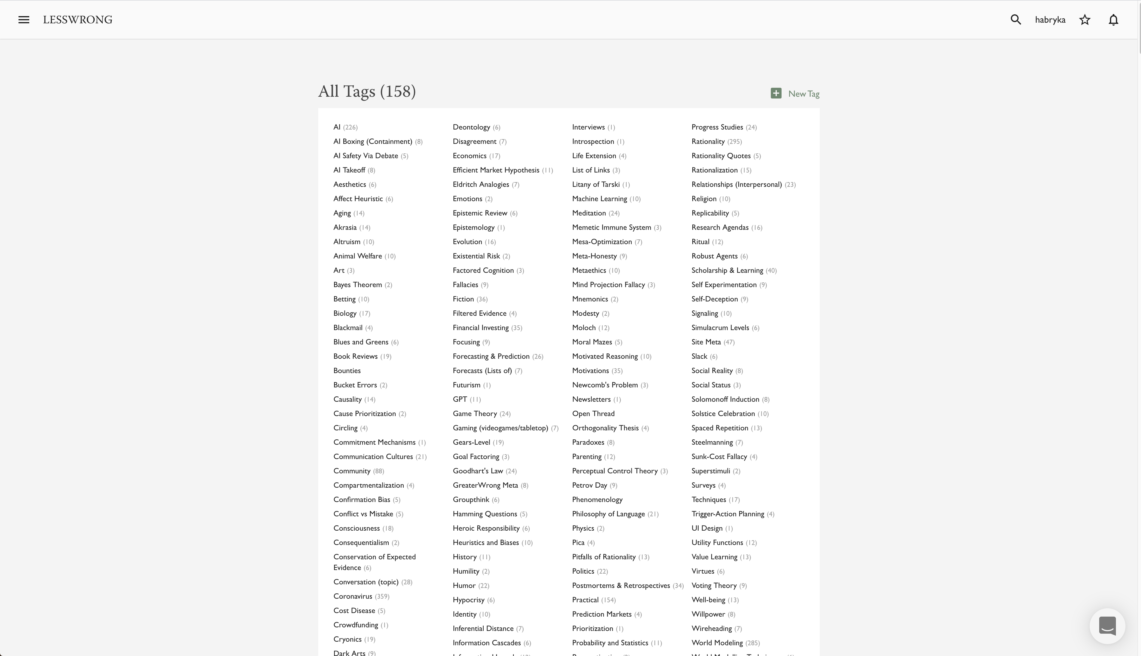
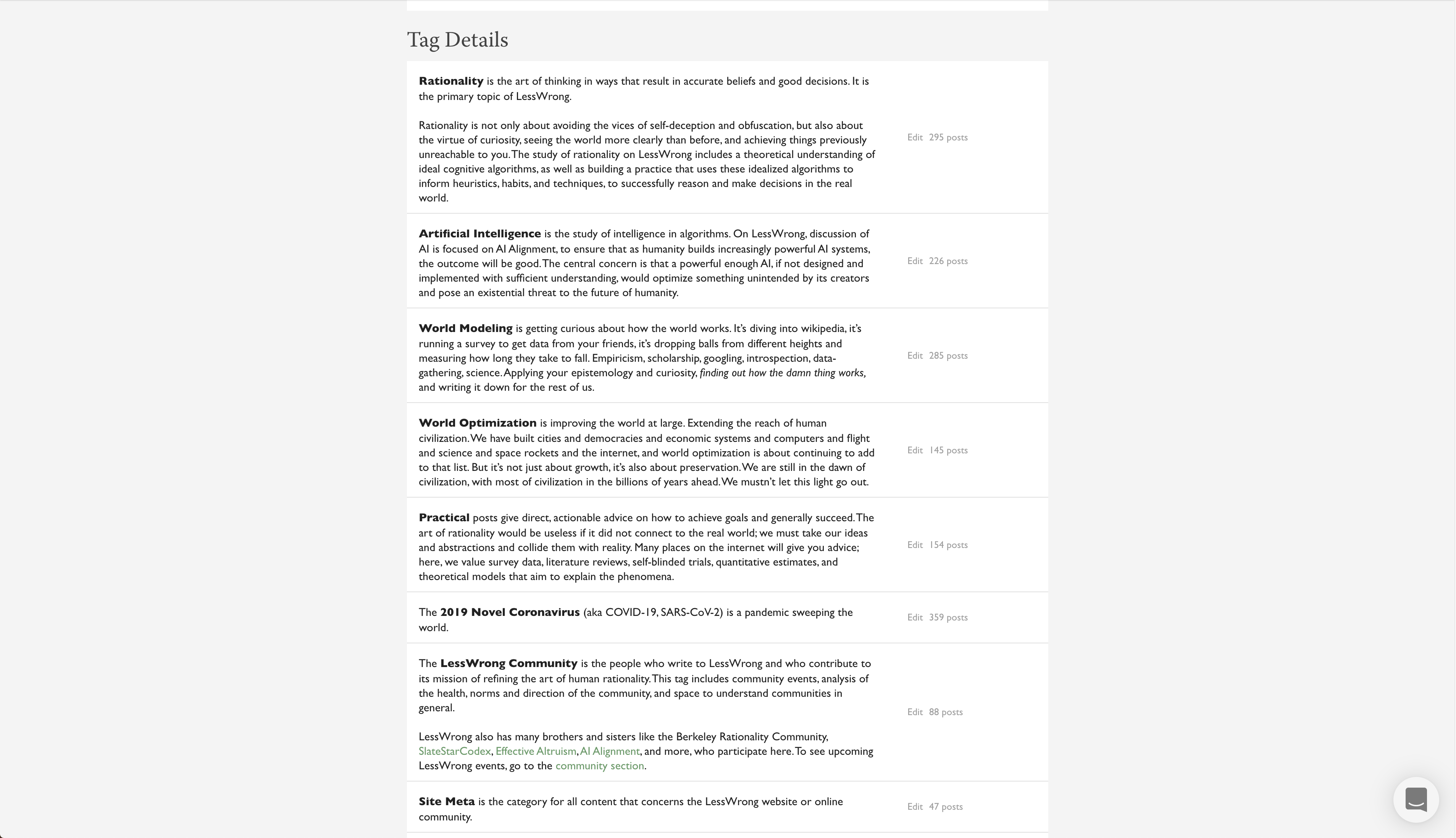
If you want to get an overview over what tags already exists, and what posts are tagged, you can go to https://www.lesswrong.com/tags/all [? · GW], which both has a quick table of all the tags, and a long list of all the tag descriptions, with the ability to edit them right there on the page:


I am also quite excited about the tagging system, and have found that it has already helped me orient to the massive amount of writing that exists on the site, and am really looking forward to what things will be like when we have a tag for all important LessWrong concepts, and have most posts appropriately tagged with them.
Added by Ruby: You can see some of our best tags so far in the July Featured Tags. (These tags have many posts, but that's not necessary to be a great tag. A great tag might be for an important concept with only a few posts.)
25 comments
Comments sorted by top scores.
comment by abramdemski · 2020-07-09T17:06:20.050Z · LW(p) · GW(p)
running some experiments to make the new design feel a bit less droopy (while the bright white background gave me a bit of eye-strain that I am glad to be rid off in this new design, the grey background does feel a bit depressing and I’ve been experimenting with whether we can improve that somehow by maybe using more images or gradients or some kind of texture, but I don’t know yet where that will go.
Have you considered a yellowish or sepia tone? Like, cream-colored. I mentally associate that kind of slight off-white with high quality writing paper, so it feels appropriate to me. (For the exact same reason; reducing eye strain while writing.)
Replies from: SaidAchmiz↑ comment by Said Achmiz (SaidAchmiz) · 2020-07-09T18:15:06.122Z · LW(p) · GW(p)
For instance, ReadTheSequences.com has a slightly off-white background for just this reason.
comment by Zack_M_Davis · 2020-07-14T06:15:19.721Z · LW(p) · GW(p)
I strongly disapprove of graphically rendering "Frontpage" and "Personal Blog" as if they were tags on post pages. They're not tags! Conflating "Personal" with topic tags on the home page "Latest" controls wasn't jarring, but this really is.
Replies from: habryka4, Raemon↑ comment by habryka (habryka4) · 2020-07-14T19:00:21.033Z · LW(p) · GW(p)
My current model here is that we should give them some kind of special styling that distinguishes them from the other tags. They obviously have some overlap with tags (in some sense you can model them as an "admin-only" tag as Ray says below, and I expect that is what we will change the underlying architecture towards at some point in the next few months).
Curious whether you think that would help sufficiently.
↑ comment by Raemon · 2020-07-14T17:58:37.402Z · LW(p) · GW(p)
Thanks for letting us know!
I am curious if your opinion changes if we actually change Frontpage and Personal Blog to be literally treated as tags in the architecture?
Over the past two years we've made a few one-of boolean fields in the posts database, and each time I thought "man, this should really be handled formally by a tag architecture, but making a tag architecture is a bunch of upfront cost we're not ready to do yet." With the recent tag overhaul we'd been talking about migrating Frontpage Status to a tag, but we had already built some infrastructure that handled it as a database-boolean, and hadn't gotten around to it yet. (But meanwhile we started tweaking the UI to reflect that goal)
Obviously there'd be some important distinction between admin-only tags vs general use tags, and maybe the UI could more explicitly reflect that in some way. Curious if that all still feels wrong to you?
comment by __nobody · 2020-07-13T23:12:15.824Z · LW(p) · GW(p)
Some (fairly low-priority) glitches / feature requests surrounding tag filtering, in decreasing order of perceived importance.
Front page filtering / tag order: Request: Currently they're in order of being added, with no way to reorder. I'm already getting confused by that… Manual reordering might be nice, but just some imposed order (most likely name or weight adjustment) would be better than the current state.
Front page filtering / adjusting tag weights in the popup: Glitch: When changing the tag weights via the up/down arrows next to the 'other' field, the size of element(s) to the left changes when reaching/leaving one of the pre-defined values, which changes where your clicks go. (Worst case, Firefox re-layouted such that the second click went to the 'remove tag' button… oops.) Ideally, the buttons stay where they are so I don't have to (remember to) wait nor reach for the keyboard and manually compute the adjustment in my head, and instead can just click a few times.
All tags page: Request: Mark newly added / edited tags in some way. (I went through the whole list to add tags that I want to track. New tags are still being created all the time. Currently, it seems the only way to find all those new/updated tags is to go through the whole list again.)
Replies from: habryka4↑ comment by habryka (habryka4) · 2020-07-13T23:37:35.180Z · LW(p) · GW(p)
These are all great suggestions! They do indeed all seem like improvements to me, though I will have to look a bit into how hard it will be to implement some of these.
comment by Raemon · 2020-07-23T21:20:29.834Z · LW(p) · GW(p)
FYI, we're about to very slightly change the shade of grey on the frontpage, which I expect most people to not notice, but I'm curious if the people who actively disliked the grey find it an improvement.
You can see the new shade over on lessestwrong.com, and the current shade on lesswrong.com.
comment by willbradshaw · 2020-07-13T07:47:15.768Z · LW(p) · GW(p)
I don't have especially strong feelings on the functional aspects of the new layout, but I do find the white-on-grey colour scheme quite dramatically more ugly than the old white-on-white scheme. I thought the old look was unusually elegant for a website and am sad that the site is now so much less pleasant to look at.
Replies from: Benito, habryka4↑ comment by Ben Pace (Benito) · 2020-07-13T21:41:30.887Z · LW(p) · GW(p)
I also think it's substantially lessened certain things that felt aesthetically pleasing. That said I had permanently changed my habits to instead use our staging server (lessestwrong.com) because for me the difference in eye-strain was so dramatic. I expect we'll find ways to build a strong aesthetic with this theme, so I'm not too worried about the local change on that dimension being fairly negative.
↑ comment by habryka (habryka4) · 2020-07-13T20:27:49.270Z · LW(p) · GW(p)
Feedback appreciated. I share some of that (though I presumably have less of a strong reaction to this than you do, since otherwise I would have designed something else). I've been creating lots of drafts and gathering ideas to make things feel more aesthetically pleasing, so I hope I can address this over the coming months.
comment by Lukas Finnveden (Lanrian) · 2020-07-09T08:21:45.297Z · LW(p) · GW(p)
Here <INSERT LINK TO TAG GUIDELINES> are some rough tag-guidelines about what makes a good tag.
Is there no guideline yet? Or is there supposed to be a link here?
Replies from: habryka4, Ruby↑ comment by habryka (habryka4) · 2020-07-09T17:20:49.494Z · LW(p) · GW(p)
Oops :P
I even left it in all caps so I wouldn't forget. Ruby added the link.
Replies from: Ruby↑ comment by Ruby · 2020-07-09T16:47:21.700Z · LW(p) · GW(p)
The things that happen when you publish late at night :P
Here are some: New Tag Guidelines [LW · GW]
Also inserted into the proper place in the post.
comment by abramdemski · 2020-07-09T18:45:27.486Z · LW(p) · GW(p)
I created a tag, and added a description, but now I want to edit that description. How do I do that?
Replies from: habryka4↑ comment by habryka (habryka4) · 2020-07-09T18:58:56.465Z · LW(p) · GW(p)
We are literally right now pushing the change that allows you to do that. Sorry for the delay!
Starting in about an hour or so you should see an edit-button show up on the tag-page that you created.
Replies from: abramdemski↑ comment by abramdemski · 2020-07-09T19:48:41.076Z · LW(p) · GW(p)
Thanks!
comment by Zack_M_Davis · 2020-07-09T05:41:46.657Z · LW(p) · GW(p)
you can go to https://www.lesswrong.com/tags/all,
The link currently points to lessestwrong.com, presumably your staging server.
Replies from: habryka4↑ comment by habryka (habryka4) · 2020-07-09T05:45:45.012Z · LW(p) · GW(p)
Thanks! Fixed!
comment by FactorialCode · 2020-07-09T16:37:54.235Z · LW(p) · GW(p)
The content on the front page is noticeably off center to the right on 1440x900 monitors.
Edit: The content is noticeably off center to the right in general.
Replies from: habryka4, Raemon↑ comment by habryka (habryka4) · 2020-07-09T17:24:26.359Z · LW(p) · GW(p)
The post page centeredness is the way it's always been. Posts are centered when there is no Table of Contents, but with the Table of Contents it looks better (IMO) if it's moved a bit further to the right, to make space for the ToC.
Replies from: FactorialCode↑ comment by FactorialCode · 2020-07-09T18:00:58.395Z · LW(p) · GW(p)
Huh.
I did not believe you so went and checked the internet archive. Sure enough, all the old posts with a ToC are off center. I did not notice until now.
Replies from: habryka4↑ comment by habryka (habryka4) · 2020-07-09T18:09:47.392Z · LW(p) · GW(p)
No worries :D This happens to me all the time as well with various parts of our design.