Second Wave Covid Deaths?
post by jefftk (jkaufman) · 2020-07-01T20:40:01.823Z · LW · GW · 16 commentsContents
16 comments
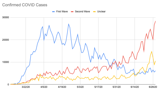
Two weeks ago I looked at covid cases by state, and divided states into three groups:
- First wave: states that had peaked and were trending down.
- Second wave: states that were rising, on a second wave with a slower build and later peak.
- Unclear: states with few cases or complex trajectories.

source: JHU CSSE
Virginia and New Mexico have controlled it some, but the other second wave states are still seeing lots of growth. Some of the first wave states are growing again (Louisiana, Illinois, Pennsylvania) and some of what I called the "unclear" states have turned out to be in the second wave as well (primarily Florida).
At the time I wrote:
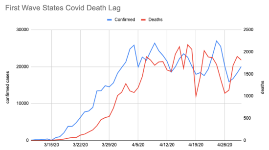
Speculating now, it looks to me like there's a pattern where people take precautions more seriously once people they know start dying. I don't think the second-wave states have hit that level yet, but with the rise in confirmed cases I think we're going to be seeing those deaths in about a week, sadly.This was based on looking at the lag time from the first wave states confirmed cases to deaths (note the different left and right axes):
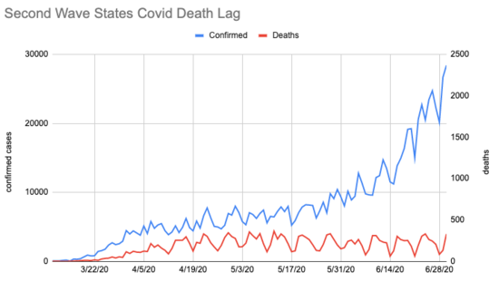
But with the latest numbers, here's what I see for second wave states (same left and right axes as the previous chart):
Starting in late May, confirmed cases start rising dramatically but deaths haven't moved along with them. What's going on? Possible explanations:
Delayed initial testing: When things were first taking off in first wave states, our testing capacity was way behind where it needed to be. Perhaps this heavily suppressed the initial "confirmed" numbers for the first wave, and so we should expect to see second wave deaths rise in the next few weeks?
Increasing test capacity: I've seen some people suggest that the second wave is just an artifact of increased testing in these states. If that were the case, then there would be no rise in covid cases to be explained. But then I would expect the fraction of tests that returned positive to be decreasing, and we aren't seeing that. This one seems like wishful thinking to me.
Undercounting: Perhaps we are seeing a large increase in covid deaths in the second wave states, but they're not being counted? If we were following the first wave trajectory, however, this would mean 1000+ mystery deaths per day, and that is quite a lot to go missing! The CDC collects "excess deaths" numbers, and while the most recent numbers they give are for 6/13 they're not showing many.
Different populations: early in the pandemic people didn't know to be being careful, and a lot of elderly or otherwise vulnerable people got it. The people getting sick now do skew younger, and it's possible we're awkwardly implementing the cocooning strategy the UK initially considered? If this is happening, whether it's a good approach depends quite a lot on whether we can keep hospitals from being overwhelmed (seems likely at this point) and how long covid immunity turns out to be (possibly as short as a year, though reinfections could maybe be cleared more easily?) This is my current best guess.
Comment via: facebook
16 comments
Comments sorted by top scores.
comment by paulfchristiano · 2020-07-02T01:53:57.161Z · LW(p) · GW(p)
(Disclaimer: I don't know what I'm talking about, pointers to real literature would be more useful than this, every sentence deserves to be aggressively hedged/caveated, etc.)
Increasing test capacity: I've seen some people suggest that the second wave is just an artifact of increased testing in these states. If that were the case, then there would be no rise in covid cases to be explained. But then I would expect the fraction of tests that returned positive to be decreasing, and we aren't seeing that. This one seems like wishful thinking to me.
I don't think the increase in testing capacity fully explains the "second wave," but I think it does totally change the quantitative picture.
Intuitively I expect that (rate of change in positive test %) is better than (rate of change in confirmed cases) as a way of approximating (rate of change in actual cases). It also doesn't seem great, especially over multiple weeks, but I'll use it here until someone convinces me this is dumb.
Johns Hopkins aggregates testing numbers here. Picking CA as a second-wave state, it hit its minimum positive test rate of .04 on May 24. That rate rose by 20% by June 21, to 0.048 (and has kept going up).
If there was a 7 day lag, we'd expect to see a 20% increase in deaths by from May 31 to June 28. Eyeballing the google deaths data things look basically flat. So I guess that means a drop of ~20% in fatality rate over that month.
Trying again, let's take Georgia. Minimum of .058 on June 10, up 50% to .091 by June 21. Google seems to have deaths roughly constant or maybe decreasing from June 17 to June 28, which is a ballpark ~30% drop in fatality rate to offset the ~50% increase in infections.
One problem with these numbers is that I think the test numbers are for day the test occurred, but the death numbers are for the day they are reported. Would probably be better to use numbers for the day the death actually occurred, though I think that probably requires going at least a few days further back in time (which is going to make it harder to interpret cases like Georgia that hit the minimum only 3 weeks ago).
Delayed initial testing: When things were first taking off in first wave states, our testing capacity was way behind where it needed to be. Perhaps this heavily suppressed the initial "confirmed" numbers for the first wave, and so we should expect to see second wave deaths rise in the next few weeks?
It seems like the average time lag between showing symptoms and dying from COVID is something like 18 days (here, data from China but if anything I expect longer lags here). So if we were testing people earlier it seems like we could easily have more like a 2 week lag than a 1 week lag. That could mostly explain Georgia and California.
Overall I can't really tell what's going on, my sense is that your story in the post is basically right (and demographic changes sound likely) but that the mystery to be explained is *much* less than a 5x change in fatality rate. I feel like the constant death rate in the face of exploding cases is suspicious but best guess is that it's a coincidence, death rates will end up rising and IFR will end up modestly lower than the initial wave.
I would love to see a version of the analysis in the OP controlling for big increases in testing, and getting a more careful handle on lags between testing and death. Hopefully someone has already done that and it's just a matter of someone here finding the cite.
Replies from: jmh↑ comment by jmh · 2020-07-03T15:11:49.250Z · LW(p) · GW(p)
Small addition on:
If there was a 7 day lag, we'd expect to see a 20% increase in deaths by from May 31 to June 28. Eyeballing the google deaths data things look basically flat. So I guess that means a drop of ~20% in fatality rate over that month.
The CDC site says the lag on reporting deaths is between 2 and 8 weeks -- and can be longer.
Replies from: jameson-quinn↑ comment by Jameson Quinn (jameson-quinn) · 2020-07-04T01:16:55.135Z · LW(p) · GW(p)
When you train on old data, you get a lag of about 10-12 days between changes in cases and corresponding changes in deaths. There are several reasons that could be not true on new data:
1. Cases are getting caught earlier by more/faster testing.
2. Cases are leading to fewer or slower deaths (due to either treatment or population effects)
3. The lag on old data is using the reported date of death, but that's not the same as the date of the reporting of the death, which has an additional lag.
Are you saying it's (at least partly) #3?
Replies from: jmh↑ comment by jmh · 2020-07-05T15:32:21.926Z · LW(p) · GW(p)
I suspect a couple of things might be worth considering, but I'm not the expert here either so take everything with the view I am speculating/thinking aloud not stating any findings.
I don't think testing will tend to lower the CFR as that testing will move things towards the real IFR rather than the CFR. This probably related to point 1 & 2 above.
I think the 10-12 days from the old data to say we see movement in the death data due to the new cases probably has some type of skew in it, the older the data the more likely it will be complete. That should be driven by the the death reporting distribution (and perhaps even corrections). The closer the old data gets to the new threshold of new deaths it should under report due to the lag. Perhaps we need to look at the distribution of reported deaths over that 8+ week period before trying to assess the results after the 10-12 days. I'm not sure if that is what you are saying in point 3.
comment by dumky · 2020-07-01T21:29:08.973Z · LW(p) · GW(p)
Another possibility (not sure how likely): maybe treatment capacity and protocols have improved?
Replies from: jkaufman↑ comment by jefftk (jkaufman) · 2020-07-02T00:32:03.233Z · LW(p) · GW(p)
Capacity is definitely higher, since this is much less concentrated than the first round.
Even if protocols have improved, deaths staying essentially flat since mid April while cases have grown ~5x is very strange.
Replies from: jmh↑ comment by jmh · 2020-07-03T00:00:20.867Z · LW(p) · GW(p)
Might be that deaths are being classified a bit differently now too. Just looking at https://data.cdc.gov/NCHS/Weekly-Counts-of-Deaths-by-State-and-Select-Causes/muzy-jte6/data for the national level numbers/trend for "Symptoms, signs and abnormal clinical and laboratory findings, not elsewhere classified (R00-R99)" look different from last year. I also heard someone claim that something of a spike in pneumonia deaths is happening but didn't really see that in the data.
But I would also think some marginal improvement in treating patients and keeping them alive has occurred as well.
comment by dralien · 2020-07-02T18:26:07.837Z · LW(p) · GW(p)
One possibility seems to be that the virus could be evolving towards lower mortality rates, possibly in conjunction with other mentioned environmental causes (higher ratio of young people being out and about, Vitamin D). I don't know of any direct evidence for this, but it might be what we'd expect from theory (e.g. SA Frank 1994, PRSB). If, for example, a portion of severity of case is underpinned by genetics of the virus (and not just the host), and these people are more mobile (and have been for months), there could be selection for reduced virulence.
Replies from: mutant-city↑ comment by mutant-city · 2020-07-03T23:35:57.646Z · LW(p) · GW(p)
This is supposedly a very stable virus.
comment by Raemon · 2020-07-01T21:00:38.562Z · LW(p) · GW(p)
Not really the main topic here, but I've been wanting to see graphs for better breakdowns of different parts of California. Anyone have good recommendations for that?
Replies from: jkaufman↑ comment by jefftk (jkaufman) · 2020-07-01T21:22:23.410Z · LW(p) · GW(p)
Have it, it's fun! git clone git@github.com:CSSEGISandData/COVID-19.git and look at time_series_covid19_confirmed_US.csv
When I looked a couple weeks ago it seemed that it was worst around LA, but I haven't checked when it's done since.
comment by Radford Neal · 2020-07-01T23:41:23.980Z · LW(p) · GW(p)
Another possibility is better disease survival due to increased vitamin D levels from sunshine (or due to some other physiological effect of sunlight).
The effect seems rather large for this to be the explanation, but it sure would be great if a bit of sunlight is all that's needed!
Replies from: PeterMcCluskey, jkaufman↑ comment by PeterMcCluskey · 2020-07-02T01:43:10.530Z · LW(p) · GW(p)
Maybe in northern states. But I doubt that vitamin D levels are increasing in the southernmost cities, where heat is likely driving people indoors. Those are the areas that most need explaining.
↑ comment by jefftk (jkaufman) · 2020-07-02T00:30:33.932Z · LW(p) · GW(p)
More sunshine in that these are sunnier places and also sunnier times of year, so you get it two ways.
comment by mutant-city · 2020-07-03T23:35:39.338Z · LW(p) · GW(p)
I don't understand how the second wave can't be explained by increase in testing. Before only people who were sick were allowed to be tested, who correlate more with hospital visits, which correlates more with deaths, so it more closely follows the death graph.
Now anyone can be tested and it's estimated that 40 to 80 percent of people are asymptomatic who will never even see a doctor.
Hence the infection rate skyrockets and the death rate remains the same.
So I don't follow the reasoning.
Additionally there's the possibility that death rates were inflated before by doctors labeling any death that test positive for covid, even if a car accident, a covid death. From a cynic's perspective there is also more financial renumeration from insurance the medicare for a corona labeled patient.
Replies from: paulfchristiano↑ comment by paulfchristiano · 2020-07-04T00:31:59.721Z · LW(p) · GW(p)
I don't understand how the second wave can't be explained by increase in testing. Before only people who were sick were allowed to be tested, who correlate more with hospital visits, which correlates more with deaths, so it more closely follows the death graph.
US positive test rate is up from 4.4% to 7.4%: https://coronavirus.jhu.edu/testing/individual-states
It used to be the case that 4.4% of people you tested had COVID-19.
Now you test more people, who look less risky on average, and find that 7.4% of people you test have COVID-19. The people you would have tested in the old days are the riskiest subgroup, so more than 7.4% of them have COVID-19.
So it sure seems like the infection rate went up by at least (7.4/4.4) = +70%.

