Charting Is Mostly Superstition
post by gilch · 2020-08-23T20:26:15.474Z · LW · GW · 18 commentsContents
  How to Chart Like a Quant
    From Adjusted Close to Daily Returns
    From Daily Returns to Distribution Histograms
    Autocorrelation Effects
    Conditional Return Distributions
None
18 comments
Part 6 of the Inefficient Markets sequence.
[I am not your financial advisor! For educational purposes only. Read part 1 [LW · GW] first.]
The technical analyst reads the signs and portends and divines the future prices. Three black crows are a bad omen, don'tcha know. An abandoned baby is a sign of changes coming. The morning star doji means the Fates are smiling.
Candlestick patterns! Trendlines! MACD's! Bollinger Bands! Stochastics! There are dozens and dozens of these so-called "technical indicators". Your stockbroker's trading software is probably full of them. They all sound very arcane and financial. Many of them have tunable parameters.
Do you know what the right parameters are? Do you know what the signs and portends mean?
Neither do they.
Maybe some of this stuff used to work. Some of it may be self-fulfilling prophecy. (Ichimoku charts only work in Japan for some reason.)
Maybe if you stare at enough charts, memorize enough patterns, some day it will all click.
Some traders seem to think that way. They may even think they're making progress. I'd call it confirmation bias.
There is something to some of this, but you're not quantifying it. What parameters? Why? How big is your edge?
Stop thinking like a diviner, and start thinking like a data scientist.
How to Chart Like a Quant
I'm not going to say that you never look at a price chart (although I have heard that said), it does tell you some things at a glance.
But as trading styles go, collecting directional alpha in a single asset is hard mode. And people think they can do it using a gut feel for signs and portends?
Really?
We kind of have to start with a single asset, because it's hard to explain how to chart a pair without explaining how to chart a single asset first, but we do want to be able to compare the relative performance of assets later on.
Share price is not the same as market cap. It's as much about how many shares were issued, and how often it split as about how well the company performed.
Comparing two assets on share price is apples-to-oranges. It's just useless for our purposes.
Even comparing the recent prices to past prices is not that helpful. Is Apple the same company it was in the '80s? Different market, different CEO, different employees (mostly). And different share price.
If you want to make money, you don't care so much about where it was, but how it moves.
Think velocity and acceleration, not position. We don't care about where it is,
We don't have to do differential calculus, but that's kind of the idea. Because price history is not continuous (there have been a finite number of trades in the history of an asset), discrete methods will do.
From Adjusted Close to Daily Returns
All right. Hands-on learning time. We're going to transform and visualize some market data, but to do that, we first need some data.
There are many sources of market data. We want one with a daily adjusted close. That's the close price in terms of the current number of shares, accounting for any splits and dividends.
Honestly, once you know how, it's a easier to do data science in a Jupyter Notebook with Python (or in R, or J, among others), especially when using very large data sets. I would be using Python for my own analysis, but a spreadsheet is a little more accessible, so I'll start there to explain how it's done.
First, get the data.
For example, go to https://finance.yahoo.com (or wherever you can get adjusted close data)
and look up a big tech company, like AAPL (Apple Inc.)
Find the "Historical Data",
set the time period to get at least ten years worth,
with "daily" resolution.
Find the "download" link to get the data as a .csv file.
Do the same for a big index ETF, like SPY (SPDR S&P 500 ETF Trust).
I'll be using the free and open-source Gnumetric, but any good spreadsheet application (Google Sheets, Microsoft Excel, etc.) can do this stuff.
You should see a table that looks something like this, with a lot more rows.
| Date | Open | High | Low | Close | Adj Close | Volume |
|---|---|---|---|---|---|---|
| 2010-08-20 | 35.627144 | 36.274284 | 35.57143 | 35.662857 | 30.817675 | 96057500 |
| 2010-08-23 | 35.970001 | 36 | 35.035713 | 35.114285 | 30.343628 | 103510400 |
Select the "Date" and "Adj Close" columns, and find the button to plot a chart. You should get something like this:
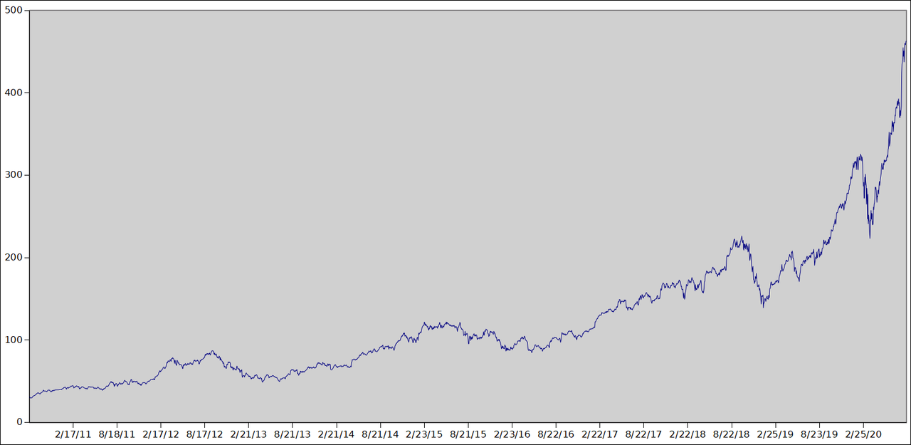
This is basically what your broker would give you. This is not what we want. We want something like the first derivative of this (think velocity, not position), but it's discrete data, so we'll use finite differences.
In the next open column, add a "differences" header.
Then enter the formula to get the difference in adjusted close
from the previous day =F3-F2 in cell H3,
in this example.
Double click the fill handle to fill the formula into the rest of the column.
This is the profit or loss for holding one (adjusted) share for one day.
We'll be adding several columns.
It's probably a good idea to save your work after each column.
But the .csv format doesn't store the formulas,
so save using your spreadsheet's native format (.gnumetric in this example).
Select the "differences" column and plot a chart. You should get something like this:
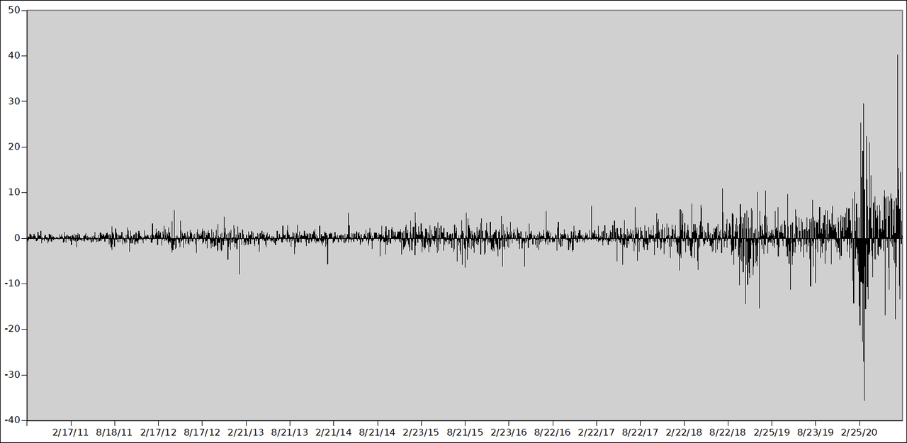
Notice that the differences chart looks like more of a stationary process than the price chart did. This should make it easier to compare market behavior over different time frames. But notice that we still have a problem. The earlier times have a much lower variance than the later times. This isn't because the volatility increased; it's because the share price increased. But, except for granularity, the number of dollars you can put in doesn't depend on the share price.
In the next open column, add a "returns" header.
Then scale the difference by the previous day's price to get the percentage return.
In this example, you would enter the formula =H3/F2 in the cell I3, and fill down.
Then select the returns column and change its display style to percentage.
This is the percentage profit or loss you would get for holding a portfolio of this asset for one day, regardless of how many shares.
Now plot the chart for "returns". You should get something like this:
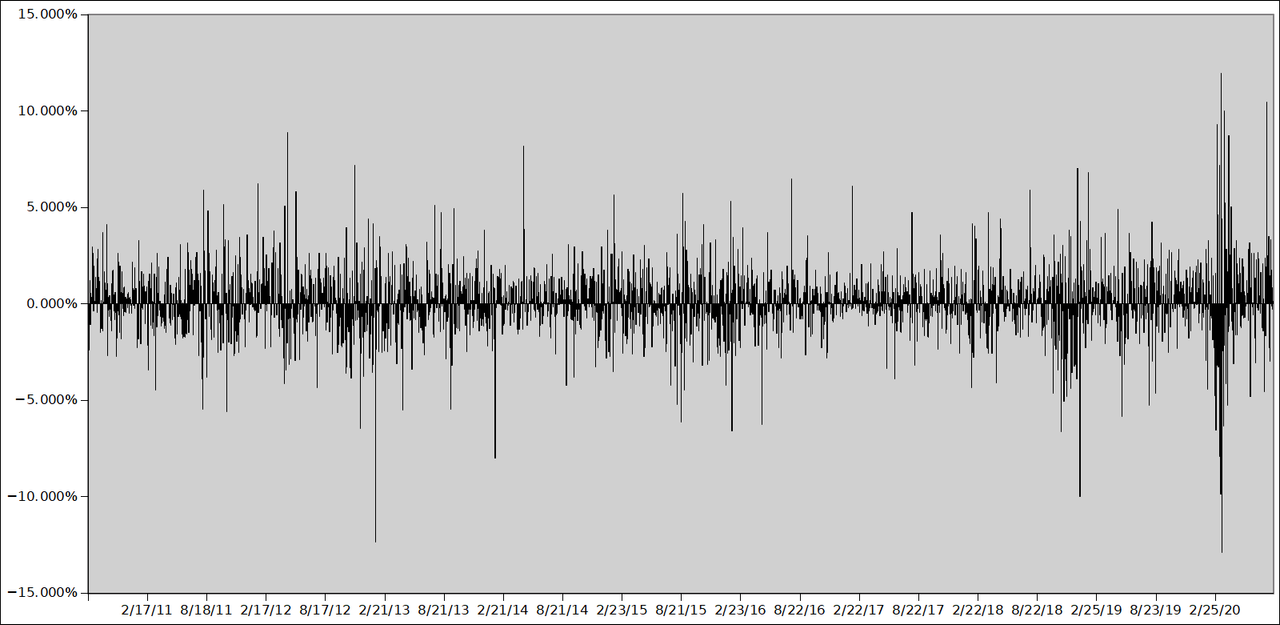
Notice that the process looks very stationary now. You can more easily compare the behavior of the asset at different times, and also between assets by charting them this way.
From Daily Returns to Distribution Histograms
For a typical stock, this chart will look very noisy.
We can get a better handle on "random" data by using the usual statistical methods. Try computing some summary statistics. Note the skewness and variance. Your spreadsheet should have functions for these.
The geometric mean of returns is a more useful statistic than the arithmetic mean.
But this is not the right form to compute it.
In the next open column, add a "factors" header.
Add one to the returns.
In this example, you would use the formula =1+I3 in the cell J3, and fill down.
Multiplying that factor by your portfolio value yields the portfolio value for the next day.
If the geometric mean of these factors is over 1,
then you have a positive expectancy for buy-and-hold.
We can also plot the distribution of returns as a histogram. In Gnumetric, you can find this feature in the statistics menu. One-tenth the number of rows is probably a reasonable bin count (Gnumetric calls them "cutoffs"), but the bars can get too thin to see well if you use too many.
You should get something like this:
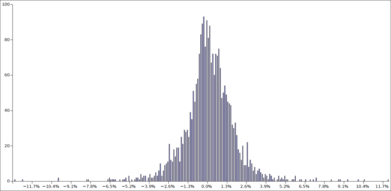
Notice that it resembles a normal distribution, but it's not perfect. There are extreme outliers, or fat tails. Most days it doesn't move very much. There's a bit of negative skew.
Autocorrelation Effects
One form of exploitable non-randomness that's easy to look for is autocorrelation. This means that if you shift the data by a certain time, you may observe a dependence between the shifted data and the original. In other words, there's a tendency to trend or to revert to the mean. Pure noise doesn't show this property, although, due to chance, the correlation would not be zero.
In the next open column, add a "shifted 1" header. We want to ask the question, was the previous day's return at all predictive of today's?
In this example, you would use the formula =I3 in cell K2, and fill down.
Now "shifted 1" should have the same data as "returns" but shifted up by one row.
Select the "returns" and "shifted 1" columns and find "correlation" in the statistics menu.
You can also plot the resulting table as columns.
We see that there's about a -0.057 correlation for AAPL in this time frame,
in other words, a small mean-reversion tendency.
It's small. Is this statistically significant, or what we'd expect from noise? If it's just noise, there's really no reason to expect this to hold in the future. Is it a big enough effect to exploit after paying spread and commissions? These are questions to keep in mind.
Let's try this with the index.
In a new Gnumetric window, open the index data (SPY in this example).
Copy the columns you added
and paste them in the same positions in the new window
to apply our formulas to the SPY data.
Compute the correlation table again. Notice anything different?
The correlation is almost -0.15. That's a much stronger effect. Is this significant or due to noise?
Collecting directional alpha in a single asset is hard mode. By using an index ETF, we're looking at a basket of multiple assets instead, and got a much stronger mean-reversion effect.
An edge doesn't have to be all that big to make money over time, if you have the discipline to trade it systematically.
The difference was already that noticeable
just by using an ETF that tracks a basket instead of a single stock.
Does SPY have the strongest effect?
Try others and see!
Let me know what you find in the comments below.
But there's no reason to think any of the available ETFs are optimal. You can get even stronger mean-reversion effects with a basket of assets you specifically select and balance to behave that way. Actually finding those is a bit of a trick. And trading them can get a bit more complex. But that's a topic for a later post.
You can also try shifting by different amounts. You can add a "shifted 2" and "shifted 3" column, and so on, and plot the correlations all at once.
Conditional Return Distributions
So we've found what appears to be some non-randomness in market behavior. Is it exploitable?
We can plot a histogram to show the returns distribution for a strategy, instead of a single asset.
Let's use the index ETF, because it had a stronger effect. The basic strategy will be to hold only if the previous day's close was negative. Otherwise, our return will be zero, because we're holding cash instead.
In the next open column,
add the header "strategy returns".
In this example, that's =IF(K3<0, I3, 0) in cell L3,
which means "if 'shifted 1' is negative, then the return is as before, otherwise zero."
Let's plot the histograms together. Select the "returns" and "strategy returns" columns, and find "histogram" in the statistics menu.
You should get something like this:
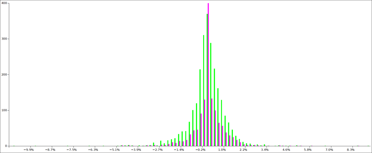
I've adjusted the colors and zoomed in on the Y-axis a bit. That big spike in magenta goes much higher. The green histogram is the original returns. The magenta is the strategy. The spike is from the zeros, which is the most frequent bin for our strategy. Notice that for the strategy, the right side of the zero line tends to be higher. The green histogram shows the opposite effect. That's the strategy exploiting the mean-reversion effect. Notice also that we escaped some of the most negative outliers.
Plotting conditional histograms like this is a good way to see what effect a condition has on return distributions.
There are many other simple conditions you might try. Does it work better if you use some cutoff more negative than zero? Maybe the effect is bigger, but that would also increase the number of zero returns. Maybe it's worth it, maybe it isn't.
Those signs and portends I mentioned before. How do you know how to use them? How do you know if they're effective? You can make a conditional histogram based on whatever signal, and see what effect it has on returns.
A word of caution. You can stack a few rules to get better distributions, but the more ad-hoc you make your strategy, the more likely you're overfitting to the noise. Plot simple rules independently before you plot the combined strategy. Keep your strategies to just a handful of simple rules.
The idea isn't to optimize your strategy's parameters, as that will risk an overfit, instead try the obvious rule for the effect you want to exploit, and see if perturbations to the parameters make the effect disappear. If so, it was probably noise. We're not interested in trading any effect so fragile. We'd rather trade what's likely to hold up in the future. Any monkey can optimize a strategy on past data. But we can't trade in the past.
Also try the rule on different time frames. If it works on old data, but not recent data, then maybe the pattern no longer holds. If it inverts frequently, maybe it's just noise.
Let's try some summary statistics for the strategy vs the original. Also make a "strategy factors" column and compute the geometric mean. What do you find? How does it compare? Also look at the variance, and consider leverage. Even though the absolute returns may be lower, is the Sharpe ratio better? If so, we can leverage up to compensate without adding much risk.
Experiment with these and compare notes with each other in the comments below. If any of you are statistics people, I'd like to hear your thoughts about statistical significance, and how we can apply Bayes' rule to this kind of analysis.
If you find a nice effect, check the quant/finance literature on Google Scholar. If someone else has found it too, you can be more confident that you've found a legitimate edge, and you're not just chasing ghosts in the noise.
18 comments
Comments sorted by top scores.
comment by Alexei · 2020-08-23T23:15:33.457Z · LW(p) · GW(p)
Hmm, I find histograms pretty unhelpful if you're trying to eye them. Seems like it would be better to take your strategy and plot the cumulative returns (with fees and without).
Replies from: gilch, None↑ comment by gilch · 2020-08-24T01:17:20.108Z · LW(p) · GW(p)
I disagree. I do, of course, run a backtest before trading, and ultimately with simulated fees and spread, yes. But when looking for new alphas, I don't do that first.
I don't just eye the histograms. I compute summary statistics. I also plot two at once to see where they differ, and maybe plot a bell curve on top of the histogram to see where it differs.
It's so easy to get in a cycle of optimizing backtests but this will almost always overfit. I want to be sure the effect exists first, in isolation, before I try to trade it.
We're trying to reverse-engineer the behavior of a "random variable" (hopefully plus some exploitable non-randomness) from its outputs. Maybe this is easier with an immature, less-efficient market like crypto (in which case, I want to figure out how to trade it too), but there is so much noise in what I'm trading, that the exploitable effects are very hard to see in a backtest. The signal-to-noise ratio is too low.
I think the best way to illustrate this would be with a simulation. Model the price as a random walk with an appropriate distribution (normal-ish, depending on how realistic you want to be), plus some signal (in the simple case of collecting the risk premium, just a constant drift) and backtest that. You'll find that with realistic parameters, the cumulative returns from a backtest are highly variable, depending on your random seed. I just can't trust it.
I don't know if you've read HPMOR yet, but remember the scene with the 2-4-6 test [LW(p) · GW(p)]? Read it if you haven't yet, I don't want to spoil it for anyone.
It's a good illustration of what's required of scientific thinking. How do you go about building an accurate model of something? What cognitive biases get in the way?
Suppose I ran one of those simulations, and gave you the output as price data. Remember, this isn't a stock, and I know exactly what the underlying distribution is, because I made it on a computer. Maybe I added some exploitable non-randomness. How confident would you be in knowing that distribution from running a backtest? How would you find the exploit? How confident could you be in your bet size? If I then took your strategy and ran it using fresh data from the simulator (with the same distribution but a new random seed), how confident could you be that your strategy would perform well?
You don't have to be 100% accurate to make money, but you have to be accurate enough, and more accurate is better. When the noise is very loud, it takes a lot of data to infer a distribution like that with much accuracy. Often more than is available from a single instrument.
comment by ChristianKl · 2020-08-24T10:22:37.741Z · LW(p) · GW(p)
If someone else has found it too, you can be more confident that you've found a legitimate edge, and you're not just chasing ghosts in the noise.
If the EMH is true, I would expect every effect that's in the literature soon to be removed from the market by market participants. Why do you believe that won't happen?
Replies from: gilch↑ comment by gilch · 2020-08-24T17:20:04.487Z · LW(p) · GW(p)
If the EMH is true,
First, I don't believe the EMH is true. [LW · GW] It's an approximation at best.
I would expect every effect that's in the literature soon to be removed from the market by market participants.
I only object to "soon". Alphas do decay and you have to keep finding new ones, but it can take years before it stops working.
Why do you believe that won't happen?
Alphas don't persist simply because of secrecy. That's a misconception. There are cases published in the academic literature that still show up in recent price data. Longer-lived alphas often persist because exploiting them is somehow distasteful (e.g. a skewed risk profile, capital constraints, awkward setup). But even for short-lived alphas, new cases of known inefficiencies can reoccur for known reasons, and if you get there first, you can be the one to exploit them. (E.g. The pump-and-dump fade.) Not all markets are liquid enough to be efficient, even approximately. Sometimes there are more whales than sharks.
comment by PatrickDFarley · 2020-09-23T03:35:07.811Z · LW(p) · GW(p)
I tried out a few of these. Strongest correlation I found was between SPY-1 and NDX, fwiw. It feels like I shouldn't be doing so much of this work in spreadsheets though, because of the time cost. Is this the kind of thing Quantopian is mainly used for?
Replies from: gilch↑ comment by gilch · 2020-09-23T17:02:31.074Z · LW(p) · GW(p)
I only demonstrated with a spreadsheet because I expect that's something most of the audience would understand. But spreadsheets have trouble handling the amount of data we need to work with. As I said, I would probably be using Python myself. Anaconda comes with enough to do this stuff. Pandas/Numpy, matplotlib, scipy, statsmodels. I kind of prefer HoloViews for charting. I also use the AlphaVantage API to get data sometimes.
I have looked at Quantopian a bit, but haven't really gotten into it yet. From the documentation, it does look like it can do the stuff I'm talking about.
Replies from: PatrickDFarley↑ comment by PatrickDFarley · 2020-09-23T18:07:43.450Z · LW(p) · GW(p)
Thanks gilch, I've got a lot to look into but I'm kind of excited to try this stuff out. Your series + some other materials I've been watching has convinced me that finding alpha isn't as impossible as I thought.
Do you currently use any strategies whose edge you've confirmed by automated backtesting?
Replies from: gilch↑ comment by gilch · 2020-09-24T04:13:52.060Z · LW(p) · GW(p)
Yes, I'm trading several of those right now, including a couple that I've hinted at in the sequence so far.
Replies from: qbolec↑ comment by qbolec · 2022-01-09T19:02:42.500Z · LW(p) · GW(p)
Hello glich! Thanks for writing this whole series. When I've first read it a year ago, I thought to myself, that instead of impulsively going to implement it right ahead, I'll wait one year to hear from you about how your strategy worked for you, first.
So.. How are you doing?
Replies from: gilch↑ comment by gilch · 2022-01-22T05:34:12.730Z · LW(p) · GW(p)
So far, so good. Last year, I was up 27% at the peak. By the end of the year profits were closer to half of that. This year (2022) has been a loser so far, but we're not even one month in yet, and it hasn't been enough to wipe out my gains yet. My Forex bot is not doing well, having lost all profits so far and again lost about that amount, but that's a relatively small part of my overall portfolio.
This is all within expectations.
I stand by my basic outline from the series, but I've refined details a bit and had a bit more insight, particularly about Nassim Nicholas Taleb's barbell strategy, which has made me more willing to take small, speculative bets, and more concerned about tail risk.
A lot of this volatility is due to a substantial (~15%) speculative bet on Ether. I'm HODLing. Bitcoin has a futures ETF available in the US, so it's only a matter of time before Ether joins, and the merge to proof-of-stake should be interesting. I expect a lot of volatility in Ether when those happen, especially if it's around the same time.
Some of my winning plays were small bets on WSB short squeezes. I kind of don't have time for the more active strategies due to work now, but most of my income is going to savings and basically all of my savings are invested in some kind of asset, and I have no plans to change that. I am hoping to gain financial independence so I can retire early. How early remains to be seen.
I've kind of co-founded a LessWrong Investing Seminar, which amounts to a private chat room for interested Rationalists, and an Etherpad documenting plans, tips, tricks, and accumulated know-how, but I have been doing most of the writing in that document. Activity level in the chat varies, but it's still active. I might write up some of what's been going in to that. I've come up with improved strategies, which look great in backtests, but it can take years for these to play out in real life.
Replies from: joshjacobson, aaron-kaufman, qbolec↑ comment by Josh Jacobson (joshjacobson) · 2022-01-25T21:28:36.965Z · LW(p) · GW(p)
It's interesting that you cite last year as evidence of your trading going well, at a 13.5% gain, while the S&P 500 (SPY) total return for 2021 was 28.7%. Can you elaborate on your perspective given that the market performed so well in general?
Replies from: gilch↑ comment by gilch · 2022-01-30T04:40:46.394Z · LW(p) · GW(p)
I think it was actually closer to 17% by the end of last year, but mostly unrealized and this is a very rough estimate.
Good point though. Why not hold 100% SPY? Serious question! That is actually not an unreasonable long-term strategy.
But are you adjusting for risk? Stocks outperform most other liquid asset classes. The exception right now seems to be crypto. Why not YOLO 100% Bitcoin? Again, a serious question. I'm less confident that is a reasonable strategy, but people do it! Does that seem reckless? It kind of does to me. Bitcoin had an 82% (!) drawdown around 2018. Yet Bitcoin absolutely dwarfed returns from SPY in 2017. It's really off the chart. 1500%. Seriously. SPY was up like 22%, which is pretty good for SPY, but it doesn't even compare. A fluke? Well, even as recently as 2020, Bitcoin was up 290% compared to SPY's 18%.
SPY isn't all that conservative either. It has had a 50% drawdown before, and over its lifetime, its compound annual growth rate is only 9%. Its Sharpe ratio is 0.6. It's not hard to do better than that in a backtest.
For example, 75% SPY and 75% TLT (borrowing the -50% cash) has both higher returns and lower volatility than 100% SPY, with a Sharpe ratio of 1.0. Its worst drawdown was only 27%. To be fair, TLT is not quite as old as SPY, which had a slightly better Sharpe of 0.7 over TLT's lifetime. The 75/75 portfolio clearly would have been a better choice overall. But some years it underperformed SPY by a significant margin. 2021 happened to be one of those years.
My portfolio is performing within expectations.
↑ comment by 25Hour (aaron-kaufman) · 2023-06-20T03:18:00.259Z · LW(p) · GW(p)
Hey, I really appreciated this series, particularly in that it introduced me to the fact that leveraged etfs (1) exist and (2) can function well as a fixed proportion of overall holdings over long periods.
Is the lesswrong investing seminar still around/open to new participants, by any chance? I've been doing lots of research on this topic (though more for long-term than short-term strategies) and am curious about how deep the unconventional investing rabbit hole goes.
comment by Capybasilisk · 2020-08-24T10:16:41.441Z · LW(p) · GW(p)
Are random trading strategies more successful than technical ones?
In this paper we explore the specific role of randomness in financial markets, inspired by the beneficial role of noise in many physical systems and in previous applications to complex socioeconomic systems. After a short introduction, we study the performance of some of the most used trading strategies in predicting the dynamics of financial markets for different international stock exchange indexes, with the goal of comparing them with the performance of a completely random strategy. In this respect, historical data for FTSE-UK, FTSE-MIB, DAX, and S&P500 indexes are taken into account for a period of about 15-20 years (since their creation until today).
...
Our main result, which is independent of the market considered, is that standard trading strategies and their algorithms, based on the past history of the time series, although have occasionally the chance to be successful inside small temporal windows,on a large temporal scale perform on average not better than the purely random strategy, which, on the other hand, is also much less volatile.In this respect, for the individual trader, a purely random strategy represents a costless alternative to expensive professional financial consulting, being at the same time also much less risky, if compared to the other trading strategies.
comment by Gordon Seidoh Worley (gworley) · 2020-08-25T18:40:05.730Z · LW(p) · GW(p)
Although you make a case against divining what to do from charts, I think there might still be a case for doing things like this.
I think this because I rely heavily on inference from charts to do my job, but these are charts telling me about the behavior of computer systems via telemetry rather than stocks. Now, there's some big differences here to be sure. I'm trying to infer the behavior of a mostly deterministic thing that, while complex, is complex like a clock rather than complex like a school of fish.
Nonetheless, this suggests to me that charts should still be useful for inferring things about how the market works and then being able to use that model to create a strategy. To the extent it doesn't work, I would say you probably need more and better charts to help you make sense of what's going on, since that's usually the answer in my world, rather than that things are just random and you can't find evidence of what's happening.
Maybe the argument is something like financial markets have so much noise that you're more likely to accidentally overfit to noise rather than find real patterns that let you infer a useful model, but if that's the case that's a problem everywhere, and you just have to get more aggressive about dealing with it up to some limit where there's simply not enough signal to determine anything useful.
Replies from: gilch↑ comment by gilch · 2020-08-25T19:04:23.091Z · LW(p) · GW(p)
Maybe the argument is something like financial markets have so much noise that you're more likely to accidentally overfit to noise rather than find real patterns that let you infer a useful model
That is pretty much my argument, yes.
Emotional trading is such a danger that I also want my trading to be in principle something that I could program into a computer, even if I do, in practice, execute the trades manually. This isn't compatible with "eyeballing it".
I do look at price charts. I use Heikin Ashi candles, Bollinger bands, probability cones, moving averages, volatility graphs, and I even eyeball support and resistance levels. But I mostly don't expect to predict the future with these. It's more about noticing when my initial assumptions have been violated, by past behavior.
but if that's the case that's a problem everywhere, and you just have to get more aggressive about dealing with it
I thought that's what I was doing. What else would you suggest?
up to some limit where there's simply not enough signal to determine anything useful.
I think this is the case in some markets. You can still sometimes get enough signal for alphas that affect multiple assets in similar ways, by trading ensembles.