Using smart thermometer data to estimate the number of coronavirus cases
post by Unnamed · 2020-03-23T04:26:32.890Z · LW · GW · 8 commentsContents
  Kinsa Smart Thermometer Dataset
  Estimating the Number of Coronavirus Infections in the US
  My Estimation Method, in Brief
None
8 comments
Kinsa Smart Thermometer Dataset
Kinsa is a company that makes smart thermometers. A few years ago, they found that they could use the data that they got from their smart thermometers (most importantly the temperature reading and location of the user) to track flu trends across the United States. (FitBit has done something similar.)
Kinsa's data science team has now turned their attention to Covid-19 trends and started a tracking website using their thermometer data, using methods which they explain in more detail on their technical approach page. It looks like the most impressive thing that they've been able to do with this dataset so far is to identify new hotspots before other people do, like the increase in cases in southern Florida. But potentially there are a lot of other things that can be done with these sorts of data.
Estimating the Number of Coronavirus Infections in the US
One of those other things which might be doable with these sorts of data: coming up with more accurate estimates of the number of people with coronavirus. Testing in the US (and many other places) is spotty and delayed a great deal, estimating the number of infections based on the number of deaths involves a very long delay and a bunch of assumptions, etc. But if you can count the number of people in America with a fever (or extrapolate from a sample), and subtract off the baseline estimate of how many fevers you'd expect from influenza or other causes, then you can get an estimate of the number of people in the US with a fever due to coronavirus. And that gets you close to an estimate of the total number of coronavirus cases.
The coronavirus tracking website that Kinsa set up is already doing much of this - their graph (also shown below) shows something like the number of people with a fever and the baseline expected number of fevers.
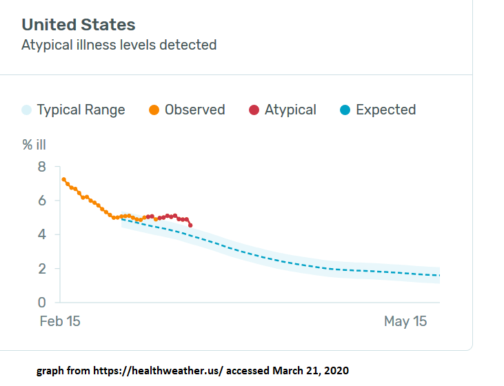
So I decided to give it a try and use their graph to estimate the total number of coronavirus cases in the US.
My calculation is here, a longer (more "thinking aloud" style) writeup of my method is here, and a more concise summary of what I did is below.
It's a fairly rough first-pass analysis, which may contain errors, and could definitely be improved with some more work. The number I got at the end is that about 1% of Americans have gotten coronavirus, through March 20.
My Estimation Method, in Brief
The graph above shows something like "number of new fevers" (on an unclear scale labeled "% ill") and Kinsa's estimate of the expected number of fevers if there was no coronavirus. So the gap between the two lines represents something like the number of new fevers each day due to coronavirus. That trend has an odd shape for a pandemic: it increases and then levels off. I suspect that this is because, once people start taking precautions to avoid coronavirus, the number of flu cases drops dramatically, so their estimated baseline gets farther and farther from reality (of # of flu cases) and coronavirus accounts for a larger and larger number of the new fevers. You can view the regional trends by clicking on particular counties; regions like the SF Bay Area and Seattle have a similar shape on earlier days. The SF Bay Area is actually now anomalously below baseline in number of new fevers on March 21.
I decided to deal with this by focusing on the trend up until March 14, and extrapolating from there. (It would be even better to do this separately for each county and then aggregate them.)
Next step: making sense of the y-axis. A little bit of digging showed that it's from their flu work, where they used their data to fit a particular measure of flu prevalence that the CDC uses, which is ILINet data (explained partly down the page here). A little bit more digging on the relationship between this number and the number of flu cases reported by the CDC (as seen headlines like this) suggests that 1 point on the scale corresponds to roughly 75,000 new flu cases that day (which probably means about 75,000 new fevers). More detailed explanation of where that number comes from in my longer writeup.
So the gap of 0.79 scale points between observed and expected on March 14 corresponds to about 60,000 excess new fevers that day. Which we're guessing are entirely due to coronavirus. Using either their data for previous days, or assumptions about the growth rate in cases, we can turn that into an estimate in the cumulative total number of feverish cases as of that day. I tried both and got numbers of 470,000 and 370,000, so let's call it about 420,000 total cumulative cases through March 14.
But this is only counting the coronavirus cases that do get a fever, and (more importantly) it is only counting them when they get the fever. My guess is that a bit more than a doubling time passes between infection and fever, and also adjusting for the cases that never get a fever, the total number of coronavirus infections on March 14 was about 3x the number of feverish cases, or about 1.3 million.
Extrapolating forward assuming a 4-day doubling time gives an estimate of 3.6 million cases in the US through March 20, or 1.1% of the population.
So that's the basic method and estimate. The longer writeup goes into more detail about each step, and includes various things things I'm still confused or uncertain about and ways in which this analysis might be wrong. For instance, maybe concerns about coronavirus are causing people to take their temperature more often, which is sufficient to cause an increased number of measured fevers, and a large part of the upwards trend line is due to that rather than to actual coronavirus cases.
I'm interested in improving this estimate, or having other people go off and do their own estimate. And I'm especially interested in people finding more good things to do with this sort of dataset.
8 comments
Comments sorted by top scores.
comment by ErickBall · 2020-03-24T01:22:25.913Z · LW(p) · GW(p)
I'm confused about the nature of the raw data here--if it's just spontaneous temperature-measurements, why would we expect it to show anything meaningful? They're showing a "% ill" which is presumably the percentage of people who took their temperature with a Kinsa thermometer recently who have a fever. But people generally only take their temperature when they think they might be sick. In a normal year, after calibration against some sort of ground-truth, I can see how you might still be able to use the data to track flu rates. But during a pandemic, won't people's pattern of temperature-taking completely change? I've taken my temperature way more in the last two weeks than I would normally (which is close to zero) and I bet the same is true for many other people. So the base rates will have changed a lot.
Replies from: ChristianKl↑ comment by ChristianKl · 2020-03-24T07:47:10.032Z · LW(p) · GW(p)
Plenty of women take their temperature daily for getting knowledge about their period. It's plausible that Kinsa has enough daily users to make these kinds of predictions.
comment by Bucky · 2020-03-23T09:45:29.623Z · LW(p) · GW(p)
I think it would be good practice to add the results of your sensitivity analysis into your summary here. If I'm understanding your sheet correctly the range found from the sensitivity to uncertainty in baseline rate of fever gives COVID-19 numbers of 0.9 - 7.0 million cases?
comment by Elizabeth (pktechgirl) · 2020-03-23T18:18:39.372Z · LW(p) · GW(p)
This is great, thank you.
It seems like the biggest gap is that it can't detect what the non-COVID fever rate "should be" in the presence of interventions like social distancing and intense handwashing. So something ends up looking normal when it's really "decreased fever from decreased flu from social distancing + increased fever from COVID", which I would guess is what's going on in the bay and Seattle.
Replies from: Unnamed↑ comment by Unnamed · 2020-03-23T19:59:20.799Z · LW(p) · GW(p)
I think that's right. Although the data still can tell us something after we get into that ambiguous range where it's hard to distinguish increasing covid and decreasing flu.
One nice thing about this pattern is that it provides some evidence that the anti-covid interventions are reducing the spread of fever-inducing diseases. And the size of the drop in total fevers tells us something about how well they're working on the whole, even if it doesn't tell us the precise trend in covid cases.
Another thing that might be possible is to find other sources of data on the actual prevalence of flu, and use that to come up with a better "baseline" which reflects actual current conditions rather than an estimate of the trendline in the counterfactual world where there was no coronavirus pandemic.
A third thing is that 0 is a lower bound on the number of non-covid fevers, so the trend in total fevers is an upper bound on the number of covid cases.
This third thing already tells us something about Seattle (King County). Their peak in excess fevers happened March 9 at 1.76 scale points (observed minus expected), and the March 22 data show the total fevers at 2.77 scale points. As an upper bound, if those are all covid fevers, that is 1.6x as many new daily cases on March 22 compared to March 9. That's 13 days, and not even a full doubling in the number of daily new fevers. Which suggests that suppression there is either working or coming very close to working (even though the number of confirmed cases has kept curving upward, at least through March 21).
comment by Douglas_Knight · 2020-03-23T18:27:07.468Z · LW(p) · GW(p)
Is this plausible? Look at the fine-grained results.
Hot spot in New York. ✔
No hot spot in Seattle. ✘
The biggest hot spot is Florida. The State is handling this very badly, so it is plausible that it the worst but not yet recognized; it would be useful to have an alternate source of information. But look at the time series. It peaked in Florida (all counties show the same) on March 19th and declined afterwards. Given how badly Florida has handled this and the delay from infection to fever, it doesn't seem plausible to me that this measures covid-19.

↑ comment by Unnamed · 2020-03-23T19:38:56.459Z · LW(p) · GW(p)
If you look at the time series for King County (Seattle area), it shows a spike peaking on March 9 with the upward trend beginning sometime around Feb 28 - Mar 2.
I think the pattern of a spike and then flattening & maybe decline (which has happened at different times in different regions) reflects a drop in the number of influenza cases, as people's anti-covid precautions also prevent flu transmission. So the baseline estimate of how many new fevers there would be if there wasn't a coronavirus pandemic doesn't actually represent the number of non-covid fevers, because there are fewer non-covid fevers than there would've been without this pandemic.
Elizabeth's comment [LW(p) · GW(p)] also describes this.
Replies from: Douglas_Knight↑ comment by Douglas_Knight · 2020-03-23T22:56:49.721Z · LW(p) · GW(p)
OK, maybe it does show a hot spot in Seattle. (though I'm not convinced)
But what about Florida? It seems to me that when you predict a million coronavirus cases, your method is predicting that half of them are in Florida. So you really have to look closely at the state. Surely the decline starting on March 19 does not represent the very minimal social distancing imposed on March 17.