Do websites and apps actually generally get worse after updates, or is it just an effect of the fear of change?
post by lillybaeum · 2023-12-10T17:26:34.206Z · LW · GW · 7 commentsThis is a question post.
Contents
  Answers
    27 quanticle
    25 cata
    21 clone of saturn
    19 Garrett Baker
    12 BrassLion
    10 MondSemmel
    9 Tiuto
    7 Dagon
    5 gwillen
    4 Sinclair Chen
    1 StartAtTheEnd
None
7 comments
I could get quite in depth about this but I'm going to assume most people have a fair amount of experience with this subject. Some examples to keep in mind so you have context for my point are Discord (new mobile app and changes to its' featureset over the years), Reddit (old.reddit compared to new), LessWrong (discussions feature).
Crux of my question is this: separate from enshittification due to capitalistic forces (changes made to attempt to please investors, create endless growth, make more money generally), are changes to apps and websites worse on-average in some clear and obvious way than their previous versions, or is the evident outrage for changes to the UI and concept of these platforms from a general 'fear or dislike of change' present in humans?
For example, let's point to things like logo and brand typeface changes. This is a change that has the least amount of actual effect on the average user of a platform, the usability of Reddit doesn't change at all between Logo A and Logo B (the new logo is on the right).

But a precursory search shows that the reaction is mostly negative.
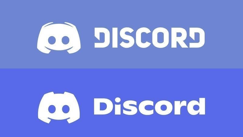
This was true for Discord as well (new logo below.) When the logo and typeface changes for Discord were announced, the reaction was overwhelmingly negative.
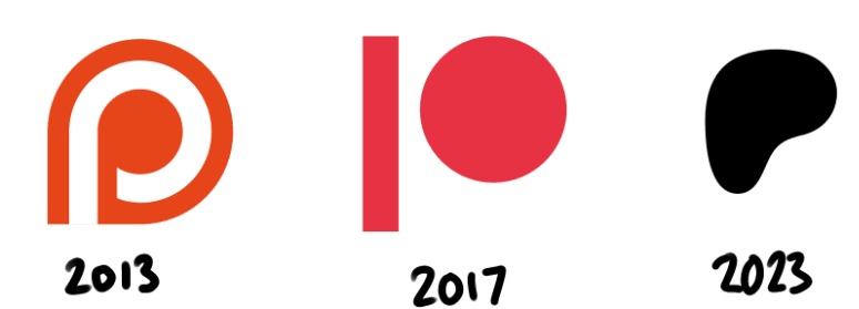
Last example here, this is the Patreon logo's recent change. People are so opposed to this change it's kind of hilarious. It's used as an indicator that the brand identity of corporations is trending towards amorphous blobs lacking any personality or identity. It's hard to find anyone who claims that the new Patreon logo is any good at all.
To be clear about the previous section: I don't think it's valuable to wonder whether the logos are better or worse. I think the previous logos are more striking and artistically interesting, but that's the purpose of my question. My intent is to point to the fact that the public response to these logo changes is almost always negative.
It's pretty easy to tell that when a company's logo changes, on average, people don't like it. I could go on by posting the logo changes of Pepsi, Coke, Burger King, facebook (oh, I mean F A C E B O O K), etc... if anyone can point out a case where a logo changed and received a positive response, I'd love to hear about it, but it's more or less besides the point.
My main question is whether the logo change outrage is indicative of the larger effect of people identifying with an app, website or brand and then feeling betrayed when that identity changes, or if the changes are actually negative on the whole, and their criticisms are valid.
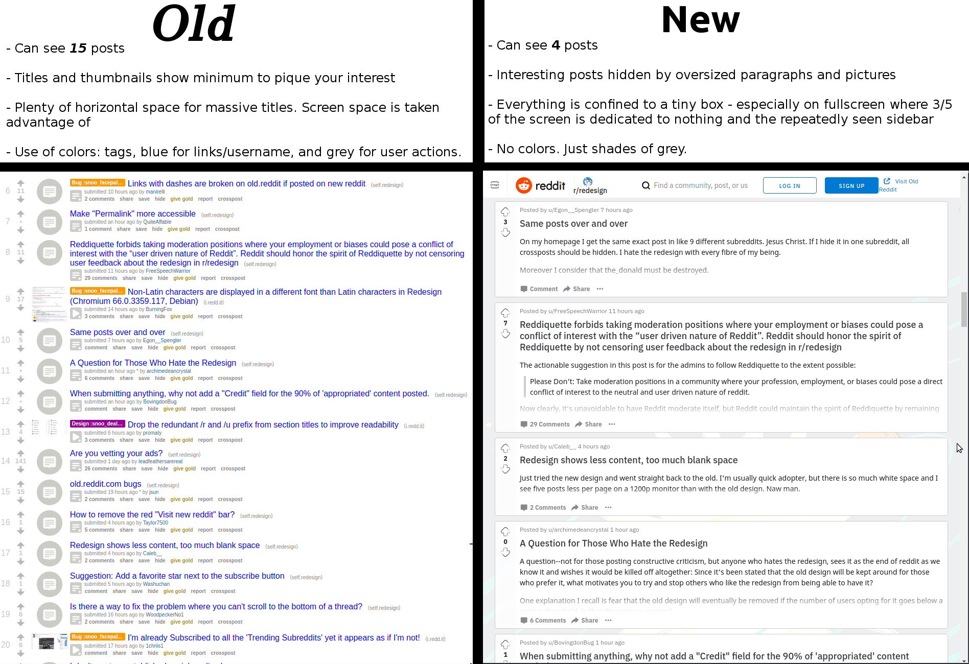
And if the changes are actually just bad by and large (I'm inclined to agree with the above infographic about Reddit) then why do websites get worse, rather than better, over time? Is it entirely the previously mentioned enshittification and related to 'market forces', or is it something else? Is it just really hard to improve a public-facing service that's already good by making incremental changes? Do UI/UX designers lack some understanding of good design, generally? That seems unlikely to me. Maybe they just often lack the context of actually using the given app regularly.
I'm a little worried that this is a pointless or meandering question. I'm just hoping to get some good discussion going and update my ideas about this sort of thing somewhat. Thanks for reading!
Answers
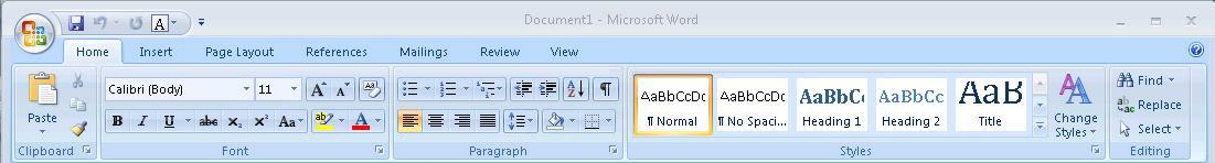
A great example of a product actually changing for the worse is Microsoft Office. Up until 2003, Microsoft Office had the standard "File, Edit, ..." menu system that was characteristic of desktop applications in the '90s and early 2000s. For 2007, though, Microsoft radically changed the menu system. They introduced the ribbon. I was in school at the time, and there was a representative from Microsoft who came and gave a presentation on this bold, new UI. He pointed out how, in focus group studies, new users found it easier to discover functionality with the Ribbon than they did with the old menu system. He pointed out how the Ribbon made commonly used functions more visible, and how, over time, it would adapt to the user's preferences, hiding functionality that was little used and surfacing functionality that the user had interacted with more often.
Thus, when Microsoft shipped Office 2007 with the Ribbon, it was a great success, and Office gained a reputation for having the gold standard in intuitive UI, right?
Wrong. What Microsoft forgot is that the average user of Office wasn't some neophyte sitting in a carefully controlled room with a one-way mirror. The average user of Office was upgrading from Office 2003. The average user of Office had web links, books, and hand-written notes detailing how to accomplish the tasks they needed to do. By radically changing the UI like that, Microsoft made all of that tacit knowledge obsolete. Furthermore, by making the Ribbon "adaptive", they actively prevented new tacit knowledge from being formed.
I was working helpdesk for my university around that time, and I remember just how difficult it was to instruct people with how to do tasks in Office 2007. Instead of writing down (or showing with screenshots) the specific menus they had to click through to access functionality like line or paragraph spacing, and disseminating that, I had to sit with each user, ascertain the current state of their unique special snowflake Ribbon, and then show them how to find the tools to allow them to do whatever it is they wanted to do. And then I had to do it all over again a few weeks later, when the Ribbon adapted to their new behavior and changed again.
This task was further complicated by the fact that Microsoft moved away from having standardized UI controls to making custom UI controls for each separate task.
For example, here is the Office 2003 menu bar:

(Source: https://upload.wikimedia.org/wikipedia/en/5/54/Office2003_screenshot.PNG)
Note how it's two rows. The top row is text menus. The bottom row is a set of legible buttons and drop-downs which allow the user to access commonly used tasks. The important thing to note is that everything in the bottom row of buttons also exists as menu entries in the top row. If the user is ever unsure of which button to press, they can always fall back to the menus. Furthermore, documents can refer to the fixed menu structure allowing for simple text instructions telling the user how to access obscure controls.
By comparison, this is the Ribbon:
(Source: https://kb.iu.edu/d/auqi)
Note how the Ribbon is multiple rows of differently shaped buttons and dropdowns, without clear labels. The top row is now a set of tabs, and switching tabs now just brings up different panels of equally arcane buttons. Microsoft replaced text with hieroglyphs. Hieroglyphs that don't even have the decency to stand still over time so you can learn their meaning. It's impossible to create text instructions to show users how to use this UI; instructions have to include screenshots. Worse, the screenshots may not match what the user sees, because of how items may move around or be hidden.
I suspect that many instances of UIs getting worse are due to the same sort of focus-group induced blindness that caused Microsoft to ship the ribbon. Companies get hung up on how new inexperienced users interact with their software in a tightly controlled lab setting, completely isolated from outside resources, and blind themselves to the vast amount of tacit knowledge they are destroying by revamping their UI to make it more "intuitive". I think the Ribbon is an especially good example of this, because it avoids the confounding effect of mobile devices. Both Office 2003 and 2007 were strictly desktop products, so one can ignore the further corrosive effect of having to revamp the UI to be legible on a smartphone or tablet.
Websites and applications can definitely become worse after updates, but the company shipping the update will think that things are getting better, because the cost of rebuilding tacit knowledge is borne by the user, not the corporation.
↑ comment by gwern · 2023-12-11T22:36:04.073Z · LW(p) · GW(p)
This would be an example of internal vs external validity: it may well be the case in that in their samples of newbies, when posed the specific tasks for the first time, the ribbon worked well and the benefit was statistically established to some very high level of posterior probability; however, just because it was better in that exact setting...
This reminds me of Dan Luu's analysis of Bruce Tog's infamous claim that Apple's thorough user-testing experiments proved, no matter how butthurt it makes people like me, that using the mouse is much faster than using the keyboard. This is something I don't believe: no one would argue that mousing over a GUI keyboard is faster than using an actual keyboard, so why would that suddenly stop being true of non-alphanumeric-entry tasks? When I consider some sequences of Emacs commands which are muscle memory, I can't believe Tog when he says that those keypresses actually took more than 1s and I just cognitively-blink out the delay and that's how I delude myself into thinking that the keyboard is faster.
Of course, this isn't quite what he says, even if he is clearly gesturing towards it in a bait-and-switch sort of way - he doesn't describe the experiment in the first post, but in the second, he seems to say that the experiments were done back in the 1980s with first-time Mac users (indeed, probably first-time computer users, period). At which point one goes, 'duh!' Why on earth would you expect some sort of unfamiliar Function-key task to be faster than using the mouse to click on the little GUI icon?' That would be surprising, shortcuts are always slow & awkward at first. But then it offers no evidence about the more relevant usecase: you are a first-time computer user only once in your life, but you may spend many decades using a particular OS or piece of software, and then you do want shortcuts.
Replies from: gwern, M. Y. Zuo↑ comment by gwern · 2023-12-13T00:42:29.896Z · LW(p) · GW(p)
A related issue here is the Schlitz effect (see my advertising experiments). Even if you do test, your testing is typically set up in an asymmetrical way where you are guaranteed to ratchet downward in quality.
So, if you test only on newbies, you will obviously never observe a degradation in performance for everyone else, and so you can expect to ratchet down indefinitely (some changes are strictly superior, but particularly after you pluck all the low-hanging fruit, you will now tend to be on a Pareto frontier & many changes will involve tradeoffs); but if you test on everyone else too only to check for a degradation, you still will ratchet downwards on average due to inevitable errors, where the true effect size is bad but you accept the change anyway because the point estimate wasn't too bad or it was even good. The solution here is to also experiment with improvements for everyone-else so they benefit on average, or to take a more rigorous decision-theoretic approach which sets the threshold explicitly using the long-term total costs rather than some arbitrary statistical threshold (so if you accept the risk of degradation, at least it pays off).
But if you do that, you can see that for a lot of design approaches, even when doing actual A/B testing, it is very difficult! For example, my advertising experiments find that big banner ads have harmful effects like -10%. This is, by any reasonable standard, a pretty large effect: a banner ad seems to single-handedly drive away a tenth of readers. However, to conclude this with any confidence (and I'm still not confident in this result because of the complexities of time-series testing and analysis), I need something like a million readers.
Now, imagine changing a logo: what could the effect of a logo redesign possibly be? I'd say that even 1% is stretching it, or a tenth the effect of having advertising. (I mean come on, people just don't care about logos that much and are blind to them.) But sample sizes scale badly, so you'd need much more than just 10 million readers to measure any logo effect. (Maybe >100m because it's a square root?)
A logo is, in some ways, the best-case scenario: a clean discrete change we could hypothetically A/B test per-user and track retention. And n>100m is in fact doable for a Reddit. (Google can, and has, run advertising A/B tests on billions of users, see my writeup.) But some things cannot be cleanly split by user or cohort, like the entire site functionality. It's not feasible to make multiple versions of an app or ecosystem. (Me & Said Achmiz have enough trouble maintaining simply desktop/mobile × light/dark-mode versions of Gwern.net - and that's only 4 almost-identical websites which change purely locally & client-side!) So you can't A/B test at the user unit level, and they live and die at the system level of units.
Let's consider the broad 'economic' argument: that systems as a whole will be constrained by competition, or, perhaps we should say, evolution. Can we hope for designs to steadily evolve to perfection? Not really. Consider how incredibly much variance there is in outcomes. If Reddit changes the logo, how much does that affect the 'fitness' of Reddit? Hardly at all. Even all the design decisions added up scarcely matter: an exogenous event like the Digg redesign or Gamergate or Trump has far greater effects. Similarly, it often matters much more for success to have the right timing be the first X to have an iPhone app, or to be the first Y to bribe streamers shamelessly enough to shill yours.
If we consider Reddit and all its competitors in evolutionary terms as a population of organisms which replicate and are being selected for better design (let's generously assume here that their fitness is not directly opposed to better design), what sort of increase in fitness would we expect from generation to generation? Well, an evolutionary computation strategy has extremely high variance (as an on-policy model-free reinforcement learning algorithm) and is extremely sample-inefficient. To detect a subtle benefit like a +1% increase in traffic from a better logo given the extremely high variance in Internet traffic numbers and then whatever that translates to in fitness improvements, you would need... well, millions of Reddit competitors would be a good starting point.
Needless to say, there are not, and never will be, millions of Reddit competitors in the current Internet generation.
And indeed, when we look around at companies in the real-world economy, what we see is that incompetent inefficient companies persist all the time, indefinitely. If they are replaced, it is by another incompetent inefficient company. Should any company enjoy huge success due to intrinsic advantages, it will degrade as it grows. (Remember when being a Googler meant you were an elite hacker solving the hardest web problems, rather than a bureaucrat who worked at Zoomer IBM?) We don't see companies converge under competition to do the same task almost equally efficiently - some companies are just way better, and others are way worse, indefinitely. This tells us that under existing conditions, evolution on system-level units like designs or corporations is almost non-existent due to weak connection to 'fitness' / high variance, and poor fidelity of replication. Under such conditions, the mutation load can be enormous and complexity not maintainable, and there will definitely be no 'progress' - as people discover all the time with evolutionary algorithms, you do still have to tune your hyperparameters or else it just won't work in any reasonable time. (For much more on all this, and cites for things like persistence of incompetence, see my backstop essay.)
Whatever gains may be made, whatever local optima of design can be reached, they are being relentlessly eroded away by 'mutations' which accumulate because they are not then purged by 'evolution'.
These mutations can happen for many reasons like errors in experiments as discussed above, or mistaken beliefs about the need to ensh---ttify an app, or just general bitrot/bitcreep, or inconsistent preferences among the managers/designers, or what have you, so taxonomizing them isn't too useful compared to understanding why they can persist and accumulate.
Basically, the market is unable to 'see' or 'enforce' good design. If there is good design, it is created only by using more efficient methods than evolution/markets: like model-based designers or focused experiments. But such powerful non-grounded-in-the-backstop-of-evolution methods always come with many risks of their own... You're stuck between the Scylla of absurdly inefficient grounded methods like evolution, and efficient but often misaligned methods like humans running experiments.
↑ comment by M. Y. Zuo · 2023-12-12T15:31:37.515Z · LW(p) · GW(p)
To add to this, I've never even seen a serious analysis of how changes affect intermediate or advanced users, 'power users', for any software program whatsoever.
Even for very popular software like Word.
Has anyone ever attempted such an analysis before?
I think the most basic and true explanation is that the companies we are thinking about started out with unusually high-quality products, which is why they came to our notice. Over time, the conditions that enabled them to do especially good work change and their ability tends to regress to the mean. So then the product gets worse.
Related ideas:
-
High-quality product design is not very legible to companies and it's hard for them to select for it in their hiring or incentive structure.
-
Companies want to grow for economy-of-scale reasons, but the larger a company is the more challenging it is to organize it to do good work.
-
Of course, doing nothing at all seems ridiculous, particularly so for companies whose investors all invested on the premise of dramatic growth.
-
In many cases, a company probably originally designed a product that they themselves liked, and they happened to be representative enough of a potential market that they became successful and their product was well-liked. Then the next step is to try to design for a mass market that is typically unlike themselves (since companies are usually made up of a kind of specific homogeneous employee base.) That's much harder and they may guess wrong about what that mass market will like.
↑ comment by Ben (ben-lang) · 2023-12-11T13:14:32.529Z · LW(p) · GW(p)
I think this answer is correct.
I think an important part of this model is that "Doing nothing doesn't look good to your boss." Lets imagine ten websites offering the same service, and (for the sake of argument) assume one of them has the absolute best UI it is possible for any website providing that service to ever have. That one grows, the other nine die. Do the managers/UI programmers/visuals people at the successful website company decide "lets never change anything ever again", or do they change things. Changing things is more fun, more rewarding, and easier to justify to your boss than doing literally nothing. By assumption is was perfect, so every change makes it worse.
Replies from: lahwran↑ comment by the gears to ascension (lahwran) · 2023-12-11T17:01:25.406Z · LW(p) · GW(p)
The need to justify things to your boss, rather than to your user, is a result of institutional incentives generated by having a centralized reporting structure that justifies itself to the company's main authority, typically investors.
As a control, you could look at Craigslist, which hasn't changed its appearance for about 25 years, but is still the most popular website in its category according to SimilarWeb.
And if the changes are actually just bad by and large (I'm inclined to agree with the above infographic about Reddit) then why do websites get worse, rather than better, over time?
I think the reason it seems bad is because old users like you are not who the company is trying to attract. They’re trying to attract new users. Or the marginal user. So they make their website, logo, and interfaces more to that marginal user’s pleasure. I’d claim that according to that metric, which is of course a very different metric than the pleasure of the people presently on the platform, the websites you list all did very well.
See also: The tyranny of the marginal user
↑ comment by MondSemmel · 2023-12-10T20:32:59.298Z · LW(p) · GW(p)
I’d claim that according to that metric, which is of course a very different metric than the pleasure of the people presently on the platform, the websites you list all did very well.
You'd have to provide some compelling argument that the website redesigns actually do better at this, though.
Here are two counter-arguments:
- The Schelling Fence argument: the current app had a good reason for looking like it looked, and it was battle-tested. The new design has no such advantage.
- Maybe you know your redesign will piss off your current user base, but you care more about acquiring new users. Still, this is not cost-free. For example, this reliably results in terrible review scores on app stores. And on reddit, some pissed-off reddit users used bots to delete all their old comments, which made the entire website worse for all users old and new alike.
Finally, let's take one example of a recent redesign which looks vaguely prettier at a glance, but where the functionality is just straight-up worse: Fitbit's recent app redesign (example post) made information much harder to see and interpret, and that in an app designed for health & exercise tracking.
Replies from: D0TheMath↑ comment by Garrett Baker (D0TheMath) · 2023-12-10T21:44:03.560Z · LW(p) · GW(p)
You seem possibly right, looking at some data with ChatGPT. It collected the following data:
| Year | MAUs (Millions) | Growth Rate (%) |
|---|---|---|
| 2013 | 90 | 95.65 |
| 2014 | 174 | 93.33 |
| 2015 | 199 | 14.37 |
| 2017 | 250 | 25.63 |
| 2018 | 331 | 32.40 |
| 2019 | 430 | 29.91 |
| 2020 | 619 | 43.95 |
| 2021 | 861 | 39.10 |
| 2022 | 1195 | 38.79 |
and graph:

2019 seems to have had a decrease in growth compared to 2018, maybe that's attributable to the redesign? If nothing else, the redesign doesn't look so impactful.
Replies from: gwern↑ comment by gwern · 2023-12-11T20:03:56.243Z · LW(p) · GW(p)
Where are these Reddit numbers coming from? I can't actually find 2013-2017 in the supposed sources, and they look like garbage: how do you go from a >90% annual growth rate to <15% in a single year? And when I search for relevant numbers, it looks like those early numbers might be 'unique visitors', which is usually a completely different metric from logged-in users like MAU.
Replies from: D0TheMath↑ comment by Garrett Baker (D0TheMath) · 2023-12-11T23:41:21.987Z · LW(p) · GW(p)
... I should not have trusted ChatGPT so much. Sorry & thanks for the time correcting my mistake.
Maybe the average design is bad, so good designs becoming worse after redesigns is just regression to the mean. Bad design is not the exception - bad design is the norm, and good design is the exception.
I have had the chance to watch software get made up close at several jobs, and this seems to track. Even designs that seem to be good normally aren't, and the having to add features normally makes the design worse (less usable, less clear) without a herculean effort against that tendency.
I'm about 40 pages in to Don Norman's The Design of Everyday Things, which seems to be the seminal text on this sort of thing, and even this early in the book it's clear that there's far more ways that a design can go wrong than ways than it can go right. Design is hard.
One counter-example I experienced this year: From what I can tell, Steam's client re-design (from 2023~05) was uncommonly well-received, or at least that's the impression I got from the discussion on reddit.
I think it's mostly that people complain when something gets worse but don't praise an update that improves the UX.
If a website or app gets made worse people get upset und complain, but if the UI gets improved people generally don't constantly praise the designers. A couple of people will probably comment on an improved design but not nearly as many as when the UI gets worse.
So whenever someone mentions a change it is almost always to complain.
If I just look at the Software I am using right now:
- Windows 11 (seems better than e.g. Windows Vista)
- Spotify (Don't remember updates so probably slight improvements)
- Discord (Don't remember updates so probably sight improvements)
- Same goes for Anki, Gmail, my notes app, my bank app etc.
All of those apps have probably had UI updates, but I don't remember ever seeing people complain about any of those updates. I use most of those apps every day and I hear less about their UI changes than about reddit's, a website I almost never use, people just like to complain.
How good was the Spotify UI 10 years ago? I have no Idea but I suspect it was worse than it is now and has slowly been getting better over the years.
I also looked up the old logo and it's clearly much worse but people just don't celebrate logos improving the way people make fun of terrible new logos.

↑ comment by gwern · 2023-12-13T21:42:24.454Z · LW(p) · GW(p)
Spotify apparently had a really strange approach, which may explain the improvement: https://www.reddit.com/r/programming/comments/901p0j/former_software_engineer_at_spotify_on_their/ (but also helps exemplify my comment [LW(p) · GW(p)] about how so many things are more important to fitness in market environments than design).
All companies and products get changed over time. And they're optimizing on multiple dimensions, some of which are cost and complexity of delivery, attractiveness to new users, usability by existing users, and different segments of paying customers (including, usually, advertisers and financiers).
In MOST cases, there's a selection effect of early (or current) users liking things well enough to overcome the hurdles of use, so many changes that are to optimize for other stakeholders (especially the very important potential users who haven't yet started using the product) are likely to seem counterproductive to those who find it good as-is.
Add to this the uncertainty of WHAT precisely makes it good, and what will make it better for the target subsets, and a lot of changes are just bad, but there's no way to know that without trying it. And it's known that many changes are path-dependent and change itself bothers many, so undoing a neutral or somewhat negative change (even when very negative to some users) is often seen as more costly than leaving it, and making other changes later.
↑ comment by lillybaeum · 2023-12-11T04:02:51.795Z · LW(p) · GW(p)
This is a weird and stupid question, but did you used to be an admin on Hellmoo?
Replies from: DagonOne possible factor I don't see mentioned so far: A structural bias for action over inaction. If the current design happened to be perfect, the chance of making it worse soon would be nearly 100%, because they will inevitably change something.
This is complementary to "mean reversion" as an explanation -- that explains why changes make things worse, whereas bias-towards-action explains why they can't resist making changes despite this. This may be due to the drive for promotions and good performance reviews; it's hard to reward employees correctly for their actions, but it's damn near impossible to reward them correctly for inaction. To explain why Google keeps launching products and then abandoning them, many cynical Internet commentators point to the need for employees to launch things to get promoted. Other people dispute this, but frankly it matches my impressions from when I worked there 15 years ago. It seems to me that the cycle of pointless and damaging redesigns has the same driving force.
I’m not convinced that the new reddit example is worse than the old one. They serve different purposes, the new one lets you actually read the posts without having to click in. It’s also more pretty and clean - I expect the median and modal user to like the new UI better even if it less useful to reddit powerusers.
Capitalistic forces causes companies to converge on design that most people find intuitive, and this is good
↑ comment by the gears to ascension (lahwran) · 2023-12-11T05:52:54.564Z · LW(p) · GW(p)
market forces would pressurize that. investor-owner pressure, the core of what differentiates capitalism from markets in general, require companies to do things that decrease how intuitive designs are in order to capture more value than is economically viable for the product, leading the product to get worse and worse as users get trapped, until finally the bad product's bubble pops and users move on to the next one. If we were in a ubi-seeded worker-driven market economy, where the technical employees didn't have to answer to investors and only had market forces to guide them, they'd be perfectly able to maximize their income directly without taking on the high risk changes that investors push for in order to achieve their target returns.
You can see this in the monetization strategies companies use. Companies that only have to answer to their users, rather than additionally having to answer to creditors like investors, are able to keep their design more reasonable; they also typically don't scale as far, because they have to compete against companies pressured by investors to grow as fast and hard as possible. In an economy where a greater proportion of companies had no-repayment-necessary seed funding and no investors, we wouldn't have quite such desperately attention-seeking recommenders, because users would have been centered from the beginning.
...actually, looking at this list, I'm quite surprised how many companies I think of as being some of the best ones around were bootstrapped: https://eqvista.com/successful-bootstrapped-startups-without-funding/ - I was initially only talking about coop-style funding models, which I know exist out there as well and are even more able to center the actual user, but the list includes some heavy hitters like Valve, SparkFun, AdaFruit, Jetbrains, Mojang, Github...
Replies from: sinclair-chen↑ comment by Sinclair Chen (sinclair-chen) · 2023-12-14T07:09:25.128Z · LW(p) · GW(p)
I think it incorrect to paint with such a broad brush that external capital ruins design.
Apple is publicly traded. If I think of software with design that I personally love a lot - Notion, Raycast, Figma, Partiful, Discord, Supabase - are all venture-backed or were early on. Some exceptions are Sublime Merge, the personal site dimden.dev, and I guess a lot of open-source packages although that is more engineering than design.
The startup wisdom I've heard is that VCs should mostly leave founders alone to do whatever crazy thing they think is right. I agree with this take.
I can think of many examples of software getting worse due to growth pressure (insomnia.rest)
or acquisition by a big company (OkCupid).
You mention investors pushing founders to take risks being bad. I disagree - risk is good. It's interesting to ask whether the median venture-backed software is better or worse than than the median bootstrapped software. But in terms of utilitarian value I think the user-weighted average is what matters. And personally what matters to me is how good the very best software is, because that's what I'll use if I can.
I'm sorry, but Atlassian's Jira is bad design. Steam is bad design - it's slow, ad-filled and hard to find your friends; compare its design to Itch.io (also bootstrapped). Jetbrains is fine, I guess.
I agree with your thesis when it comes to game design. I grant that Minecraft is very well designed (actually not entirely, it just gets the important things really right). I feel like AAA games are punching way below their weight compared to indie games in terms of how fun they should be.
... actually do indie devs/studios seek venture capital? I am much less informed about how game development is financed.
↑ comment by the gears to ascension (lahwran) · 2023-12-14T10:19:32.937Z · LW(p) · GW(p)
I'm much more interested in late in life products and the risks I speak of are the ones where you keep taking more risk of the user basec revolting due to overmonetization. I'm not so much talking about taking risks in early development in any sort of general sense.
Everything gets worse with size more than time (not strictly time, but activity, updates, manhours, whatever you'd call it).
Steam has a small team, so the degeneration of Steam has been slow, and it's still mostly a good company. But I'm starting to see some appeal which is not geared towards users (Wokeness¹), and some bloat (my Steam client is constantly using like 1GB of memory).
I think that if you have something good, and you change it, then you tend towards something different which is not necessarily good. There also tends to be various "creeps", like power-creep, feature-creep, software/code bloat.
I suppose that you can tell enshittification by who benefits from the updates. But even wanted updates can ruin a product, which is a different mechanic. Let me expand on this before I get more downvotes. There's a cool post online called "Warrens, Plazas and the Edge of Legibility" which compares "Warrens" and "Plazas". The following is my own, I'm mainly just borrowing their terms: Things currently tend towards Plazas, resulting in more openness of information, this makes things like moderation easier, but it also makes it easier to game the platform and to "expose" things that only a minority of people will like, which leads these things getting negative pressure from the outside. Two additional results of this is that platforms become more artificial, and that they lose the appeal of hidden value usually given by the "fog of war" so to speak. Video games lost part of their soul with the appearence of online guides and meta-strategies. Dating apps suffer from bots and meta-gaming as well. My answer covers all these examples, I'm speaking extremely generally and listing the abstract patterns.
A final way I've seen things degenerate is with regulation. Bad actors abuse the product, changes are made to stop the abuse, but at the cost of making the product a little worse. The bad actors find a new thing to exploit, and this repeats until the process generally sucks for everyone (Compare airports now to 25 years ago. Also the internet).
This last issue can't be helped for anything big. Once you have the size of say, Twitter, you're forced to ruin your product in order to keep the government, public opinion or the media from ruining your image. There's no real way to fight against this, search engines (and cloudflare, etc.) will blacklist you. The reason this will happen is that a small portion of any big group is extreme in some sense, say mentally ill or aggressive. This minority will sooner or later cause some event which gets a lot of public attention. Smaller companies/websites/communities/services do not run this risk.
Everything grows and dies, be it software, people, trees or nations. The only difference is how many years each generation lasts (and this is more or less proportional to size, perhaps following a powerlaw or something).
Edit: Accidentally double-posted as the servers had a hiccup, my bad. And let me see if I can add links.
1: https://store.steampowered.com/sale/lgbtq-sale (Admittedly I can't seem to find more examples now. I might have confused Steams official position and the poor moderation of the Steam forums)
↑ comment by lemon10 · 2023-12-13T07:34:17.407Z · LW(p) · GW(p)
The reason steam has avoided rot is because its a private company with a passionate owner who is not bound by the reckless profit seeking inherent in public corporations, and is thus capable of making long term plans even if it will cost the company profits in the short-medium term.
Its frequently the case that companies with strong founders that forge a monopoly manage to keep the company together as they slowly accumulate power and capital until their inevitable passing.
But as you say, everything dies, and once Gabe Newell dies his successor may not be as skilled, or much worse, may simply not care about the vision Gabe had and seek profit above all else.
If the worst comes to pass and Valve becomes a public company I have no doubt that its enshittification will begin in earnest.
↑ comment by Andrew Currall (andrew-currall) · 2023-12-14T14:26:11.500Z · LW(p) · GW(p)
Largely tangential to the main comment, but I'm not sure a "lgbtq" sale is a particularly good example of over-the-top wokeness. The only thing I could reasonably see to object to about it is the name, but I fear we are probably stuck with "lgbt######??", bad as it is. And as examples go, that one is actually quite tame- only 5 letters!
Replies from: StartAtTheEnd↑ comment by StartAtTheEnd · 2023-12-14T20:10:34.634Z · LW(p) · GW(p)
It's not over-the-top, but it's a step away from neutrality, and towards pandering to some political issue because it's profitable.
They're just superficial traits, they don't define you as a person, right? So why celebrate them? And have we forgotten why pride is the worst sin one can commit? T is not even a sexuality, and queer is basically the same as gay. And this is basically just a popular club for socially acceptable "minority traits", meaning that it still does nothing for prosecuted minorities. If the most popular movement in the world is on your side, then you're not prosecuted nor in the need of protection.
Having public opinion against you is terrible, and public opinion cannot be the protector of people who have the public against them, that's a contradiction.
It's all in the name of profits anyway. If "ethical" and "profitable" line up, that's a happy coincidence, but most companies would support child labor if that was profitable. Public opinion has become a commodity, it's not the positive progress that it looks like. I know that this is the slippery slope fallacy, but at this point I'd call it inductive reasoning.
The loss of neutrality is a sign of decay, for similar reasons that separation of powers is important. I'm afraid I have no formal proof of this, and that I don't know the words for it since I've noticed this independently
7 comments
Comments sorted by top scores.
comment by ShardPhoenix · 2023-12-11T06:20:54.188Z · LW(p) · GW(p)
If you hire UI designers they have to do something to justify their salaries. If the existing UI can't be easily improved any further, they will instead make it worse.
Also I agree that the above mentioned marginal user thing is significant.
comment by RamblinDash · 2023-12-10T18:00:20.513Z · LW(p) · GW(p)
separate from enshittification due to capitalistic forces (changes made to attempt to please investors, create endless growth, make more money generally), are changes to apps and websites worse
I think you can't separate these things. This is a large driver of these kinds of changes, but there's no public information to definitively know which is which. So you see like 10 updates and maybe 8 of them are driven by this but you don't know which 8. And maybe 7 of the 10 updates make the product noticably worse but it's hard to know what the overlap is.
Replies from: lillybaeum↑ comment by lillybaeum · 2023-12-10T18:16:34.235Z · LW(p) · GW(p)
I think you might be right. For example, any of the logo changes I described is going to necessarily be related to making the company more attractive to investors by seeming more 'modern', and a lot of these changes are probably not simply decided upon by the designers themselves, but are also incentivized and meddled with by higher-ups who want things to look more like another, more popular and profitable app.
Replies from: pktechgirlcomment by mako yass (MakoYass) · 2023-12-10T23:29:26.226Z · LW(p) · GW(p)
My first guess would be that it just isn't common for organizations to constitute with resilient meritocratic internal hiring (sometimes because that's genuinely not in the interest of the founders), and they regress towards the mean (being shit) over time. And the rise happens especially quickly with web apps, so sustqinable internal dynamics aren't required for them to rise ti prominence, and the network effects are strong, so it's more visible?
comment by Ben (ben-lang) · 2023-12-11T13:29:21.782Z · LW(p) · GW(p)
An example is error bars in excel.
When I was at school adding error bars could be done with a single click on a button, then selecting the data that told the graph how big the error bars were. If they were all the same size you could just drag to get a column repeating the same number.
Now the error bars button is about three submenus deep (or feels that way), so many more clicks are needed to find it. Then, when you press "add error bars" it puts error bars of length 1 on the X and Y axes immediately, without asking for sizes. If you have already chosen sensible axis limits this often completely ruins them (eg. The quantity goes from -1E-5 to +1E-5, oh no! Error bars of size 1, change scale!). Then you need to click on the error bars to modify them to sensible numbers, which (if you were at a large scale) requires you to ruin the scale anyway to zoom in to a point that error bars of length 1 are visible.
comment by lillybaeum · 2024-12-09T16:33:46.556Z · LW(p) · GW(p)
I think this post brought up some interesting discussion and I'm glad I made it. Not sure if it's 'best of 2023' material but I liked the comments/responses quite a bit and found them enlightening.