New LessWrong review winner UI ("The LeastWrong" section and full-art post pages)
post by kave · 2024-02-28T02:42:05.801Z · LW · GW · 64 commentsContents
  What will I see when I click that link?
  How can I see more of a book?
  Any other goodies?
  Why did you make this?
  But what were the results of this year's review?
  That's it
None
64 comments
(Also announcing: annual review prediction markets & full-height table of contents. If you're looking for this year's review results, you can find them here [LW · GW])
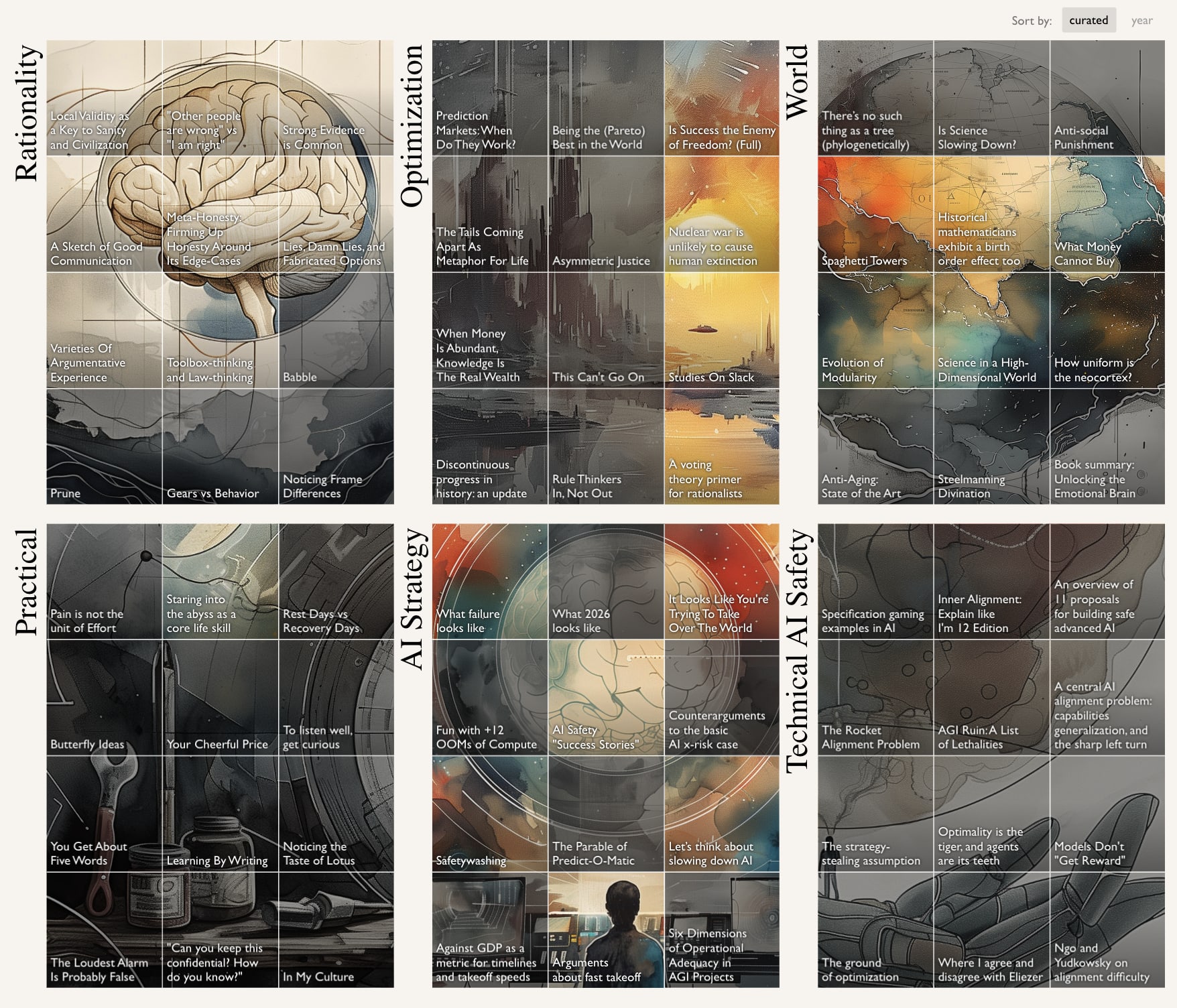
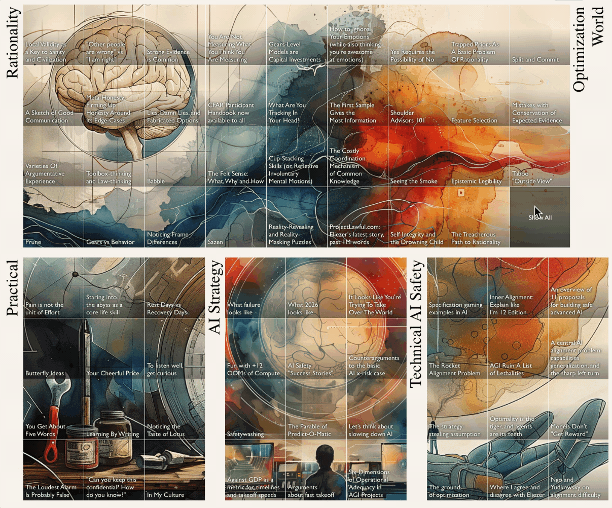
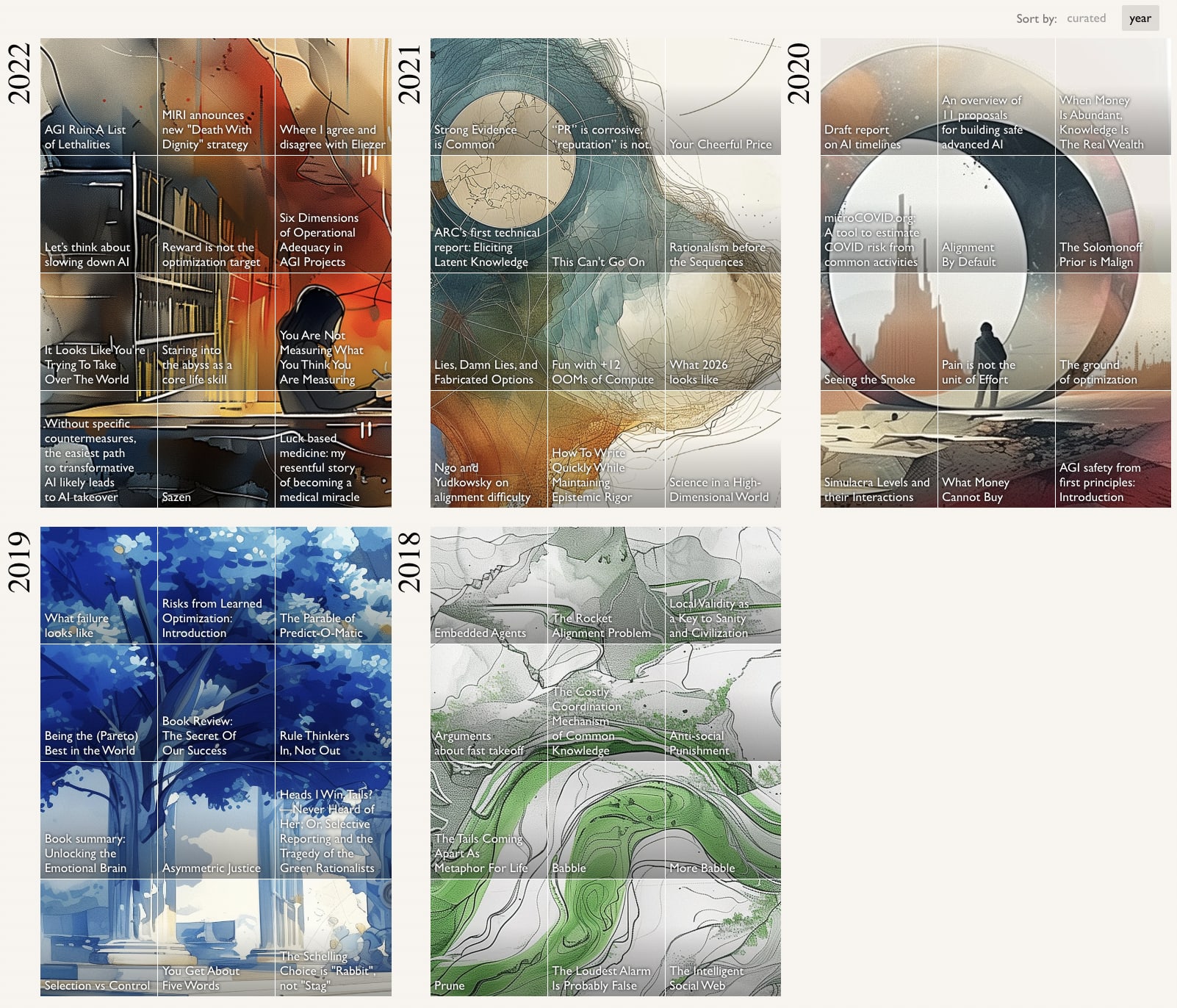
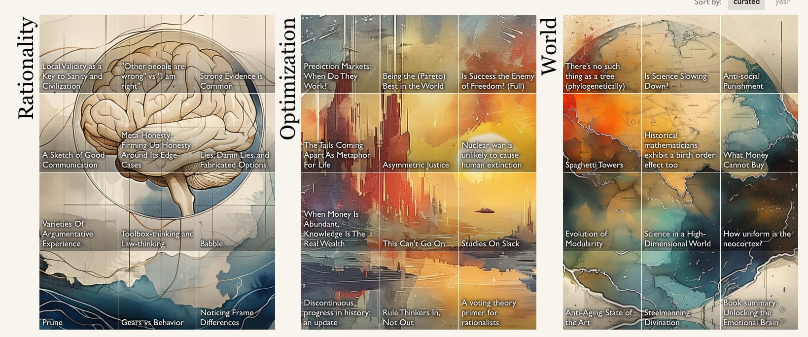
The top 50 posts of each of LessWrong’s annual reviews have a new home: The LeastWrong [? · GW].
What will I see when I click that link?
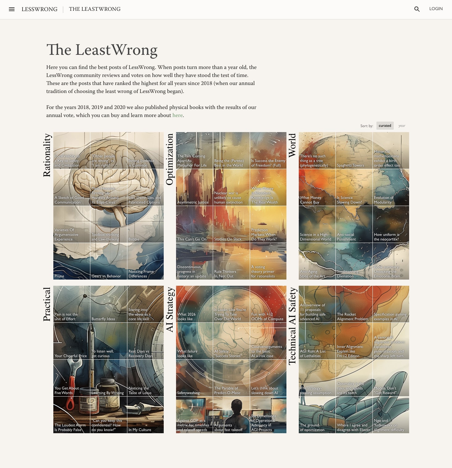
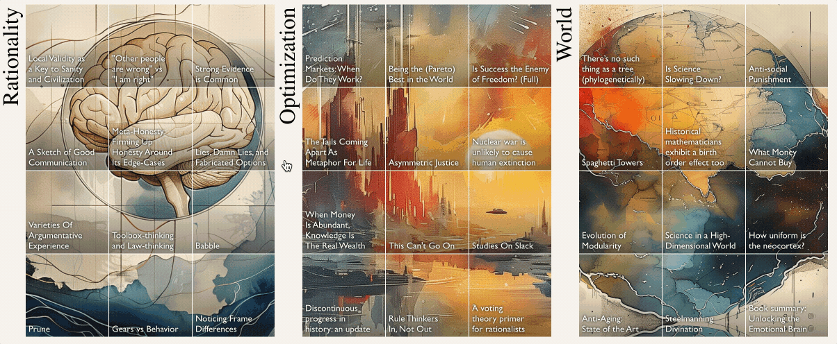
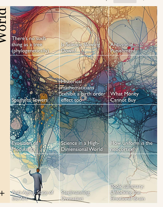
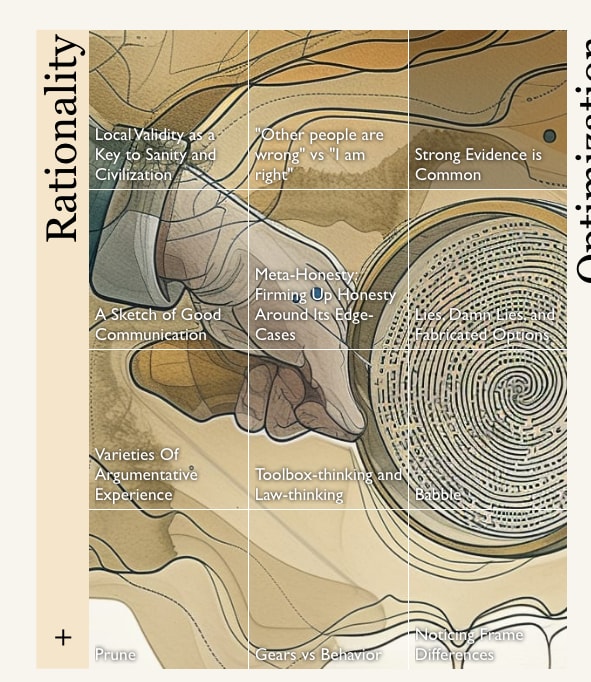
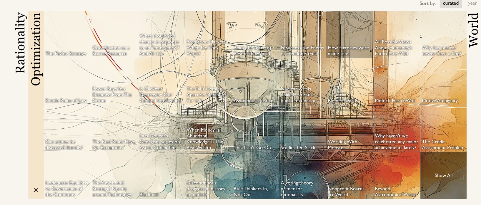
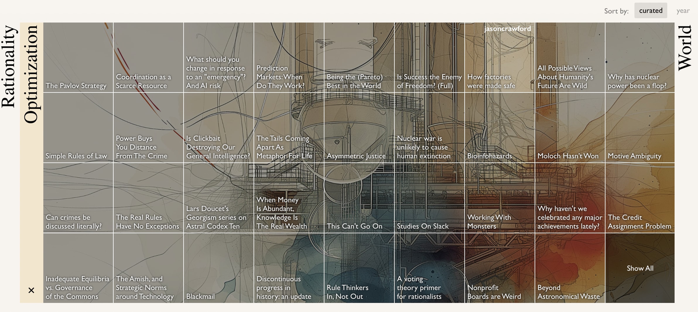
You will find the posts organized into six “books”: Rationality, Optimization, World, Practical, AI Strategy, and Technical AI Safety. Each square on the grid is a post that made the top 50 of the review in some year. The collections are ordered more-or-less with the aim of putting the accessible posts in the most prominent spots.
If you're logged-in the essays will be dark until you've read them, to help guide you to posts you've not read before.
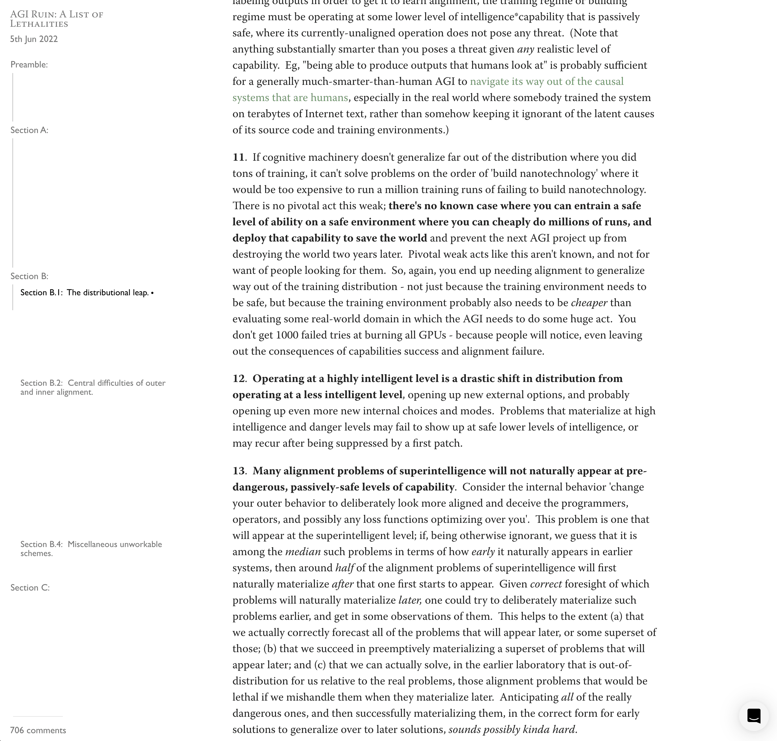
Each of the essays on this page also now has its own full-bleed art and updated post page:

How can I see more of a book?
If you click on the name of a book, like “Rationality”, you’ll get a full width view of the content.
Any other goodies?
Full height table of contents with a progress bar!
Markets on whether posts with over 100 karma will make it in to the top 50 of their year's review!
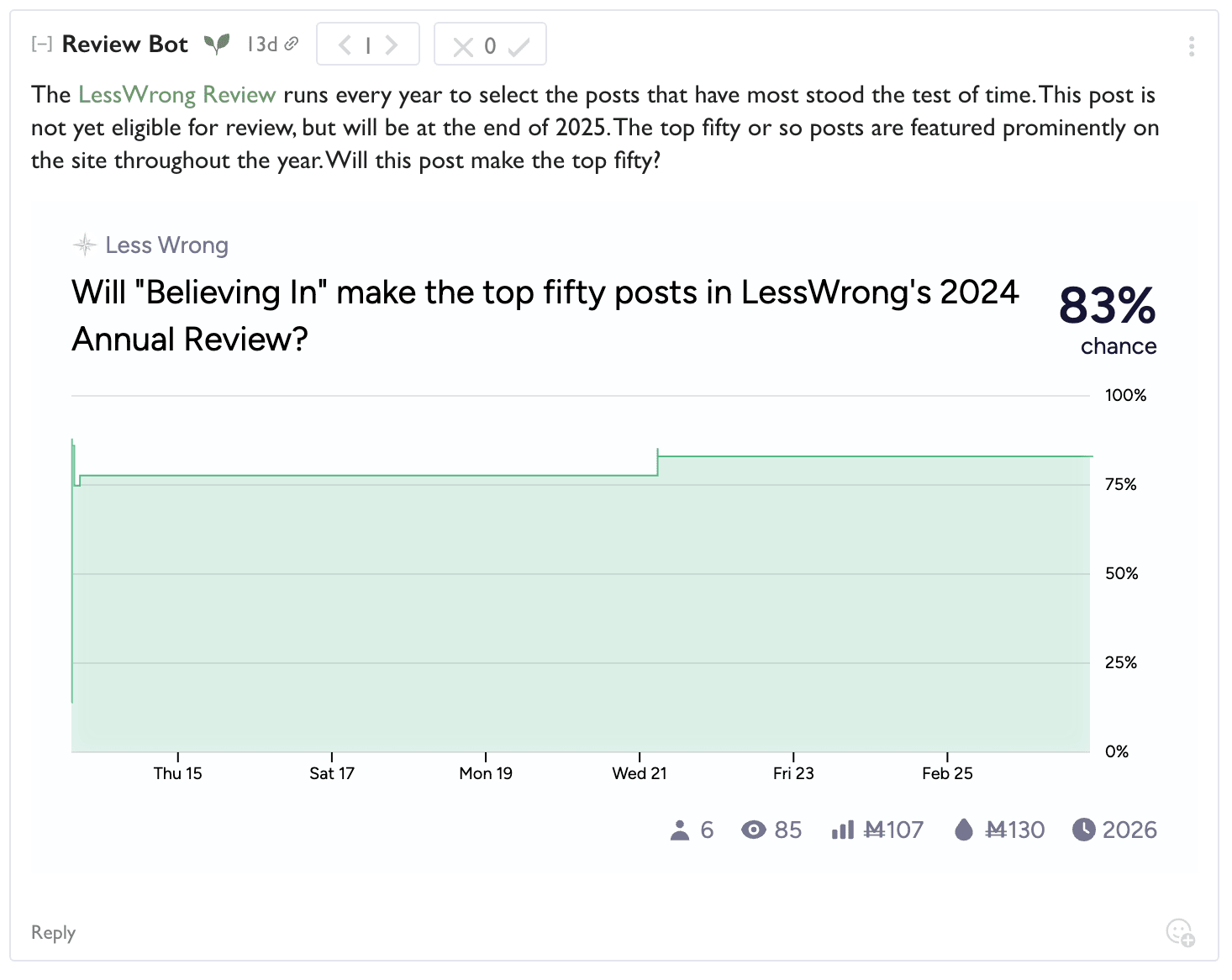
With golden highlighted karma if it's predicted with more than 50%!

Why did you make this?
Many people on the LW team wanted to celebrate the top posts in the review.
Historically we've printed annual review books [? · GW], but only a small fraction of people who read the essays got to experience the books, and the effort that went into the books felt disconnected from the rest of the site. They also took a really long time to make, and required constant ongoing attention from the Lightcone team to handle logistics of shipping and sales and new print runs.
It seemed more appropriate to put effort into making the reading experience of these essays on LessWrong itself a more memorable and rewarding experience.
But what were the results of this year's review?
Read all about it in Ben's post [LW · GW]!
That's it
I hope some of you really like it. And report any bugs with this new stuff in intercom in the bottom right.
64 comments
Comments sorted by top scores.
comment by Lucius Bushnaq (Lblack) · 2024-02-28T15:47:17.983Z · LW(p) · GW(p)
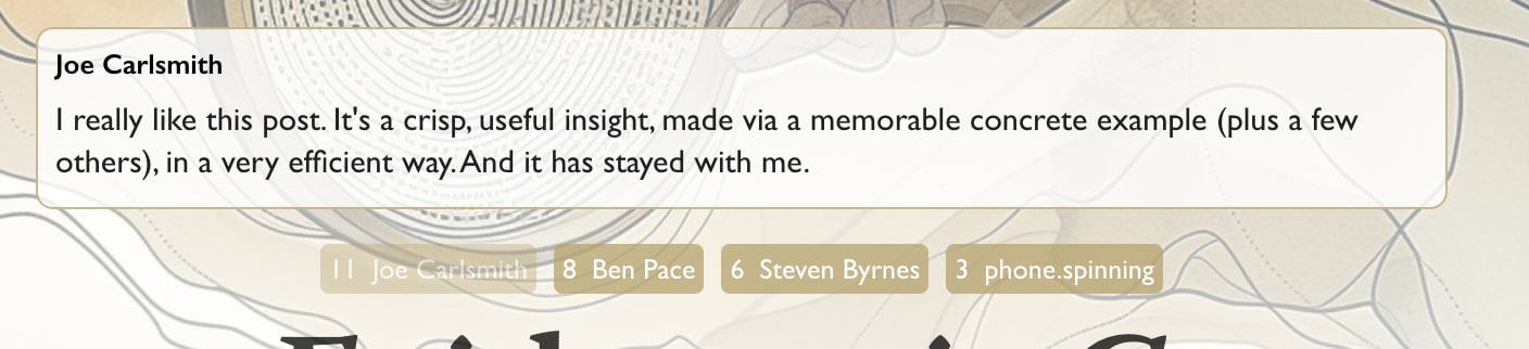
I feel like 'LeastWrong' implies a focus on posts judged highly accurate or predictive in hindsight, when in reality I feel like the curation process tends to weigh originality, depth and general importance a lot as well, with posts regarded by the community as 'big if true' often being held in high regard.
Replies from: habryka4, neel-nanda-1↑ comment by habryka (habryka4) · 2024-02-29T01:12:42.644Z · LW(p) · GW(p)
By popular demand I have changed it to "Best Of LessWrong" (though I might change it back in a few days if I do like it less).
I did keep the "/leastwrong" URL because it feels like a kind of fun easter egg.
↑ comment by Neel Nanda (neel-nanda-1) · 2024-02-28T22:54:15.263Z · LW(p) · GW(p)
In my opinion the pun is worth it
comment by Ben (ben-lang) · 2024-02-29T15:31:36.173Z · LW(p) · GW(p)
I am very impressed with the art, interrace and most especially the way they synergise. I didn't realise until I came to writing this that, as I am on dark mode, the fact that it looks good and is easy to use from my perspective is doubly impressive.
comment by MondSemmel · 2024-02-28T21:24:18.364Z · LW(p) · GW(p)
Thanks for making this :).
Feedback on aesthetics and UX:
- Art and layout are pretty!
- I find the white text on colored backgrounds hard to read. In particular, some cells have white backgrounds and a white font which only offers contrast via a thin shadow outline. Also, the font color stays constant, but the backgrounds don't, which makes for a somewhat jarring experience of reading text in adjacent cells.
- When I move my cursor from hovering one cell to another, the art instantly changes, in a way I find pretty disorienting.
- Overall, it feels like there's way more flickering on the page than on the rest of LW.
- The section headings (e.g. "Rationality", "Optimization") cannot be read from left to right, but require tilting one's head or something, which seems suboptimal.
- The "Show All" UX is confusing: first you hover a cell in e.g. "Rationality"; then a small plus sign appears in the bottom left, which is apparently clickable; and only then a "Show All" appears all the way in the bottom right. In particular, it's weird that the buttons are in different corners, rather than in the same corner.
Other feedback:
- Major kudos to the LW team for continuing to work on stuff like this <3.
- I'm not loving the name "LeastWrong".
- I agree with some of the other objections, e.g. how this sounds from outside the community.
- Also, while a title like "Best of LessWrong" would be more wordy and less funny, it seems clearer and easier to understand. E.g. I could link someone to "Best of LessWrong" and the name would be self-explanatory, whereas linking to "LeastWrong" is more of an insider. And it's not like this community suffers from an insufficient supply of jargon.
- Also, does "LeastWrong" even capture the spirit of the yearly LW Reviews? Truth and accuracy are important considerations, to be sure, but we as a community don't actually have the manpower to 100% vet the reviewed posts. Furthermore, tons of other things are also considered during the review vote: like "this post was important to me", "I referenced this post a lot", "this post (or author) makes LW better (or worse)", etc. Not to mention that there's guidance by the LW team for what an upvote/downvote is supposed to mean, and this meaning has changed over time! E.g. IIRC at some point we were asked to consider whether a post contributed to intellectual progress or some such. It seems to me like "LeastWrong" doesn't properly capture all that, and rather makes it sound like we as a community have decided that these are the most accurate posts on LW.
↑ comment by habryka (habryka4) · 2024-02-28T21:45:28.413Z · LW(p) · GW(p)
When I move my cursor from hovering one cell to another, the art instantly changes, in a way I find pretty disorienting.
Yeah, I'll experiment a bit with putting a longer delay on the hover transition. I agree that it feels currently a bit too flickery. I do also want it to feel responsive when you hover of an individual post.
↑ comment by habryka (habryka4) · 2024-02-28T21:42:52.917Z · LW(p) · GW(p)
On readability: I currently made the tradeoff to make post titles that are unread quite readable (with a heavily darkened background). Curious whether the unread/darkened items still seem like they have readability problems for you.
Replies from: MondSemmel, SaidAchmiz↑ comment by MondSemmel · 2024-03-08T19:40:22.291Z · LW(p) · GW(p)
I'd already clicked on most of the articles, so I also didn't realize that some cells were marked as unread, but I agree that titles with the unread background are comparatively easier to read. And the readability on all titles benefited from the stronger shadows you've implemented. Overall my impression is that those stronger shadows make the page slightly less pretty but a lot more readable.
↑ comment by Said Achmiz (SaidAchmiz) · 2024-02-28T23:47:58.951Z · LW(p) · GW(p)
I would not have guessed that there is any read/unread state marking going on, FYI.
Replies from: habryka4↑ comment by habryka (habryka4) · 2024-02-28T23:50:09.452Z · LW(p) · GW(p)
My guess would be that you are one of the few users who has clicked on practically everything in the best of?
For most random users I sampled during testing there is a very clear and identifiable pattern for read-statuses that users understood reliably, but it becomes less obvious as the percentage you've read goes above 80% or so (and indeed I cannot test on my own account for I have read all posts and so am seeing a pretty outlierish UI state).
Replies from: SaidAchmiz↑ comment by Said Achmiz (SaidAchmiz) · 2024-02-29T00:12:12.674Z · LW(p) · GW(p)
Ah, yeah, that makes sense. (I guess this isn’t terribly important information to communicate in this particular context, anyway…)
Replies from: habryka4↑ comment by habryka (habryka4) · 2024-02-29T00:16:59.075Z · LW(p) · GW(p)
I guess this isn’t terribly important information to communicate in this particular context, anyway…
I do actually think in user testing, seeing people fill the urge to "fill out the picture" by reading a lot of the content, or at least checking it out, seemed like something that brought people a bunch of joy.
comment by notfnofn · 2024-02-28T12:41:47.374Z · LW(p) · GW(p)
It's extremely beautiful, and seems like it would serve as a nice introduction to the website that isn't subject to the same random noise as the front page.
I really like 'leastwrong' in the url and top banner (header?), but I could see how making 'The LeastWrong' the actual title could rub off on some as pretentious.
comment by habryka (habryka4) · 2024-02-28T04:32:00.247Z · LW(p) · GW(p)
Meta: I like the snappiness of "The LeastWrong", but also feel a bit weird about it. I feel like it makes sense with the site title and everything, but also liked some of the straightforwardness of "Best of LessWrong". Feel free to use this thread to give takes.
My overall sense is that both "Best of LessWrong" and "The LeastWrong" are both exaggerations. "LessWrong Review Winners" feels most accurate, but is too long for most places in the UI. I prefer "The LeastWrong" over "Best of LessWrong" because it's also more obviously in slight jest.
Replies from: pktechgirl, lahwran, None↑ comment by Elizabeth (pktechgirl) · 2024-02-29T20:39:21.532Z · LW(p) · GW(p)
new solution: BestWrong
Replies from: MondSemmel↑ comment by MondSemmel · 2024-03-01T15:12:23.325Z · LW(p) · GW(p)
TopWrong, PeakWrong, MountWrong, ...
↑ comment by the gears to ascension (lahwran) · 2024-02-28T04:45:16.303Z · LW(p) · GW(p)
I really dislike "The LeastWrong". it takes something I was already on edge about and elevates it to an explicit phrase. How about just "Review Winners" or "Voted Best" or something else that doesn't have weird implications if someone fails to interpret it as a joke?
Replies from: habryka4↑ comment by habryka (habryka4) · 2024-02-28T04:49:10.548Z · LW(p) · GW(p)
Just to confirm, where the "on edge" thing is presumably the name "LessWrong" (which can be interpreted in a kind of arrogant way of implying we are less wrong than other people)?
Replies from: Zack_M_Davis↑ comment by Zack_M_Davis · 2024-02-28T07:12:17.531Z · LW(p) · GW(p)
I second the concern that using "LeastWrong" on the site grants undue legitimacy to the bad "than others" interpretation of the brand name (as contrasted to the intended "all models are wrong, but" meaning). "Best Of" is clear and doesn't distort the brand.
Replies from: habryka4↑ comment by habryka (habryka4) · 2024-02-28T07:24:23.123Z · LW(p) · GW(p)
Yeah, I can kind of see that, though I don't feel like I can super make explicit what the implicit line of reasoning for that association is. If you have an idea of spelling it out, I would find it helpful for thinking about the tradeoffs.
Edit: An initial attempt is "The LeastWrong" feels a bit like a global claim of "these are the least wrong things on the internet". It also puts emphasis on the posts on the site being the kind of thing that's described as "less wrong" on a kind of factual level as opposed to the people aspiring to be less wrong themselves in a more holistic sense.
But this doesn't feel super coherent to me. Like, the central interpretation I have for the "LessWrong" name is on the about page:
The road to wisdom? Well, it's plain
and simple to express:Err
and err
and err again
but less
and less
and less.– Piet Hein
And the meaning in here feels compatible with having some posts that are less wrong than others, and a collective effort to try to find the "least wrong" content. In general, I feel pretty good with having a thing we collective contribute that's trying to be "least wrong", and it doesn't feel super like it makes a comparative claim to the rest of the world. Though I do still feel like there is something real here.
Replies from: Kaj_Sotala↑ comment by Kaj_Sotala · 2024-02-28T10:51:25.297Z · LW(p) · GW(p)
Edit: An initial attempt is "The LeastWrong" feels a bit like a global claim of "these are the least wrong things on the internet".
This is how it feels to me.
Whether you can find a logic in which that interpretation is not coherent doesn't seem relevant to me. You can always construct a story according to which a particular association is actually wrong, but that doesn't stop people from having that association. (And I think there are reasonable grounds for people to be suspicious about such stories, in that they enable a kind of motte-and-bailey: using a phrasing that sends the message X, while saying that of course we don't mean to send that message and here's an alternative interpretation that's compatible with that phrasing. So I think that a lot of the people who'd find the title objectionable would be unpersuaded by your alternative interpretation, even assuming that they bothered to listen to it, and they would not be unreasonable to reject it.)
Replies from: Kaj_Sotala↑ comment by Kaj_Sotala · 2024-02-28T10:58:19.124Z · LW(p) · GW(p)
Comment retracted because right after writing it, I realized that the "leastwrong" is a section on LW, not its own site. I thought there was a separate leastwrong.com or something. In this case, I have much less of a feeling that it makes a global claim.
Replies from: lahwran↑ comment by the gears to ascension (lahwran) · 2024-02-28T11:00:25.607Z · LW(p) · GW(p)
I still feel that that is the claim it is making. It's obviously in jest to me, but my thinking about it is marred by this already being the main complaint people make about the name "lesswrong", and reifying it further seems like going the wrong direction.
↑ comment by [deleted] · 2024-02-28T05:05:51.421Z · LW(p) · GW(p)
What bothers me about it is that I don't know if it's on-brand for the lesswrong vision of the future.
A futuristic cityscape with flying vehicles? How do you expect that in the lifetime of any site patron without, you know, the superintelligence that either gets paused, fails to work, or replaces this vision with identical cuboid mega-buildings full of incomprehensible equipment. With desperate human refugees looking gaunt huddled around a fire at the base, if anyone is alive.
The lesswrong Utopia looks like ordinary buildings, but richer with greenery, and you see an ambulance hauling a patient out in a cryonics capsule. There are still cars in the street, they are finally all electric, but anything really advanced isn't available, it's all still in safety review. Thousands of years will pass like that, coordinated humans aren't going to turn the solar system into a dyson swarm of ravenous robots with any urgency.
After all, new technology has side effects and risks extinction. Why take a risk?
Replies from: Benito, habryka4↑ comment by Ben Pace (Benito) · 2024-02-28T18:09:02.982Z · LW(p) · GW(p)
In case it's unclear, the side image is temporary, just around to inform folks about the new Best Of collections and artworks.
↑ comment by habryka (habryka4) · 2024-02-28T05:26:33.607Z · LW(p) · GW(p)
(I don't think I am getting what this comment is about. Is it critiquing the name, or is it critiquing the frontpage image/cover image for the optimization book?)
Replies from: None↑ comment by [deleted] · 2024-02-28T05:27:10.934Z · LW(p) · GW(p)
A futuristic cityscape with flying vehicles?
The cover art. It looks like something e/acc would use as their cover. Rapid progress is their vision. Flying vehicles above an urban area are actually pretty risky! They will crash and people will be killed.
Replies from: habryka4, lahwran, Benito↑ comment by habryka (habryka4) · 2024-02-28T05:31:55.497Z · LW(p) · GW(p)
I definitely want a dope future with flying cars and terra formed planets and everything. Pretty sure this is true of most people on LW. Technological progress is great, and AI is a large outlier in the relative risks and benefits.
↑ comment by the gears to ascension (lahwran) · 2024-02-28T07:54:35.279Z · LW(p) · GW(p)
the only disagreements are about how to get there
↑ comment by Ben Pace (Benito) · 2024-02-28T05:31:58.278Z · LW(p) · GW(p)
...just because some random tribal line is sometimes being drawn in some social scene doesn't mean it carves reality at its joints. Nothing you said is any argument that progress is bad, and by default I am a big fan of visions of technological progress. See my longer comment here [LW(p) · GW(p)] for more details on my position on thinking about random tribal lines.
Replies from: None↑ comment by [deleted] · 2024-02-28T20:35:38.364Z · LW(p) · GW(p)
I thought the "tribal" line was:
Rationality from EY: pause AI for 30 years at the level of GPT-4. Nuclear war for defectors. After 30 years, very slow, careful adoption and slow forward progress for anything you need AI to accomplish. Very similar world to today.
e/acc : AI is now proven feasible, race to exploit it as fast as possible, if it results in human extinction that's what the laws of physics wanted. Many negative outcomes are the cost of progress*, similar to the 1960s in the USA. Geohot will expressly mention this when plotting the slowing of progress in the 1970s.
- eg asbestos, still one of the most fireproof substances found.
If you thought reality makes { flying cars, futuristic cities, fusion vtol shuttles, terra forming, life extension to see this in person } require AI, for the reason that humans have not made much progress in these domains without it in 50+ years, and these things are all incredibly expensive, doesn't this "carve reality at the joints"?
Without the intelligent robotic labor you need AI for, it won't happen, in the same way humans would not have reached this point without engines.
Am I using "carving reality" wrong in this context, ignoring the details of the way I think future technology all has AI as a pre-requisite?
Replies from: Benito, stavros↑ comment by Ben Pace (Benito) · 2024-02-28T23:33:09.371Z · LW(p) · GW(p)
I think there was a miscommunication; I don't mean to say that you are inaccurately describing some tribal lines that were going on in some other social scene, I mean that I have little faith that these tribal lines will be a remotely accurate guide to good ideas. Like national politics in the US which has two parties, I think it is wrong to think that one party has all the questions exactly right and the other party has all the questions exactly wrong, there are too many other social and political forces on where tribal lines are drawn for that to be a feasible outcome, and I think that when asking yourself a specific question it's better to just look at how reality pertains to that question (e.g. "What is the optimal tax rate? Which societies have done better and worse with different rates? What makes sense ethically from first principles?") rather than asking what different tribes say about it.
↑ comment by stavros · 2024-04-04T08:09:17.745Z · LW(p) · GW(p)
I think future technology all has AI as a pre-requisite?
My high conviction hot take goes further: I think all positive future timelines have AI as a pre-requisite. I expect that, sans AI, our future - our immediate future: decades, not centuries - is going to be the ugliest, and last, chapter in our civilization's history.
comment by Said Achmiz (SaidAchmiz) · 2024-02-28T14:46:54.812Z · LW(p) · GW(p)
The art is beautiful; unfortunately, actually navigating the sections is unwieldy and annoying…
Replies from: habryka4↑ comment by habryka (habryka4) · 2024-02-28T18:28:12.544Z · LW(p) · GW(p)
Curious which part feels unwieldy and annoying. Navigating it feels definitely less straightforward than just scrolling a list, though it is also a lot denser and allows us to have 6 sections visible at the same time, which allows people to get an overview over the types of content we have on the site without needing to scroll up and down a lot.
I do still share a feeling that it's less straightforward to navigate than other stuff on the site. My guess was that the benefit of interactivity and playfulness that comes from the UI choices outweighs that (especially for new users who would probably mostly just be overwhelmed by a huge amount of information, which this page is more aimed at), but not sure.
Replies from: mr-hire, SaidAchmiz↑ comment by Matt Goldenberg (mr-hire) · 2024-02-28T22:10:46.211Z · LW(p) · GW(p)
The art change is pretty distracting, and having to hover to see the author is also a bummer, plus no way to get a summary (that I can see).
It's seemingly optimized for a "judge a book by it's cover" type of thing where I click around until I see a title and image I like
Replies from: SaidAchmiz, habryka4↑ comment by Said Achmiz (SaidAchmiz) · 2024-02-28T23:49:08.008Z · LW(p) · GW(p)
How do you see the author? Hovering doesn’t do that, for me…
Replies from: habryka4↑ comment by habryka (habryka4) · 2024-02-28T23:51:45.855Z · LW(p) · GW(p)
Huh, it definitely should do that. See my screenshot in response to you in this comment: http://www.lesswrong.com/posts/qvCMiwkBqdYjfiX6n/new-lesswrong-review-winner-ui-the-leastwrong-section-and?commentId=RDZAizo8EMSmYLAZs [LW(p) · GW(p)]
What browser/device combo are you on?
Replies from: SaidAchmiz↑ comment by Said Achmiz (SaidAchmiz) · 2024-02-29T00:06:18.781Z · LW(p) · GW(p)
Ah, it’s an outdated browser issue. (Mac, Chromium 103.) (Lack of support for the :has() pseudo-class, specifically, in the selector .TopPostsPage-imageGridPostBody:hover:not(:has(.TopPostsPage-imageGridPostHidden)) .TopPostsPage-imageGridPostAuthor, is what’s causing the problem.)
↑ comment by habryka (habryka4) · 2024-02-29T00:15:33.767Z · LW(p) · GW(p)
Ah, yeah, we do sure rely on that, and it's really quite hard to work around without moving a lot of stuff into JS, which I wanted to avoid.
↑ comment by habryka (habryka4) · 2024-02-28T22:23:40.699Z · LW(p) · GW(p)
Yeah, getting summaries would be nice, but the effort of writing a summary for each post would have been prohibitive (especially one that the authors would have been happy with). We tried showing the start of the post, but it wasn't very helpful for deciding whether to read something.
Replies from: owencb, mr-hire↑ comment by owencb · 2024-02-28T22:39:42.042Z · LW(p) · GW(p)
Maybe consider asking the authors if they'd want to volunteer a ?50? word summary for this purpose, and include summaries for those who do?
Replies from: Benito, habryka4↑ comment by Ben Pace (Benito) · 2024-02-28T23:35:03.377Z · LW(p) · GW(p)
It's a nice idea to have an optional field on posts for the author to submit a summary with a max-length.
↑ comment by habryka (habryka4) · 2024-02-28T23:05:10.146Z · LW(p) · GW(p)
My worry was that having summaries only inconsistently adds a lot of mental complexity to track to the page. Now only sometimes when you hover over something do you see some kind of preview, and if you have ~60 items on a single page, adding any kind of indicator for that quickly makes things very cluttered.
And you would have to redesign the page quite a bit to have a good place for summaries without adding a huge amount of clutter or flashing or movement on the page.
↑ comment by Matt Goldenberg (mr-hire) · 2024-02-29T03:39:03.460Z · LW(p) · GW(p)
Why not show the top-rated review, like you do at the top of the page?
Replies from: habryka4↑ comment by habryka (habryka4) · 2024-02-29T03:41:14.650Z · LW(p) · GW(p)
I think they wouldn't work well for this the vast majority of time. I think if you see all the reviews and can quickly skim them they are useful, but they definitely are not that helpful for deciding whether to read a post. It's either a pretty generic "this post was great and useful", or a really in-depth review that definitely assumes you've read the post and is very hard to parse without having read it.
↑ comment by Said Achmiz (SaidAchmiz) · 2024-02-28T23:41:59.115Z · LW(p) · GW(p)
Well, just for example, I tried to find a post, so I did Cmd-F, and… it didn’t work because the post I was looking for was in a collapsed part. (That is, the browser reported a hit on the search, but nothing changed in the viewport.)
(This is an easy thing to forget to implement; I’ve forgotten this very thing a few times myself. The solution is to listen for the selectionchange event, such that the enclosing section is automatically un-collapsed when the search function highlights text within a collapsed block.)
Then there’s the fact that it can be hard to read the post titles against the beautiful backgrounds. Notably, this is hard to notice when simply looking at the page as it initially loads, as the initially displayed artwork is mostly dark-colored (though the “Rationality” section isn’t great in this regard) and the text is light-colored (with a dark shadow, as is proper). But when you hover over the sections, the artwork changes—often, to much lighter and/or busier imagery, which makes the text harder to read:
As I said, this stuff really is pretty, but as a way of navigating a list of text items, it leaves much to be desired…
Replies from: habryka4↑ comment by habryka (habryka4) · 2024-02-28T23:47:08.977Z · LW(p) · GW(p)
Yeah, I also played around a bit with legibility before you posted this, and am likely pushing a change to make it so that when are hovering over something, the text contrast goes up a lot (instead of down). Here is your last screenshot with the new styling:
The text-legibility here seems a lot better. Will probably push in the next hour, curious about more comments from you after you see that change.
Well, just for example, I tried to find a post, so I did Cmd-F, and… it didn’t work because the post I was looking for was in a collapsed part. (That is, the browser reported a hit on the search, but nothing changed in the viewport.)
Ah, yeah, that's a solid point. I'll see how easy it is to fix something here (it's a bit more complicated since the visual space of the sections overlaps, so if you search for a word that has a hit in more than one section on the same row, we can't expand both, so I'll have to think about how to handle that case).
Replies from: SaidAchmiz↑ comment by Said Achmiz (SaidAchmiz) · 2024-02-29T00:00:21.753Z · LW(p) · GW(p)
The text-legibility here seems a lot better.
Agreed, that’s an improvement. (Must you require hover for that, though? I’d make that change unconditionally, frankly.)
I would also suggest deepening the text shadow, changing it from text-shadow: 0 0 3px \#000 to, e.g., text-shadow: 0 0 3px \#000, 0 0 5px \#000, 0 0 8px \#000, which looks like this:
it’s a bit more complicated since the visual space of the sections overlaps, so if you search for a word that has a hit in more than one section on the same row, we can’t expand both, so I’ll have to think about how to handle that case
Note that the selectionchange event will report the currently selected hit for the searched text, not all highlighted hits, so this should not be a problem. (As the user presses Cmd-G [Find Next], or Enter in the search box, the browser will cycle through the highlighted hits, firing a new selectionchange event each time.) Thus, each time the event is fired, you can expand whatever section the currently-selected hit is in (and collapse its neighbors in the row).
↑ comment by Said Achmiz (SaidAchmiz) · 2024-03-13T14:42:32.625Z · LW(p) · GW(p)
Note that the
selectionchangeevent will report the currently selected hit for the searched text, not all highlighted hits, so this should not be a problem. (As the user presses Cmd-G [Find Next], or Enter in the search box, the browser will cycle through the highlighted hits, firing a newselectionchangeevent each time.) Thus, each time the event is fired, you can expand whatever section the currently-selected hit is in (and collapse its neighbors in the row).
Update: I just checked, and it seems like this stopped being true at some point; I am now seeing selectionchange events fired only on the initial search (when the user first spawns the Search box, by invoking the Find command or the Find Next / Find Previous command) and also when that box is dismissed, but not on subsequent invocations of Find Next/Previous (or the Enter key) when the Search box is open. (It is still the case that only a single selected hit, and not all highlighted hits, are reported.) This reduces the usefulness of the technique I described, though does not entirely eliminate it. @habryka
↑ comment by habryka (habryka4) · 2024-02-29T00:10:23.646Z · LW(p) · GW(p)
(Must you require hover for that, though? I’d make that change unconditionally, frankly.)
Yeah, I might consider it. I do think it makes the initial pageload a lot more drab, and removes a lot of the beauty from the page (and logged-in users who haven't read most of the posts already have much stronger text-contrast).
Note that the
selectionchangeevent will report the currently selected hit for the searched text, not all highlighted hits, so this should not be a problem. (As the user presses Cmd-G [Find Next], or Enter in the search box, the browser will cycle through the highlighted hits, firing a newselectionchangeevent each time.) Thus, each time the event is fired, you can expand whatever section the currently-selected hit is in (and collapse its neighbors in the row).
Oh, that's great, I didn't realize that's how it works.
I would also suggest deepening the text shadow, changing it from
text-shadow: 0 0 3px #000to, e.g.,text-shadow: 0 0 3px #000, 0 0 5px #000, 0 0 8px #000, which looks like this:
Oh, this is also a pretty good idea. I had forgotten that you can do multiple text-shadows at the same time. I'll give it a try.
comment by Review Bot · 2024-03-04T11:43:36.030Z · LW(p) · GW(p)
The LessWrong Review [? · GW] runs every year to select the posts that have most stood the test of time. This post is not yet eligible for review, but will be at the end of 2025. The top fifty or so posts are featured prominently on the site throughout the year.
Hopefully, the review is better than karma at judging enduring value. If we have accurate prediction markets on the review results, maybe we can have better incentives on LessWrong today. Will this post make the top fifty?
comment by Neel Nanda (neel-nanda-1) · 2024-03-01T12:03:06.105Z · LW(p) · GW(p)
The art is great! How was it made?
Replies from: kave↑ comment by kave · 2024-03-01T16:59:38.355Z · LW(p) · GW(p)
We give each essay to GPT-4, and ask it to generate 3 visual metaphors for the essay (with some scaffolding so that it doesn't just ask for things like "someone reading a book on rationality"). Those are then put inside a prompt for Midjourney that was built using a bunch of /describe and trial-and-error (it also uses an image prompt to help lock-in the style). Then mods go through and pick their favourite of the ~12 images that end up generated.
comment by the gears to ascension (lahwran) · 2024-02-28T23:21:26.647Z · LW(p) · GW(p)
I keep accidentally clicking the link to this here post that I'm commenting on when I intend to be clicking off a shortform comment
Replies from: habryka4↑ comment by habryka (habryka4) · 2024-02-28T23:23:54.958Z · LW(p) · GW(p)
Ah, hmm, that's fair, I was worried that would happen with the large click area on the side. I'll make it smaller.
Replies from: lahwran↑ comment by the gears to ascension (lahwran) · 2024-03-02T03:04:56.687Z · LW(p) · GW(p)
looking forward, this has happened several more times today
comment by Drake Morrison (Leviad) · 2024-02-28T14:42:43.697Z · LW(p) · GW(p)
Yay! I've always been a big fan of the art you guys did on the books. The Least Wrong page has a sort of official magazine feel I like due to the extra design.
comment by Chris_Leong · 2024-02-28T02:57:08.730Z · LW(p) · GW(p)
Is there going to be a link to this from somewhere to make it accessible?
Replies from: kave, habryka4↑ comment by habryka (habryka4) · 2024-02-28T02:58:38.061Z · LW(p) · GW(p)
Yeah, it's in the site navigation (currently "Best Of" but will be changed to "The LeastWrong" in like the next half hour or so).
comment by Lucie Philippon (lucie-philippon) · 2024-05-21T16:08:23.689Z · LW(p) · GW(p)
In the new UI, the estimated reading time is not visible anymore. Is it intended?
It was often useful for me. How can I tell my friends "I'll arrive in X minutes, just after reading this post" without knowing the reading time !
comment by Tiuto (timothy-currie) · 2024-03-04T20:51:22.628Z · LW(p) · GW(p)
At the moment, a post is marked as "read" after just opening it. I understand it is useful not to have to mark every post as "I read this", but it makes it so that if I just look at a post for 10 seconds to see whether it interests me, it gets marked as read. I would prefer if one could change the settings to a "I have to mark posts as <read> manually" mode. With a small box at the bottom of a post, one can check.
Replies from: habryka4↑ comment by habryka (habryka4) · 2024-03-04T21:27:11.142Z · LW(p) · GW(p)
Yeah, this is something I've been wanting for a while, but requires a bunch more engineering work to get accurate. I've been wanting something like "fullreads" for a while, or maybe "completion percentage" which we can use to assess what fraction of a post you actually read.
I think few people would want to mark all posts as read manually, but we could provide overrides, and improve our algorithms to get it right much more by default.