Investigating the Chart of the Century: Why is food so expensive?
post by Maxwell Tabarrok (maxwell-tabarrok) · 2024-08-16T13:21:23.596Z · LW · GW · 26 commentsThis is a link post for https://www.maximum-progress.com/p/investigating-the-chart-of-the-century
Contents
26 comments
You’ve probably seen this chart from Mark Perry at the American Enterprise Institute.
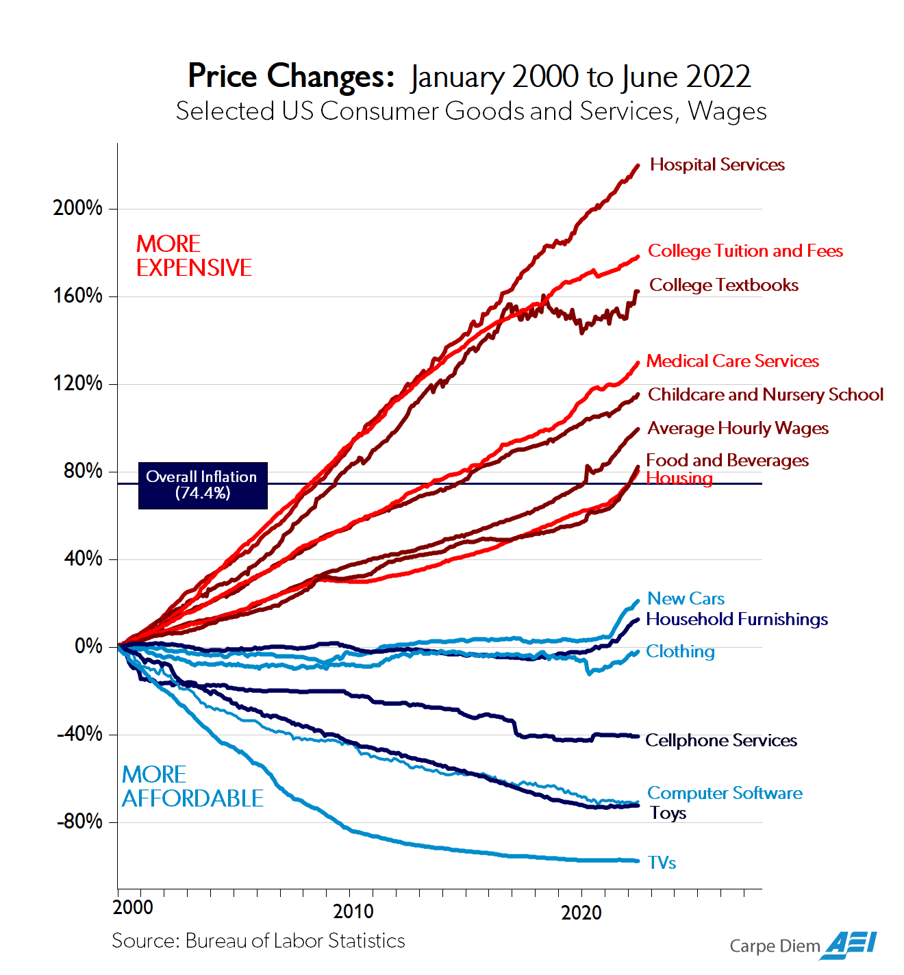
I’ve seen this chart dozens of times and have always enjoyed how many different and important stories it can tell.
There is a story of the incredible abundance offered by technological growth and globalization. Compared to average hourly wages, cars, furniture, clothing, internet access, software, toys, and TVs have become far more accessible than they were 20 years ago. Flatscreens and Fiats that were once luxuries are now commodities.
There is also a story of sclerosis and stagnation. Sure, lots of frivolous consumer goods have gotten cheaper but healthcare, housing, childcare, and education, all the important stuff, has exploded in price. Part of this is “cost disease” where the high productivity of labor in advancing industries like software, raises the cost of labor in slower productivity growth industries like healthcare. Another part is surely the near-universal “restrict supply and subsidize demand” strategy that governments undertake when regulating an industry. Zoning laws + Prop 13 in housing, occupational licensing and the FDA + Medicare in healthcare, and free student debt + all of the above for higher ed.
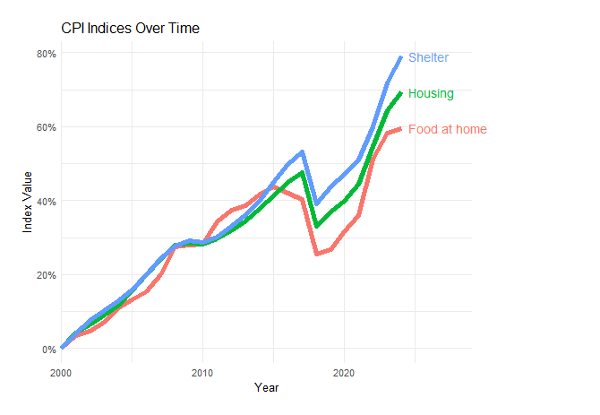
One story from this graph I’ve never heard and only recently noticed is that “Food and Beverages” has inflated just as much as Housing in this graph. This is extremely counterintuitive. Food is a globally traded and mass produced commodity while housing is tied to inelastic land supply in desirable locations. Farming, grocery, and restaurants are competitive and relatively lightly regulated markets while the housing is highly regulated, subsidized, and distorted. Construction productivity is worse than stagnant while agricultural productivity has been ascendent for the past 300 years and even retail productivity is 8x higher than it was in 1950. Construction is also more labor intensive than farming or staffing the grocery.
Yet food prices have risen just as much as housing prices over the past 24 years. What explains this?
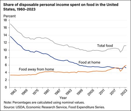
One trend is that Americans are eating out more. The “Food and Beverages” series from the BLS includes both “Food At Home” and “Food Away From Home.” In 2023, eating out was a larger portion of the average household’s budget than food at home for the first time, but they have been converging for more than 50 years.
Restaurant food prices have increased faster than grocery prices. This makes sense, as a much larger portion of a restaurant’s costs are location and labor, both of which are affected by tight supply constraints on urban floor space. This isn’t enough to satisfy my surprise at the similarity in price growth though. Even if we just look at “food at home” price growth, it only really sinks below housing after 2015. Beverages at home/away from home follow a more divergent version of the same pattern, but are a much smaller part of the weighted average that makes up the aggregate index.
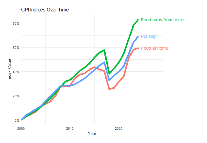
The BLS series for “Housing” is also an aggregate index of “Shelter” prices, which is the actual rent (or Owner Rent Equivalent), and other expenses like utilities, moving, and repairs. Stagnant construction productivity and land use regulation will show up mostly in rents so these other pieces of the series are masking a bit of the inflation.
There is also changing composition within the “Food at home” category. Americans eat more fats and oils, more sugars and sweets, more grains, and more red meat; all four items that grew the most in price since 2003.
There’s also a flipside to food and beverage’s easy tradability: they’re closer to the same price everywhere. House prices per square foot, by contrast, differ by more than $1000 just across the boroughs of New York City. Over the period tracked by this index there has been massive migration between the most expensive housing states and the cheapest ones. This means the average housing price tracked by BLS gets weighted more towards the Austin housing market as the San Francisco and NYC markets keep rising.
Mike Konczal has a nice breakdown of the BLS indices behind the AEI graph where he shows, among other things, that “Delivery Services” had the highest price inflation of any category over the period, beating out “Hospital Services” by about 10 percentage points. So some of the inflation is due to this cost of trucking and delivery.
These considerations widen the gap between food prices and housing prices, but not nearly as much as the gap between housing and cars or clothing. I’m still pretty surprised by the similarity and I’m not sure why food tracks housing so much more closely than clothing, which seems like a much closer match in terms of supply chain and market structure.
26 comments
Comments sorted by top scores.
comment by NickH · 2024-08-19T12:32:39.562Z · LW(p) · GW(p)
Food costs are not even slightly comparable. When I was kid (in the UK) they ran national advertising campaigns on TV for brands of flour, sugar and sliced bread. Nowadays the only reason these things aren't effectively free is because they take up valuable shelf space. Instead people are buying imported fruit and vegetables and ready-meals. It's like comparing the price of wood in the 1960's to the price of a fitted kitchen today.
Replies from: AnthonyC↑ comment by AnthonyC · 2024-08-19T20:24:04.454Z · LW(p) · GW(p)
Came to say pretty much this. Even within product categories, quality is nearly incomparable. In the 1990s if you wanted more than a handful of options for cheese in America you needed to go to specialty stores. Things like organic flour, whole wheat flour, non-wheat flours, more than 2 varieties of apple, were very hard to come by in most places.
I could easily spend a quarter as much on groceries as I currently do, if I wanted to eat like my parents ate when I was little. Less than that, if I ate like my grandparents did when they were my age. I don't do that, because the food quality is worth the price to me.
In contrast, the kinds of houses they lived in, built, or bought would mostly be illegal today, either not up to code or not in line with zoning ordinances. Ditto for cars and childcare.
Edit to add:
Nowadays the only reason these things aren't effectively free is because they take up valuable shelf space.
It's hard to overstate how true this is. About 10 years ago I talked to a senior manager from General Mills who told me that if they shipped cereal boxes to the stores empty, the price would probably only be a couple of cents lower. For flour it's even more true.
comment by aphyer · 2024-08-16T14:37:59.578Z · LW(p) · GW(p)
Splitting out 'eating out' and 'food at home' is good, but not the whole story due to the rise of delivery.
I believe the snarky phrasing is "Inflation is bad? Or you ordered a private taxi for your burrito?"
Replies from: korin43↑ comment by Brendan Long (korin43) · 2024-08-16T22:06:44.047Z · LW(p) · GW(p)
Doesn't that just make it even more confusing? I guess we also buy taxis for our groceries, but the overhead is much lower when you're buying hundreds of dollars worth of groceries instead of a $10 burrito. Plus, these prices all tracked each other from 2000-2010, but Instacart didn't even exist until 2012.
Replies from: jmhcomment by khafra · 2024-08-19T09:07:10.382Z · LW(p) · GW(p)
I guess this is common knowledge, but I missed it: What is with the huge dip in CPI before 2020? I'm confused, especially because the 2008 crash barely shows up. A cursory googling and asking ChatGPT failed me.
Replies from: AnthonyC↑ comment by AnthonyC · 2024-08-20T15:00:31.377Z · LW(p) · GW(p)
IIRC it was a 2018 change in the calculation methodology. How they account for geographic variation and how they account for quality change over time, possibly among other things. So those might not be directly comparable numbers.
That change in CPI price level does not show up if you look at y-o-y inflation. I assume they back-calculated the 2017 (and a few more years) numbers with the new methodology to do inflation calculations, but maybe actual price level data is harder to find to make a graph with?
comment by Matthew Barnett (matthew-barnett) · 2024-08-20T22:01:27.768Z · LW(p) · GW(p)
There is also a story of sclerosis and stagnation. Sure, lots of frivolous consumer goods have gotten cheaper but healthcare, housing, childcare, and education, all the important stuff, has exploded in price.
I think the idea that this chart demonstrates sclerosis and stagnation in these industries—at least in the meaningful sense of our economy getting worse at producing or affording these things—is largely a subtle misunderstanding of what the chart actually shows. (To be clear, this is not an idea that you lean on much in this post, but I still think it's important to try to clarify some misconceptions.)
Prices are relative: it only makes sense to discuss the price of X relative to Y, rather than X's absolute price level. Even inflation is a relative measure: it shows the price of a basket of goods and services relative to a unit of currency.
With this context in mind, we should reconsider what it means for the items at the top of the chart to have "exploded in price". There are several possible interpretations:
- These items have become more expensive relative to a unit of US currency (true, supported by the chart)
- These items have become more expensive relative to average hourly wages (true, supported by the chart)
- These items have become more expensive relative to an average consumer's income (mostly not true, not supported by the chart)
If the economic stagnation narrative were accurate, we would expect:
- Claim (3) above to be true, as this would indicate that an average consumer finds these items harder to purchase. Conversely, if a service's price decreases relative to someone's income, it becomes more affordable for that person, even if its price increases relative to other metrics.
- The chart to accurately represent the overall price of healthcare, housing, childcare, and education, rather than misleading sub-components of these things.
However, I argue that, when correctly interpreted under the appropriate measures, there's little evidence that healthcare, housing, childcare, and education have become significantly less affordable for an average (not median) consumer. Moreover, I claim that the chart is consistent with this view.
To reconcile my claim with the chart, it's crucial to distinguish between two concepts: average income and average wages. Income encompasses all money received by an individual or household from various sources, including wages, non-wage benefits, government assistance, and capital investments.
Average income is a broader and more appropriate way to measure whether something is becoming less "affordable" in this context, since what we care about is whether our economy has stagnated in the sense of becoming less productive. I personally think a more appropriate way to measure average income is via nominal GDP per capita. If we use this measure, we find that average incomes have risen approximately 125% from 2000-2023, which is substantially more than the rise in average wages over the same time period, as shown on the chart.
Using average wages for this analysis is problematic because it overlooks additional income sources that people can use to purchase goods and services. This approach also introduces complexities in interpretation, for example because you'd need to account for a declining labor share of GDP. If we focused on wages rather than average income, we would risk misinterpreting the decrease in average wages relative to certain services as a real decline in our ability to afford these things, instead of recognizing it more narrowly as a shift in the price of labor compared to these services.
A closer examination of the chart reveals that only four items have increased in price by more than 125% over the given period: Medical Care Services, College Textbooks, College Tuition and Fees, and Hospital Services. This immediately implies that, according to the chart, childcare and housing have actually become more affordable relative to average incomes. For the remaining items, I argue that they don't accurately represent the overall price levels of healthcare and education. To support this claim, let's break down each of these components:
- Regarding Medical Care Services and Hospital Services, Random Critical Analysis has (to my mind) convincingly demonstrated that these components of the CPI do not accurately reflect overall healthcare prices. Moreover, when using the right standard to measure average income (nominal GDP per capita), he concludes that healthcare has not become significantly less affordable in the United States in recent decades.
- Regarding College Tuition and Fees, this is not a measure of the quality-adjusted price level of college education, in the sense that matters here. That's because colleges are providing a fundamentally different service now than they did in the past. There are more staff members, larger dorm complexes, and more amenities than before. We shouldn't mistake an increase in the quality of college with whether education is becoming harder to produce. Indeed, given that a higher fraction of people are going to college now compared to decades ago, the fact that colleges are higher quality now undermines rather than supports a narrative of "stagnation", in the economically meaningful sense.
- Regarding College Textbooks, I recall spending a relatively small fraction of my income in college on textbooks, making me suspect that this component on the chart is merely cherrypicked to provide another datapoint that makes it seem like education has become less affordable over time.
To avoid having this comment misinterpreted, I need to say: I'm not saying that everything has gotten more affordable in the last 25 years for the median consumer. I'm not making any significant claims about inequality either, or even about wage stagnation. I'm talking about a narrower claim that I think is most relevant to the post: whether the chart demonstrates substantial economic stagnation, in the sense of our economy getting worse at producing certain stuff over time.
Replies from: CronoDAS↑ comment by CronoDAS · 2024-08-22T05:55:39.801Z · LW(p) · GW(p)
Don't forget Baumol's cost disease: if one part of the economy gets a lot more productive per labor-hour, then wages in other parts will go up to compensate. I don't think that the number of employees per patient in a hospital or the number of employees per student in a university is lower today than it was in the 1980s, even if hospitals and universities have improved in other ways.
Replies from: matthew-barnett↑ comment by Matthew Barnett (matthew-barnett) · 2024-08-23T00:37:49.319Z · LW(p) · GW(p)
In my view, Baumol's cost disease is poorly named: the name suggests that certain things are getting more expensive, but if "more expensive" means "society (on the whole) cannot afford as much as it used to" then this implication is false. To be clear, it is definitely possible that things like healthcare and education have gotten less affordable for a median consumer because of income inequality, but even if that's true, it has little to do with Baumol's cost disease per se. As Scott Alexander framed it,
The Baumol effect cannot make things genuinely less affordable for society, because society is more productive and can afford more stuff. However, it can make things genuinely less affordable for individuals, if those individuals aren’t sharing in the increased productivity of society.
I don't think that the number of employees per patient in a hospital or the number of employees per student in a university is lower today than it was in the 1980s, even if hospitals and universities have improved in other ways.
I think this is likely wrong, at least for healthcare, but I'd guess for education too. For healthcare, Random Critical Analysis has written about the data, and I encourage you to look at their analysis.
comment by CronoDAS · 2024-08-22T05:43:55.785Z · LW(p) · GW(p)
In terms of food prices in particular, what I've heard is that prices at the grocery store and in restaurants depend much more on the cost of labor than on anything else. Grocery stores themselves operate on razor-thin margins, and changes in the price of wheat and other "raw materials" have only tiny effects on grocery store prices. Most of the actual expense of putting food on grocery store shelves comes from the cost of food processing (turning wheat into bread, cutting up dead animals into cuts of meat, etc.), which is a fairly labor-intensive industry.
comment by jmh · 2024-08-18T18:43:58.762Z · LW(p) · GW(p)
Owner equivalent rent seem a bit of a misdirect for tracking inflation. I own and I can tell you that I don't pay anything close to what someone renting a similar house pays.
The other thing that kind of jumps out at me here is the hourly wages. Have to dig a bit more to be sure but in general it seems that non-hourly wage incomes have been growing faster than hourly wage incomes. Inflation is suppose to tell us something about real prices. But the real prices most people care about is what their income is buying. It would be interesting to use that hourly wages data as the base for the other series and see what the chart looks like. (Note -- I should acknowledge that this is somewhat addressed in the chart on share of disposable income.)
You note a bit about the composition of food but pretty high level. I wonder if we're not seeing food prices going up as peoples' incomes raise due to changes in what they are buying and eatting -- both at home and away from home. If that is the case it's not really inflation but simply higher quality foods that will cost more regardless of inflation.
Replies from: romeostevensit↑ comment by romeostevensit · 2024-08-18T22:31:03.000Z · LW(p) · GW(p)
Most people conflate cash flow and expected net worth at future time t. Implicit rents are useful for measuring the actual delta.
Replies from: romeostevensit, jmh↑ comment by romeostevensit · 2024-08-20T06:03:00.575Z · LW(p) · GW(p)
oops, I did not in fact parse the qualifier 'for the purposes of calculating inflation.'
Replies from: jmh↑ comment by jmh · 2024-08-20T16:06:56.114Z · LW(p) · GW(p)
Yeah, I was a bit less clear in my statement than I could have been.
Replies from: romeostevensit↑ comment by romeostevensit · 2024-08-20T16:22:21.802Z · LW(p) · GW(p)
I think it's on me, you lead with a clear thesis statement.
↑ comment by jmh · 2024-08-19T15:11:42.440Z · LW(p) · GW(p)
Could you perhaps expand on how conflating cash flow and expected net worth at future time t relates to accurate measurement of current and past inflation in housing or shelter costs?
Replies from: AnthonyC↑ comment by AnthonyC · 2024-08-20T15:11:14.349Z · LW(p) · GW(p)
I own and I can tell you that I don't pay anything close to what someone renting a similar house pays.
I think this is the point. If rent for the house you own is going up faster than your cost of ownership, then the difference is in some sense untaxed capital gains from your home equity. As a homeowner, your income (in terms of buying power) is higher than your salary.
To put it another way: If you had instead taken the equity you've built in your home and bought stocks (or whatever you see as the next best investment after homeownership), then devoted the returns from those stocks into paying rent, would you be better or worse off? And how would that answer change over time?
Similarly: if you were a retiree living on returns from your investments made over the course of your working life, whether you own or rent makes a significant difference to your standard of living. If you own and your home is paid off, you don't owe rent. Let's say you have one retiree A with a $500k home (fully paid off) and $2M in investments, and another B with $2.5M in investments. Both use the common advice that they can spend 4% of their principle a year. Person A probably owes a few hundred dollars a month on taxes and a few hundred more on upkeep, then has $80k/year to spend on other things. Person B owes rent but has $100k annual income. That gives person B $20k/year to spend on rent. That's about a third of what it would cost to rent the home person A owns. So, we can treat person A's buying power as being equivalent to almost $140k/yr. The difference between A and B is a result of housing inflation since A bought their home being higher than inflation in the economy overall.
(Note: in reality if these hypothetical retirees had the same working life history, we'd have to also ask whether person B was able to put away more money in investments back when housing costs were lower and whether the compound growth would give them much more net worth now. I have not attempted to account for that, and I'm not sure if or how that affects the question of estimating inflation. I think my example is still directionally correct).
comment by martinkunev · 2024-10-10T12:20:58.531Z · LW(p) · GW(p)
The health and education categories would be quite different in most european countries
comment by NuclearGang · 2024-09-02T00:32:24.566Z · LW(p) · GW(p)
Looking at the first chart here, I'm seeing a big divide between domestic products and imported products. Things like cars, T.V.s, clothing, computers, household furnishings, all almost exclusively produced internationally, while things like childcare, healthcare, housing, and food are either domestically produced by default (i.e. childcare, I imagine >99% of Americans don't send their kids overseas when they need a babysitter), or are mostly sourced domestically (i.e. food, things like grains, vegetables, livestock are bought from within the country).
If one consequence of free trade is that prices get cheaper, maybe that explains part of the price differential? To take food as an example, almost all of the avocados I eat are grown in Mexico, but I buy them in American stores, so any price savings from growing produce in a country with an average wage of ~$15k/year gets lost when you have to buy from a country with an average wage of ~$50k/year. Compare to a T.V., where most of the labor in manufacturing semiconductors is done in, say, China (average wage ~$18k/year) or Taiwan (average wage ~$25k), and thus the cost savings is passed on to the consumer in the U.S.
This model wouldn't necessarily explain domestic products increasing in price by inflation-adjusted dollars, only why certain products have gotten cheaper over time. It would only predict that if a product or category of products (T.V.s) have gotten cheaper while other products have increased in price, it is more likely that the product in question is manufactured somewhere where it is cheaper to do so.
This model also wouldn't predict the price drop in something like cellphone service. Sure, most of the material involved is manufactured somewhere cheaper, but (I'm guessing) most of the cost in expanding cell phone coverage is in labor, putting up new towers, laying phone lines, etc., which necessarily can't be exported, you gotta hire an electrician in America at American wages, even if they are hired from another country with expected lower wages. That is a little more confusing for me, maybe long-term investments in communication infrastructure are coming to fruition?
comment by qwerty2 · 2024-08-24T05:06:21.917Z · LW(p) · GW(p)
This is a minor nitpick, and it does not really concern the overall point you try make in the post, but it is incorrect to use the chart of "Share of Disposable Personal Income spent on food in the United States" as lone evidence for the claim that Americans are eating out more. These results would also be perfectly consistent, for example, with rising costs in "Food away from home", and falling/stagnant costs with "Food at home", all with no fluctuation in the actual proportion of meals that an American eats away from home vs at home. More importantly, even knowing both prices rise (as evidenced by the following chart) does not fully complete the picture if failing to also provide a baseline value for these. Note I don't actually doubt for a second that it is true (that Americans are eating out more)!
comment by Review Bot · 2024-08-19T05:59:09.415Z · LW(p) · GW(p)
The LessWrong Review [? · GW] runs every year to select the posts that have most stood the test of time. This post is not yet eligible for review, but will be at the end of 2025. The top fifty or so posts are featured prominently on the site throughout the year.
Hopefully, the review is better than karma at judging enduring value. If we have accurate prediction markets on the review results, maybe we can have better incentives on LessWrong today. Will this post make the top fifty?
comment by denkenberger · 2024-08-19T05:55:38.252Z · LW(p) · GW(p)
Why does the chart not include energy? Prepared meals in grocery stores cost more, so their increased prevalence would be part of the explanation. Also, grains got more expensive in the last 20 years partly due to increased use in biofuels.
comment by Jackson Wagner · 2024-08-18T17:46:12.474Z · LW(p) · GW(p)
"Americans eat more fats and oils, more sugars and sweets, more grains, and more red meat; all four items that grew the most in price since 2003."
Nice to know that you can eat healthy -- fish, veggies, beans/nuts, eggs, fresh fruit, etc -- and beat inflation at the same time! (Albeit these healthier foods still probably have a higher baseline price. But maybe not for much longer!)
The linked chart actually makes red meat look fine (beef has middling inflation, and pork has actually experienced deflation), but beverages, another generally unhealthy food, are near the top: https://www.ers.usda.gov/data-products/chart-gallery/gallery/chart-detail/?chartId=76961
As to the actual subject of the post, I have to imagine that:
- housing inflation feels so much worse in superstar cities than everywhere else, so for us cosmopolitan types it's hard to believe that the national average (brought lower by cheap housing across the Rust Belt, etc) isn't way higher.
- housing inflation is being measured in a way that doesn't indicate the true severity of the economic distortion. Like you say, housing prices cause migration -- SF is not just more expensive but also much smaller, less productive, etc, than it would be with better zoning laws. So only part of the tragedy caused by restrictive housing policy, actually shows up as high housing prices. (You could say the same for health and other things -- healthcare gets more expensive, but surely that also means people forgo certain expensive-but-beneficial treatments? But maybe housing just sees more of this effect than healthcare or education.)
↑ comment by Declan Molony (declan-molony) · 2024-08-19T00:52:40.231Z · LW(p) · GW(p)
"Albeit these healthier foods still probably have a higher baseline price."
Maybe in the short-term, but considering the lifetime consequences of unhealthy eating (e.g., atherosclerosis, heart disease, cancer, dementia---Dr. Peter Attia's stated 4 horsemen of death that account for 80% of death in the US---not to mention the emotional damage on your mood and potential productivity), the cost/benefit analysis seems heavily weighted in favor of eating healthier foods.
Replies from: AnthonyC↑ comment by AnthonyC · 2024-08-20T15:33:52.443Z · LW(p) · GW(p)
I agree, but from a purely economic POV I don't know if that holds.
This depends on how healthy eating affects lifetime medical costs. Compare person 1 who lives 70 years, and person B who eats healthier and lives to 80. Both people probably have about the same number of working years (lifetime income/contribution to GDP). Does person A spend (or cost) more on medical care in 70 years than person B does in 80? Or does Person B get more healthy years but also more years where they need expensive chronic care? In that case, the healthy food costs more up front, and also makes it harder to save enough to pay for the medical care you're going to need once you retire. Sure, person B may be able to stay healthy and work more years, so that complicates things, but then they may spend a longer fraction of their retirement not healthy enough to fully enjoy it, it's not clear to me.
Note: just want to make clear this is not about inflation, which would be more a discussion of the costs of individual bits of medical or chronic care. It does relate to the cost of healthcare as a fraction of the economy.